Components Basics
|
This section documents the current Vue 3.x release line as published at
the official Vue.js documentation, which is the reference these pages are written and
verified against. No specific patch version is pinned. The Composition API with This content was generated with the assistance of AI and should be verified against the official documentation before being relied on in production, since Vue and its ecosystem iterate quickly. This section’s bibliography lists the reference material consulted while preparing these pages. |
A component is a reusable instance with its own template, logic, and styling. A Vue app is a tree of components nested inside one root component. This page is the quick tour; each topic links to a deeper page. The reference is Components Basics.
Defining a component
The usual unit is a Single-File Component (SFC): a .vue file with <script>, <template>, and optional
<style> blocks, compiled by the build tool. See
Single-File Components for the format.
<!-- ButtonCounter.vue -->
<script setup>
import { ref } from 'vue'

const count = ref(0)
</script>

<template>
  <button @click="count++">Clicked {{ count }} times</button>
</template>

<style scoped>
button { font-weight: 600; }
</style>
Without a build step a component can be a plain object with a setup() and a string template, but SFCs are
the norm.
Using a component
Import it and use it in the template. With <script setup>, an imported component is available to the
template automatically — no registration call.
<script setup>
import ButtonCounter from './ButtonCounter.vue'
</script>

<template>
  <h1>A child component</h1>
  <ButtonCounter />
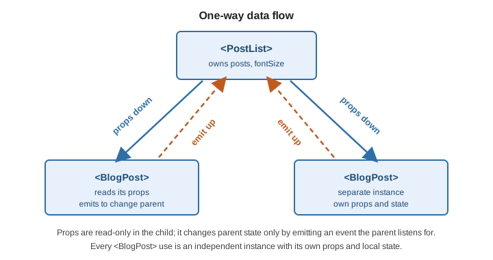
  <ButtonCounter />   <!-- each use is an independent instance with its own count -->
</template>
Use PascalCase in SFC templates. Components used this way are locally registered — scoped to the
component that imports them. For app-wide app.component(…) registration and the trade-off it carries, see
Registration and Props and
Component Registration.
Passing props
Props are the custom attributes a component accepts. Declare them with defineProps; the parent passes them
as attributes, static or bound with :.
<!-- BlogPost.vue -->
<script setup>
defineProps({
  title: String,
  likes: { type: Number, default: 0 }
})
</script>

<template>
  <h4>{{ title }} ({{ likes }})</h4>
</template>
<script setup>
import BlogPost from './BlogPost.vue'
const posts = [
{ id: 1, title: 'Reactivity' },
{ id: 2, title: 'Templates' }
]
</script>
<template>
<BlogPost v-for="post in posts" :key="post.id" :title="post.title" />
</template>Props flow one way: parent to child. A child must not mutate a prop; to change parent state it emits an
event. Full prop validation, typing, and defineModel are in Registration and Props.
Listening to events
A child declares its events with defineEmits and fires one with emit(name, …args). The parent listens
with @. See Listening to
Events.
<!-- BlogPost.vue -->
<script setup>
defineProps({ title: String })
const emit = defineEmits(['enlarge-text'])
</script>

<template>
  <h4>{{ title }}</h4>
  <button @click="emit('enlarge-text', 0.1)">Bigger</button>
</template>
<script setup>
import { ref } from 'vue'
const fontSize = ref(1)
</script>
<template>
<BlogPost
title="Hello"
@enlarge-text="(amount) => fontSize += amount" />
</template>Event arguments, v-model on components, and fallthrough attributes are in
Component Events and v-model.
A first look at slots
A slot lets a parent pass template content into a child; the child renders it wherever it puts <slot />.
See Content
Distribution with Slots.
<!-- AlertBox.vue -->
<template>
  <div class="alert">
    <strong>Error!</strong>
    <slot>A default message</slot>
  </div>
</template>
<template>
<AlertBox>Something bad happened.</AlertBox>
</template>Named and scoped slots have their own page: Slots.
Dynamic components
<component :is="…"> renders a different component depending on a value — tabs, a wizard, a content
switch. :is takes a component (imported, or looked up in a local map) or, for a native element, a tag-name
string. See Dynamic Components.
<script setup>
import { shallowRef } from 'vue'
import Home from './Home.vue'
import Posts from './Posts.vue'

const tabs = { Home, Posts }
const current = shallowRef('Home')
</script>

<template>
  <button v-for="(_, name) in tabs" :key="name" @click="current = name">
    {{ name }}
  </button>

  <component :is="tabs[current]" />
</template>
Switching away unmounts the outgoing component, so its state is lost and it is rebuilt on return. Wrap it
in <KeepAlive> to cache the inactive instances instead:
<template>
  <KeepAlive>
    <component :is="tabs[current]" />
  </KeepAlive>
</template>
Kept-alive components fire onActivated / onDeactivated rather than mount / unmount — see
Lifecycle Hooks.
In-DOM template caveats
When a template is written directly in an HTML file — not in an SFC or a JavaScript string — the browser parses it before Vue sees it, so HTML rules apply. See in-DOM template parsing caveats.
-
Case-insensitive tags and attributes. The browser lowercases everything, so
<BlogPost>and:somePropare unreachable — use kebab-case:<blog-post some-prop="…">. -
No self-closing custom elements.
<my-component />is not recognised by the HTML parser; write<my-component></my-component>. -
Element placement restrictions.
<table>allows only certain children, so a component row needs<tr is="vue:blog-row">(with thevue:prefix) rather than<blog-row>inside<tbody>. The same applies inside<ul>,<ol>, and<select>.
None of this affects SFCs or string templates — their content is compiled by Vue, not by the browser.
See also
-
Registration and Props — global vs. local registration and the full props API.
-
Component Events and v-model —
defineEmits,defineModel, and fallthrough attributes. -
Slots — named and scoped slots.
-
Lifecycle Hooks — what mount, update, and
<KeepAlive>activation run. -
React Reference and Angular Reference — the same component model elsewhere.