Flexbox Layout
|
This content was generated with the assistance of AI and should be verified against the official documentation before being relied on in production; see the section bibliography for the reference material consulted while preparing these pages. |
Every style prop touched so far — on App.tsx in
Getting Started, on PlaceCard in
Core Components and React Fundamentals and
TypeScript in React Native — has quietly relied on flex,
flexDirection, alignItems, and justifyContent without explaining them. This page covers that layout system
in full: Yoga, the engine that computes it; every layout property it understands; safe areas and Android’s
now-mandatory edge-to-edge display; a small catalogue of layout patterns Places reuses across screens; and the
Places home screen — header, list, and floating action button — laid out with exactly these properties.
Visual styling itself — colors, typography, and the theme object this page’s examples consume via
useTheme() — is Styling's subject, not this page’s; this page is about
where things sit, not what they look like.
Yoga: React Native’s Layout Engine
Yoga is Meta’s own C++ implementation of the Flexbox specification, compiled into every React Native app and invoked from both Fabric (rendering) and Codegen-produced native code — it is not the browser’s CSS layout engine, and it is not WebKit’s or Blink’s Flexbox implementation reused, even though it targets the same specification and, for the most part, the same property names. That shared vocabulary is precisely what makes one property’s default behave differently enough to matter:
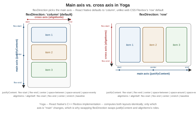
flexDirection defaults to 'column' in React Native, not 'row'. This is the single biggest difference
from web CSS Flexbox, whose own default is row. Every unstyled View in Places stacks its children
top-to-bottom unless flexDirection: 'row' is set explicitly — code ported from a web Flexbox layout that
never set flexDirection will render its children in the wrong direction until this is corrected.
With that one default flipped, the rest of the property set works exactly as it does in browser Flexbox:
| Property | What it controls |
|---|---|
|
Which axis is the main axis: |
|
Distributes children along the main axis: |
|
Aligns children along the cross axis (the axis perpendicular to |
|
The same set of values as |
|
Distributes rows of children along the cross axis when |
|
Shorthand most Places code uses directly: a single non-negative number sets |
|
The three properties |
|
|
|
Fixed space between children along the main axis ( |
|
Removes a child from Yoga’s normal flex flow entirely and positions it relative to its nearest positioned
ancestor, using |
Percentage dimensions, |
|
|
|
|
Paint order among siblings that would otherwise overlap — higher values paint on top, independent of JSX order — used below to keep Places's floating action button above the list beneath it. |
None of this is negotiated per platform: Yoga runs identically on iOS and Android (and, via the same engine,
inside the New Architecture’s C++ layer described on
Architecture Under the Hood), so a layout that is
correct on one platform is, barring a genuinely platform-specific measurement quirk, correct on the other without
any Platform.OS branch.
Safe Areas and Edge-to-Edge Display
A layout that fills its View correctly can still end up behind a notch, a status bar, a home indicator, or
a gesture-navigation bar, because Yoga lays out within the space it is given — it has no built-in notion of
"the part of the screen the OS reserves for itself." Two tools close that gap, and only one of them is still the
right default:
-
SafeAreaView— exported directly fromreact-native— insets its children away from the notch and status bar on iOS only; historically it was a no-op on Android, which is why it was never a reliable cross-platform solution even before the change below. -
react-native-safe-area-context'sSafeAreaProvider(wrapped once, near the root, alongside Places's ownThemeProviderfrom Styling) anduseSafeAreaInsets()— a Hook returning{ top, right, bottom, left }in points — is the actually-recommended approach today: it resolves correctly on both platforms, updates on rotation and on-screen-keyboard changes, and lets a screen apply exactly the insets it needs (often justpaddingTop: insets.topon a header) rather than wrapping an entire screen in an opaqueSafeAreaViewbox.
React Native 0.86 made edge-to-edge display mandatory on Android 15 and later — the OS itself no longer
letterboxes an app’s content away from the status bar and navigation bar by default the way earlier Android
versions did. An app that never accounted for insets used to get away with it because the OS drew a safe margin
for it; on Android 15+ that margin is gone, and content that does not call useSafeAreaInsets() (or otherwise
apply its own top/bottom padding) now renders under the status bar and the gesture/navigation bar. Places
treats react-native-safe-area-context as required infrastructure from this page onward specifically because of
this change, not only as a nicety for iOS notches.
Responsive re-layout on rotation or window resize — a tablet turned sideways, a foldable unfolded, a window
resized in Android’s multi-window mode — is useWindowDimensions()’s job, already introduced on
Styling: unlike a one-shot `Dimensions.get('window') call,
useWindowDimensions() is a Hook that re-renders the component with fresh { width, height } whenever either
changes, which is exactly what the responsive Places grid later on this page depends on.
A Layout Catalogue
A handful of flex-prop combinations cover most of the shapes a Places screen actually needs. Each snippet below
composes only View, flex, and the properties from the table above — no third-party grid library.
A three-column row, each column sharing the remaining width equally:
<View style={{ flexDirection: 'row', gap: theme.spacing.md }}>
  <View style={{ flex: 1 }}><Text>Trips</Text></View>
  <View style={{ flex: 1 }}><Text>Places</Text></View>
  <View style={{ flex: 1 }}><Text>Favourites</Text></View>
</View>
A flexible row that spreads its children across the full width, useful for a card’s label-and-value pair or a screen’s title-and-action header:
<View style={{ flexDirection: 'row', justifyContent: 'space-between', alignItems: 'center' }}>
  <Text style={{ fontWeight: '600' }}>Category</Text>
  <Text>{place.category}</Text>
</View>
A flexible grid, wrapping fixed-fraction items onto additional rows once they no longer fit:
<View style={{ flexDirection: 'row', flexWrap: 'wrap', gap: theme.spacing.sm }}>
  {categories.map((category) => (
    <View key={category} style={{ width: '31%' }}>
      <Text>{category}</Text>
    </View>
  ))}
</View>
A rows-and-columns grid, built as a column of rows rather than as a single wrapping row, when items must line up in fixed columns instead of merely filling whatever space is left on each line:
<View style={{ gap: theme.spacing.sm }}>
  {chunk(categories, 3).map((row, rowIndex) => (
    <View key={rowIndex} style={{ flexDirection: 'row', gap: theme.spacing.sm }}>
      {row.map((category) => (
        <View key={category} style={{ flex: 1 }}>
          <Text>{category}</Text>
        </View>
      ))}
    </View>
  ))}
</View>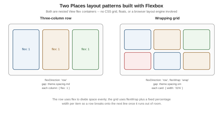
The Places Home Screen Layout
PlacesListScreen — Places's home screen, first named on
Getting Started — composes exactly three regions with the
properties above: a header inset from the top safe area, a FlatList of PlaceCard`s filling the remaining
space, and a floating action button pinned to the bottom-right corner via `position: 'absolute'. How FlatList
itself virtualizes and scrolls that data is Lists and Scrolling's
subject; here it is only ever the flex child that fills the screen between the header and the button:
// src/features/places/screens/PlacesListScreen.tsx
import { FlatList, Pressable, Text, View } from 'react-native';
import { useSafeAreaInsets } from 'react-native-safe-area-context';
import { useTheme } from '../../../theme/ThemeProvider';
import { usePlaces } from '../hooks/usePlaces';
import { PlaceCard } from '../components/PlaceCard';
import type { Place } from '../types';

export function PlacesListScreen({ navigation }: PlacesListScreenProps) {
  const theme = useTheme();
  const insets = useSafeAreaInsets();
  const { data, fetchNextPage } = usePlaces();
  const places: Place[] = data?.pages.flatMap((page) => page.items) ?? [];

  return (
    <View style={{ flex: 1, backgroundColor: theme.colors.background }}>
      <View
        style={{
          paddingTop: insets.top + theme.spacing.md,
          paddingHorizontal: theme.spacing.md,
          paddingBottom: theme.spacing.sm,
        }}
      >
        <Text style={{ fontSize: 22, fontWeight: '700', color: theme.colors.text }}>Places</Text>
      </View>

      <FlatList
        style={{ flex: 1 }}
        contentContainerStyle={{ paddingHorizontal: theme.spacing.md, gap: theme.spacing.sm }}
        data={places}
        keyExtractor={(place) => place.id}
        onEndReached={() => fetchNextPage()}
        renderItem={({ item }) => (
          <PlaceCard
            place={item}
            onPress={(placeId) => navigation.navigate('PlaceDetails', { placeId })}
            onToggleFavourite={(placeId) => toggleFavourite(placeId)}
          />
        )}
      />

      <Pressable
        onPress={() => navigation.navigate('AddPlace')}
        style={{
          position: 'absolute',
          right: theme.spacing.lg,
          bottom: insets.bottom + theme.spacing.lg,
          width: 56,
          height: 56,
          borderRadius: 28,
          backgroundColor: theme.colors.primary,
          alignItems: 'center',
          justifyContent: 'center',
          zIndex: 10,
        }}
      >
        <Text style={{ fontSize: 26, color: theme.colors.onPrimary }}>+</Text>
      </Pressable>
    </View>
  );
}
Three things about this layout are worth calling out because they are easy to get wrong the first time:
-
The outer
Viewis{ flex: 1 }so the screen fills the space React Navigation’s stack hands it — without it, theFlatListbeneath it (alsoflex: 1) would have nothing to grow into and would collapse to zero height. -
Only the header adds
insets.top; theFlatListitself needs no top inset because it sits below the header, and the floating action button addsinsets.bottominstead, so it never sits under a gesture-navigation bar on Android 15+ edge-to-edge, or the home indicator on iOS. -
The button’s
zIndex: 10is what keeps it painted above the list, sinceposition: 'absolute'alone only removes it from flex flow — without an explicitzIndex, sibling paint order (the list, declared first in JSX, versus the button, declared second) already happens to put the button on top here, but relying on declaration order instead ofzIndexis fragile the moment a screen’s JSX is reordered.
A Responsive Two-Column Grid for Tablets
useWindowDimensions() lets the same screen switch from a single-column list to a two-column grid once the
window is wide enough to make a second column worthwhile — a tablet in portrait, or any window past a 768
logical-pixel breakpoint:
// src/features/places/screens/PlacesListScreen.tsx (responsive variant)
import { useWindowDimensions } from 'react-native';

const TABLET_BREAKPOINT = 768;

export function PlacesListScreen({ navigation }: PlacesListScreenProps) {
  const theme = useTheme();
  const { width } = useWindowDimensions();
  const isTablet = width >= TABLET_BREAKPOINT;
  const numColumns = isTablet ? 2 : 1;

  // ...usePlaces() and insets exactly as above...

  return (
    <View style={{ flex: 1, backgroundColor: theme.colors.background }}>
      {/* ...header exactly as above... */}
      <FlatList
        key={numColumns} // FlatList requires a new key when numColumns changes
        style={{ flex: 1 }}
        contentContainerStyle={{ paddingHorizontal: theme.spacing.md, gap: theme.spacing.sm }}
        columnWrapperStyle={isTablet ? { gap: theme.spacing.sm } : undefined}
        numColumns={numColumns}
        data={places}
        keyExtractor={(place) => place.id}
        renderItem={({ item }) => (
          <PlaceCard
            place={item}
            style={isTablet ? { flex: 1 } : undefined}
            onPress={(placeId) => navigation.navigate('PlaceDetails', { placeId })}
            onToggleFavourite={(placeId) => toggleFavourite(placeId)}
          />
        )}
      />
      {/* ...floating action button exactly as above... */}
    </View>
  );
}
numColumns is a FlatList prop, not a Yoga property — it tells FlatList to lay each row out as a flexDirection: 'row'
group of numColumns items internally, which is why PlaceCard also needs { flex: 1 } (via the typed style
override from TypeScript in React Native's fully-typed PlaceCard) once
isTablet is true, so each card shares its row evenly rather than staying pinned to its single-column width. The
key={numColumns} remount is required by FlatList itself: changing numColumns on an already-mounted list
without changing its key throws, since the list’s internal cell layout is computed once per column count.