Core Components and React Fundamentals
|
This content was generated with the assistance of AI and should be verified against the official documentation before being relied on in production; see the section bibliography for the reference material consulted while preparing these pages. |
Getting Started with React Native and React Native Architecture Under the Hood covered what gets rendered and how. This page covers what you write to render it: the small set of built-in Core Components, how they relate to platform Native Components and third-party community components, and which parts of the React model carry over unchanged versus what has no equivalent outside a browser DOM.
Core Components, Native Components, and Community Components
A Core Component is a React component that react-native itself exports and that maps directly to a real
native view on both platforms — View, Text, Image, TextInput, ScrollView, FlatList, Pressable, and
a handful of others. They are the built-in vocabulary every Places screen is written in, exactly the way div,
span, and input are the built-in vocabulary of an HTML page.
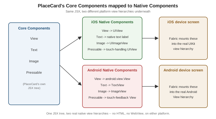
A Native Component is the platform-specific implementation a Core Component actually renders to underneath — View becomes a UIView on iOS and an Android android.view.View; Text becomes an NSTextView-backed
label on iOS and an Android TextView. Most React Native code never has to name a Native Component directly, but
Native Modules and Components (later in
this section) covers writing one from scratch when a Core Component’s platform surface is not enough.
A community component is a third-party package — most of them wrapping their own Native Component the same
way a Core Component does — that fills a gap the Core Components deliberately leave open: FlatList handles a
long scrolling list, but a swipeable card carousel, a native map, or a bottom sheet come from a package such as
react-native-reanimated-carousel, react-native-maps, or @gorhom/bottom-sheet. Places stays on Core
Components for everything in this page and reaches for a community package only where a later page names one
explicitly (maps in Device Capabilities, for
example).
| Component | What it’s for | Android | iOS |
|---|---|---|---|
|
The non-scrolling layout container — the Flexbox box every other component nests inside, roughly React Native’s
|
✓ |
✓ |
|
The only place text may appear; every other component that shows a string, wraps it in a |
✓ |
✓ |
|
Displays a local ( |
✓ |
✓ |
|
Single- or multi-line editable text, with |
✓ |
✓ |
|
Renders all of its children up front and scrolls them — fine for a short, bounded form, wrong for a long or unbounded list. |
✓ |
✓ |
|
Virtualized, lazily-rendered scrolling list for a long or unbounded data set (Places's own list of places); renders only what is near the viewport instead of every row up front. |
✓ |
✓ |
|
Like |
✓ |
✓ |
|
The modern, composable tap/press primitive — replaces the older |
✓ |
✓ |
|
A native toggle switch, used on Places's settings screen. |
✓ |
✓ |
|
A native full-screen or sheet-style overlay presented above the current screen. |
✓ |
✓ |
|
A native spinner, shown while Places's list or details screen is loading. |
✓ |
✓ |
|
Controls the OS status bar’s style, color, and visibility for the current screen. |
✓ |
✓ |
|
Insets content away from notches, the home indicator, and status/navigation bars — superseded in new code by
|
✓ |
✓ |
|
Shifts or resizes its content so the on-screen keyboard does not cover a focused |
✓ |
✓ |
|
A native side-drawer, only meaningful where Android’s own drawer navigation pattern is used. |
Android only |
— |
|
A native toast/snackbar-style transient message. |
Android only |
— |
|
Presents iOS’s native action-sheet picker. |
— |
iOS only |
|
Attaches a custom view above the iOS keyboard while a |
— |
iOS only |
What Is Unchanged From React
Everything about how you describe UI in JavaScript is exactly the React you already know from the React reference — this page does not repeat it, only points at the pages that cover it in full:
-
JSX — JSX and Rendering — the same curly-brace expression embedding, conditional rendering, and list rendering with
key. -
Props — Components and Props — one-way data flow,
children, composition over inheritance. -
State and Hooks — State and Events and Core Hooks and the Rules of Hooks —
useState,useReducer,useEffect, the Rules of Hooks, all identical. -
Context — Core Hooks and the Rules of Hooks covers
useContext; Places's ownThemeProvider(introduced on Styling) is an ordinary Context provider, no different from a web one.
PlaceCard, PlacesListScreen, and every other Places component below are function components using Hooks,
exactly like a React-DOM component would be — the only thing that changes is which host components they
render.
What Has No DOM Equivalent
A handful of things that are second nature in a browser simply do not exist in React Native, because there is no
DOM and no react-dom renderer underneath — react-native is its own renderer target, rendering directly to
native views instead of to HTML:
-
Text only inside
Text. A bare string cannot be a child ofViewthe way it can be a child of adiv— React Native throws at runtime ("Text strings must be rendered within a<Text>component") if you try. Every piece of visible text, down to a single character, must be wrapped inText. -
onPress, notonClick. Touch has no mouse click to name the handler after;Pressable,Text, and every other interactive Core Component exposeonPress(andonLongPress,onPressIn,onPressOut) instead. -
No
<div>,<span>, or CSS classes. There is no HTML element vocabulary and no stylesheet cascade to attach aclassNameto — Styling (later in this section) covers thestyleprop andStyleSheet.createthat replace both. -
No
react-dom.react-nativeis the renderer package inpackage.json, playing the same rolereact-domplays on the web; nothing in a React Native project importsreact-dom, and no APIreact-domexposes (createPortal,hydrateRoot,findDOMNode) has a direct equivalent here.
AppRegistry and the Root Component
Where a React-DOM app calls createRoot(document.getElementById('root')).render(<App />) to mount into a page
element that already exists in HTML, a React Native app has no HTML page to mount into at all. Instead,
AppRegistry.registerComponent names the root component and hands control to the native side, which is what
actually creates the first native view and asks React Native to render App into it once the native app process
starts:
// index.js -- the actual entry point (app/App.tsx above is registered from here)
import { AppRegistry } from 'react-native';
import App from './app/App';
import { name as appName } from './app.json';

AppRegistry.registerComponent(appName, () => App);
Under Expo, create-expo-app generates and wires this file automatically — day-to-day work never touches it — but it is why a React Native app’s mount point is a name registered with the native runtime, not a DOM node
selected by an id.
Class Components: Legacy
Class components (extends React.Component, this.state, this.setState) work exactly as they do in
React-DOM and are still present in some older third-party packages and pre-Hooks tutorials, but every page in
this section — and Places itself — uses function components with Hooks exclusively, matching current React
Native and React guidance; no new Places code in this section is written as a class component.
PlaceCard: Native Components vs. Their Hypothetical React-DOM Markup
Every Places example in this section is built on one domain type, declared once here and imported by every later page rather than redefined:
// src/features/places/types.ts
export type PlaceId = string; // a client-generated UUID

export type PlaceCategory = 'restaurant' | 'landmark' | 'nature' | 'other';

export interface Place {
  id: PlaceId;
  name: string;
  notes: string;
  category: PlaceCategory;
  favourite: boolean;
  visitedAt: string; // ISO-8601 date
  latitude: number | null;
  longitude: number | null;
  photoUri: string | null;
  createdAt: string;
  updatedAt: string;
}

export interface NewPlaceInput {
  name: string;
  notes: string;
  category: PlaceCategory;
  visitedAt: string;
  latitude: number | null;
  longitude: number | null;
  photoUri: string | null;
}
PlaceId is a plain string alias rather than a branded type, and identifiers are generated on the device so a
place can be created offline and synchronised later — see
Storage and Offline. The nullable latitude/longitude and
photoUri fields are what let a place be saved before its location or photo is attached, which
Text Input and Forms and
Device Capabilities both rely on.
Places's PlaceCard (introduced here, reused by every later page in this section) renders a place’s photo,
name, category, and a favourite toggle from View, Text, Image, and Pressable:
// src/features/places/components/PlaceCard.tsx
import { Image, Pressable, StyleSheet, Text, View } from 'react-native';
import type { Place } from '../types';

interface PlaceCardProps {
  place: Place;
  onPress: (placeId: string) => void;
  onToggleFavourite: (placeId: string) => void;
}

export function PlaceCard({ place, onPress, onToggleFavourite }: PlaceCardProps) {
  return (
    <Pressable style={styles.card} onPress={() => onPress(place.id)}>
      {place.photoUri !== null && (
        <Image source={{ uri: place.photoUri }} style={styles.photo} resizeMode="cover" />
      )}
      <View style={styles.body}>
        <Text style={styles.name}>{place.name}</Text>
        <Text style={styles.category}>{place.category}</Text>
      </View>
      <Pressable
        onPress={() => onToggleFavourite(place.id)}
        hitSlop={8}
        accessibilityLabel={place.favourite ? 'Remove from favourites' : 'Add to favourites'}
      >
        <Text style={styles.favourite}>{place.favourite ? '★' : '☆'}</Text>
      </Pressable>
    </Pressable>
  );
}

const styles = StyleSheet.create({
  card: {
    flexDirection: 'row',
    alignItems: 'center',
    padding: 12,
    borderRadius: 10,
    backgroundColor: '#fff',
  },
  photo: { width: 56, height: 56, borderRadius: 8, marginRight: 12 },
  body: { flex: 1 },
  name: { fontSize: 16, fontWeight: '600' },
  category: { fontSize: 13, color: '#666' },
  favourite: { fontSize: 20, marginLeft: 8 },
});
The same card, hand-written as hypothetical React-DOM markup, shows exactly which pieces have no equivalent
above — div/span instead of View/Text, a native img instead of Image, className instead of
style, and onClick instead of onPress:
// Hypothetical React-DOM equivalent -- not part of Places, shown only for contrast.
function PlaceCardWeb({ place, onOpen, onToggleFavourite }) {
  return (
    <div className="place-card" onClick={() => onOpen(place.id)}>
      {place.photoUri && (
        <img src={place.photoUri} className="place-card__photo" alt={place.name} />
      )}
      <div className="place-card__body">
        <span className="place-card__name">{place.name}</span>
        <span className="place-card__category">{place.category}</span>
      </div>
      <button
        className="place-card__favourite"
        onClick={(event) => {
          event.stopPropagation();
          onToggleFavourite(place.id);
        }}
      >
        {place.favourite ? '★' : '☆'}
      </button>
    </div>
  );
}
The component’s shape — props in, JSX out, a nested clickable favourite control — is identical; only the host-component vocabulary and the event/props naming differ, exactly as the previous two sections describe.