The Box Model
|
This section documents general HTML5 and CSS concepts — it is not tied to any specific framework or library. This content was generated with the assistance of AI. Verify it against current MDN documentation and browser-support tables (caniuse.com) before relying on it in production, since HTML/CSS features and browser support continue to evolve. |
Every HTML element rendered by the browser is a rectangular box made up of four nested layers — content, padding, border, and margin, from the inside out. This box model is the foundation that every other layout technique in this reference builds on (see Layout: Float, Flexbox & Grid and Positioning), so it is worth understanding thoroughly before moving on to those pages.
The Four Layers
Picture each element as a box made up of the following layers, from innermost to outermost:
-
Content — where the element’s actual content lives (text, images, or other child elements). Sized by the
widthandheightproperties. -
Padding — spacing between the content box and the border. Part of the element itself: it takes on the element’s background color/image.
-
Border — a visible (or invisible, by default) line that wraps the padding and content.
-
Margin — spacing between the element’s border and neighboring elements. Always transparent — it is used purely to push other elements away.
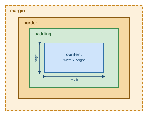
The margin is the outermost layer, followed by the border, then the padding, with the content area at the very center.
The Content Box
The content box is where the actual content lives — typically text, but it can contain child elements
or media such as images. The two properties that size this layer are width and height, typically
expressed in pixels or percentages:
.box {
  width: 200px;
  height: 100px;
}
By default (see box-sizing below), these two properties size the content box only — padding and border are added on top of them, so the element’s total rendered size ends up larger
than width x height.
Padding
Padding is the spacing between the content box and the border. Like the content box, padding takes on the element’s background, so it visually looks like part of the content.
The padding shorthand
The padding shorthand property accepts one, two, or four values:
/* one value: applied to all four sides */
padding: 50px;

/* two values: vertical (top/bottom) then horizontal (left/right) */
padding: 50px 0;

/* four values: top, right, bottom, left (clockwise) */
padding: 10px 15px 20px 25px;
Longhand properties
Each side can also be set independently with padding-top, padding-right, padding-bottom, and
padding-left:
padding-top: 10px;
padding-right: 10px;
padding-bottom: 10px;
padding-left: 10px;
Applying width: 200px; height: 100px; padding: 25px; grows the element’s total rendered footprint to
250px x 150px (200 + 25 + 25 by 100 + 25 + 25), since padding is added outside the content box.
Border
The border sits between the end of the padding area and the beginning of the margin. Unlike padding and content, the border is not visible by default — it only appears once you explicitly set a width, style, and color for it.
The border shorthand
The border shorthand (and its direction-specific counterparts border-top, border-right,
border-bottom, and border-left) all take the same three values, in order: width, style, and
color:
/* applied to all four sides */
border: 5px solid red;

/* applied to one side at a time */
border-top: 5px solid red;
border-right: 15px dotted green;
border-bottom: 10px dashed blue;
border-left: 10px double pink;
The border style determines how the line is drawn; the most common values are solid, dotted,
dashed, and double, plus none (the default — no border is rendered even if a width/color is set)
and groove/ridge/inset/outset for 3D-style effects.
Adding border: 10px solid black; on top of the earlier padding example grows the element’s total
footprint further, to 270px x 170px (adding 10px of border on every side).
Margin
Margin is the spacing between the outer edge of the border and neighboring elements on the page. It follows the exact same shorthand and longhand pattern as padding:
/* shorthand: one, two, or four values, same rules as padding */
margin: 50px;
margin: 50px 0;

/* longhand: one side at a time */
margin-top: 10px;
margin-right: 10px;
margin-bottom: 10px;
margin-left: 10px;
Continuing the running example, adding margin: 25px; around the bordered box does not change the
box’s own rendered size — 270px x 170px, as before — but it does push every neighboring element at
least 25px away on each side.
| Adjacent vertical margins between block-level elements can collapse into a single margin (the larger of the two, rather than their sum). This "margin collapsing" behavior only applies to the top/bottom margins of normal-flow block elements, never to horizontal margins, and never to elements participating in a flex or grid layout. |
box-sizing
By default, the width/height you set only size the content box — padding and border are added on
top, which means the actual rendered size of an element keeps changing every time you tweak its
padding or border, as shown in the running example above. This makes it hard to reason about layout,
since "set an element to be 200px wide" and "the element renders 200px wide" are not the same thing.
The box-sizing property lets you change what width/height measure:
.box {
  /* default: width/height size the content box only;
     padding and border are added on top */
  box-sizing: content-box;
}

.box {
  /* width/height size the border box instead: padding and
     border are subtracted from the inside, so the element's
     rendered footprint always matches width x height exactly */
  box-sizing: border-box;
}
Because content-box sizing is rarely what you actually want, it is standard practice to reset every
element to border-box sizing at the top of a stylesheet:
html {
  box-sizing: border-box;
}

*,
*::before,
*::after {
  box-sizing: inherit;
}
Setting box-sizing: border-box directly on html (rather than on the universal selector) and then
having every other element inherit it from its ancestor means a component author can still override
box-sizing for a single subtree if genuinely needed, and every descendant of that override will pick
it up too — something a blanket * { box-sizing: border-box; } rule would not allow.
Worked Example
Putting the whole box model together, the following three boxes each combine width/height,
padding, border, and margin differently:
.box-1 {
  float: left;
  width: 200px;
  height: 200px;
  padding: 50px;
  border: 1px solid red;
}

.box-2 {
  float: left;
  width: 20%;
  height: 20%;
  padding-top: 50px;
  margin-left: 10px;
  border: 5px solid green;
}

.box-3 {
  float: left;
  width: 300px;
  padding: 30px;
  margin: 50px;
  border-top: 50px solid blue;
}
box-1 uses fixed pixel dimensions with padding and a thin border applied on all sides. box-2 mixes
percentage-based sizing with a longhand padding-top (no padding on the other three sides) and a
margin-left to separate it from box-1. box-3 has no explicit height (it grows to fit its
content), padding and margin applied uniformly, and only a border-top — the other three sides stay
borderless. Inspecting each box with the browser’s developer tools (in Chrome, the Computed tab of
the element inspector) is the fastest way to see exactly how the four layers stack up for any given
element.