SwiftUI Views and Modifiers
|
This content was generated with the assistance of AI and should be verified against the official documentation before being relied on in production; see the section bibliography for the reference material consulted while preparing these pages. |
SwiftUI is the one UI framework that runs on every Apple platform, and everything it draws starts as a view:
a small value that describes a piece of the interface. This page covers the building blocks every later SwiftUI
page relies on — the View protocol, composition, modifiers, the result builder that turns a closure into a
view tree, and the rules SwiftUI uses to decide whether a view on screen is "the same" view as before. The page
is written against iOS, iPadOS, macOS, watchOS and visionOS 27, built with Xcode 27 and Swift 6.4,
while FieldNotes keeps a deployment minimum of 26. Two of the topics below changed with the 27 SDKs:
ContentBuilder replaces the type-specific builders, and the @Entry macro now warns about risky default
values. Both are build-time changes that come with Xcode 27 rather than runtime APIs, so they need no
if #available checks; the text says so where it matters.
The Swift language features SwiftUI leans on — opaque some types, result builders, macros and property
wrappers — are explained in the Swift reference and are only
linked here. The examples are slices of FieldNotes: NoteRow and TagChip live in the FieldNotesUI
package, and the Note and Notebook model types come from FieldNotesModel, as introduced on
Getting Started with Apple Platforms.
Views Are Descriptions, Not Objects
A SwiftUI view is a type that conforms to the View protocol. The protocol has one requirement: a computed
body property that returns another view. SwiftUI calls body whenever the data the view depends on changes,
compares the new description with the previous one, and updates only what differs on screen. The view value
itself is cheap and short-lived; it is a recipe, not the label or the table cell you see. The real platform
objects (a UILabel-like text renderer on iOS, an NSView layer on macOS, a RealityKit entity on visionOS) are
owned and reused by SwiftUI behind the scenes.
That is why views are almost always structs with plain stored properties: a view has no lifetime of its own
beyond one evaluation of its parent’s body. Anything that must survive across evaluations lives outside the
view value — in @State, in the environment, or in an @Observable model such as NoteStore — which is the
subject of State and Data Flow with Observation.
Here is NoteRow, the row every note list in FieldNotes uses:
import SwiftUI
import FieldNotesModel

public struct NoteRow: View {
    let note: Note

    public init(note: Note) {
        self.note = note
    }

    public var body: some View {
        VStack(alignment: .leading, spacing: 4) {
            HStack {
                Text(note.title)
                    .font(.headline)
                if note.isPinned {
                    Image(systemName: "pin.fill")
                        .foregroundStyle(.orange)
                        .accessibilityLabel("Pinned")
                }
            }
            Text(note.body)
                .font(.subheadline)
                .foregroundStyle(.secondary)
                .lineLimit(2)
            Text(note.createdAt, style: .date)
                .font(.caption)
                .foregroundStyle(.tertiary)
        }
    }
}A few details in this small type are worth naming:
-
some View.bodyreturns an opaque type. The concrete type is a deeply nested generic — aVStackof aTupleViewof anHStack, aText, and so on — that the compiler knows precisely and you never write. Keeping the real type visible to the compiler (rather than erasing it) is what lets SwiftUI diff two descriptions cheaply. Opaque result types are a language topic, covered in the Swift reference. -
Inputs are
letproperties.NoteRowreceives aNotevalue and never mutates it. WhenNoteStorechanges that note, the parent re-creates a newNoteRowvalue with the newNote, and SwiftUI updates the existing row in place. -
public.NoteRowlives in theFieldNotesUIpackage, so its type, initializer andbodymust be public for the app target to use them; see Swift Packages and Modularizing an App. -
The main actor.
Viewis isolated to the main actor, sobodyalways runs on the main thread and can read main-actor state such asNoteStoredirectly. The concurrency consequences are covered on Swift Concurrency in Apps.
Every view you declare is previewable in Xcode’s canvas with the #Preview macro, which is how the examples on
this page are meant to be iterated on:
#Preview("Pinned note") {
    NoteRow(note: Note(
        id: UUID(),
        title: "Ridge trail survey",
        body: "Two new cairns past the second switchback; path eroded near the stream crossing.",
        createdAt: .now,
        notebookID: nil,
        tags: ["trail", "erosion"],
        isPinned: true
    ))
    .padding()
}Previews themselves (canvases, variants, preview traits) are covered on Xcode Projects, Targets, Schemes and Previews, and the macro mechanics on Macros.
Composing Views
SwiftUI has no base class to subclass and no view controller to own a screen. You build interfaces by
composition: small views that each do one job, combined inside container views (VStack, HStack, List,
NavigationSplitView) into larger ones. Because a view value is so cheap, splitting a big body into several
types costs nothing at run time, and it often makes updates cheaper: SwiftUI re-evaluates only the body of a
view whose inputs actually changed.
NoteRow grows a tag strip below the body text. Rather than inlining a ForEach into the row, FieldNotes
extracts it into its own view, which NoteDetail reuses too:
public struct TagStrip: View {
    let tags: [String]

    public init(tags: [String]) {
        self.tags = tags
    }

    public var body: some View {
        HStack(spacing: 6) {
            ForEach(tags, id: \.self) { tag in
                TagChip(tag)
            }
        }
    }
}

struct NoteRowHeader: View {
    let title: String
    let isPinned: Bool

    var body: some View {
        HStack {
            Text(title).font(.headline)
            if isPinned {
                Image(systemName: "pin.fill")
                    .foregroundStyle(.orange)
                    .accessibilityLabel("Pinned")
            }
        }
    }
}

public struct NoteRow: View {
    let note: Note

    public init(note: Note) { self.note = note }

    public var body: some View {
        VStack(alignment: .leading, spacing: 4) {
            NoteRowHeader(title: note.title, isPinned: note.isPinned)
            Text(note.body)
                .font(.subheadline)
                .foregroundStyle(.secondary)
                .lineLimit(2)
            if !note.tags.isEmpty {
                TagStrip(tags: note.tags)
            }
        }
    }
}The parent side of the composition is just as plain. NoteList, the content column of ContentView, reads the
store from the environment and hands each Note value down:
struct NoteList: View {
    @Environment(NoteStore.self) private var store
    let notebookID: Notebook.ID?
    @Binding var selection: Note.ID?

    var body: some View {
        List(store.notes.filter { $0.notebookID == notebookID }, selection: $selection) { note in
            NoteRow(note: note)
        }
        .navigationTitle("Notes")
    }
}Three guidelines keep composed views healthy:
| Guideline | Why |
|---|---|
Extract a type, not a computed property, when a piece has its own inputs |
A separate |
Pass the smallest value the child needs |
|
Keep |
|
Apple’s Creating and combining views tutorial walks through the same pattern step by step, and the WWDC24 session SwiftUI essentials explains why the declarative model favours many small views.
Modifiers
A modifier is a method on View that returns a new view wrapping the original one. .font(.headline) does
not change a property of a Text object; it returns a different view whose body is "the text, rendered in the
headline font". Chaining modifiers therefore builds a nest of wrappers from the inside out, with the original
view at the centre and the last modifier outermost.
Text(note.title)          // the innermost view
    .font(.headline)      // wraps it: sets the font in the environment for the text
    .padding(8)           // wraps that: adds 8 points on every edge
.background(.yellow) // wraps that: draws yellow behind everything inside itThe plain color fill in .background(.yellow) above is the classic look that predates Liquid Glass, whose
translucent, refracting materials for controls and bars are covered separately on
Liquid Glass, Materials and Icons.
Modifiers fall into two broad families, and knowing which kind you are applying explains most surprises:
-
Environment modifiers such as
.font(_:),.foregroundStyle(_:),.tint(_:)and.environment(_:_:)write a value into the environment that every descendant reads. Applied to a container, they reach every child; a child can override the value closer to itself.NoteRowsets.font(.subheadline)on the body text only, while a.fontset on the wholeVStackwould become the default for all three lines. -
Wrapping (geometry and drawing) modifiers such as
.padding(_:_:),.frame(…),.background(…),.overlay(…),.clipShape(_:style:)and.offset(…)create a new view with its own size and position. What they affect depends entirely on what is inside them at the point where they are applied.
VStack(alignment: .leading) {
    Text(note.title)
    Text(note.body)
        .font(.subheadline)           // overrides the container's font for this line only
}
.font(.body)                          // environment: default font for both lines
.foregroundStyle(.primary) // environment: default style for both linesWhy Modifier Order Matters
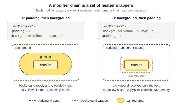
Because each wrapping modifier works on everything inside it, swapping two modifiers can produce a completely
different result. The classic example is padding and background:
// A: padding first -- the yellow fills the padded area, a "chip" with breathing room.
Text("erosion")
    .padding(.horizontal, 10)
    .padding(.vertical, 4)
    .background(.yellow, in: .capsule)

// B: background first -- the yellow hugs the text, and the padding is transparent space outside it.
Text("erosion")
    .background(.yellow, in: .capsule)
    .padding(.horizontal, 10)
.padding(.vertical, 4)In A, background receives a view that is already padded, so the capsule is drawn behind the text and
the padding. In B, background receives only the bare text, so the capsule is tight around the glyphs, and
the padding added afterwards is empty space that pushes neighbouring views away without being coloured. The same
reasoning applies to every wrapping pair:
| Chain | Result | Rule of thumb |
|---|---|---|
|
The border outlines the full 120-point frame. |
Decorate after sizing to decorate the final box. |
|
The border hugs the text; the frame adds invisible space around it. |
Decorate before sizing to decorate only the content. |
|
The padded area is tappable. |
Hit-testing follows the shape inside the gesture modifier. |
|
The background stays where the text was laid out; only drawing moved. |
|
A Custom ViewModifier: TagChip
When the same group of modifiers appears in several places, bundle it into a type conforming to
ViewModifier. The protocol has one requirement, body(content:), which receives the view being modified as a
proxy named content and returns the decorated version. A custom modifier can hold its own inputs (here,
whether the chip is selected) and read the environment, just like a view.
FieldNotes draws tags as rounded chips in NoteRow, NoteDetail and the tag filter on the sidebar. The
styling lives once, in FieldNotesUI:
import SwiftUI

struct TagChipStyle: ViewModifier {
    var isSelected: Bool
    @Environment(\.colorScheme) private var colorScheme

    func body(content: Content) -> some View {
        content
            .font(.caption.weight(.medium))
            .padding(.horizontal, 8)
            .padding(.vertical, 3)
            .foregroundStyle(isSelected ? Color.white : Color.primary)
            .background(
                isSelected ? Color.accentColor : Color.secondary.opacity(colorScheme == .dark ? 0.35 : 0.15),
                in: .capsule
            )
    }
}

public extension View {
    /// Styles any view as a FieldNotes tag chip.
    func tagChip(selected: Bool = false) -> some View {
        modifier(TagChipStyle(isSelected: selected))
    }
}The extension View method is the idiomatic way to expose a modifier: call sites read like built-in modifiers
(.tagChip(selected: true)) and never mention modifier(_:) or the struct directly. TagChip, the view the
tag strip uses, is then a thin wrapper:
public struct TagChip: View {
    let tag: String
    var isSelected = false

    public init(_ tag: String, isSelected: Bool = false) {
        self.tag = tag
        self.isSelected = isSelected
    }

    public var body: some View {
        Text("#\(tag)")
            .tagChip(selected: isSelected)
            .accessibilityLabel("Tag \(tag)")
    }
}

// The same modifier styles a Button label in the sidebar's tag filter.
Button {
    filter.toggle(tag)
} label: {
    Label(tag, systemImage: "number")
        .tagChip(selected: filter.contains(tag))
}
.buttonStyle(.plain)Choosing between the three ways of packaging reusable UI is mostly about what varies:
| Package it as | When | FieldNotes example |
|---|---|---|
A |
You are building content: the thing itself, with its own layout. |
|
A |
You are decorating any content the caller provides, possibly with state or environment reads. |
|
A plain |
A fixed chain of built-in modifiers with no stored state. |
|
Styles for built-in controls (ButtonStyle, LabelStyle, ToggleStyle) are the fourth option and are covered
on Controls, Forms, Text, Images and SF Symbols.
ViewBuilder and the New ContentBuilder
body can list several child views, contain if statements and loop with ForEach, even though it returns a
single value. That works because body is implicitly marked with a result builder, which collects every
expression in the closure and combines them into one view: two statements become a TupleView, an if/else
becomes a conditional view with two branches, an if without else becomes an optional view. The mechanics of
result builders (buildBlock, buildEither, buildOptional) are a language feature, covered on
Result Builders; this section covers how SwiftUI uses
them.
You meet the builder attribute whenever you write a container view that takes content from its caller.
SectionCard in FieldNotesUI frames any content with a title and a material background, and NoteDetail uses
it for its metadata:
public struct SectionCard<Content: View>: View {
    let title: LocalizedStringKey
    let content: Content

    public init(_ title: LocalizedStringKey, @ViewBuilder content: () -> Content) {
        self.title = title
        self.content = content()
    }

    public var body: some View {
        VStack(alignment: .leading, spacing: 8) {
            Text(title)
                .font(.caption.smallCaps())
                .foregroundStyle(.secondary)
            content
        }
        .padding()
        .frame(maxWidth: .infinity, alignment: .leading)
        .background(.regularMaterial, in: .rect(cornerRadius: 12))
    }
}

// Usage in NoteDetail: several statements and an `if`, all turned into one Content value.
SectionCard("Details") {
    LabeledContent("Created", value: note.createdAt, format: .dateTime)
    if let notebook {
        LabeledContent("Notebook", value: notebook.name)
    }
    TagStrip(tags: note.tags)
}Store the built content (let content: Content), not the closure: calling the closure once in init keeps the
view a plain value, and SwiftUI can compare it. The same attribute also goes on helper properties and functions
that return several views, such as @ViewBuilder private var pinBadge: some View.
ContentBuilder in Xcode 27
Until Xcode 26, SwiftUI had one result builder per kind of content: ViewBuilder for views,
ToolbarContentBuilder for toolbar items, CommandsBuilder for menu commands, SceneBuilder for scenes, and
so on. Each came with its own overloads of Group, ForEach and Section. When you build with Xcode 27,
SwiftUI uses one builder for all of them: ContentBuilder, a type alias of ViewBuilder that constructs
type-agnostic content. Its build functions no longer require the pieces to conform to View; instead the
result (for example TupleContent) conditionally conforms to View, ToolbarContent or Commands depending
on what it contains. That lets a single set of initializers on Group, ForEach and Section serve every
content type.
For FieldNotes, the visible effect is that toolbar and command helpers use the same attribute as views:
struct NoteDetail: View {
    @Environment(NoteStore.self) private var store
    let note: Note

    var body: some View {
        ScrollView {
            // ...
        }
        .toolbar { noteToolbar }
    }

    // Xcode 27: one builder attribute for any kind of content.
    @ContentBuilder
    private var noteToolbar: some ToolbarContent {
        ToolbarItem(placement: .primaryAction) {
            Button(note.isPinned ? "Unpin" : "Pin", systemImage: note.isPinned ? "pin.slash" : "pin") {
                store.togglePin(note)
            }
        }
        if !note.tags.isEmpty {
            ToolbarItem(placement: .secondaryAction) {
                ShareLink(item: note.body)
            }
        }
    }
}What this means in practice:
-
It is a compiler-side change, not a runtime API.
ContentBuilderis documented as available back to iOS 13 and macOS 10.15, because it is an alias that the Xcode 27 toolchain interprets. FieldNotes can use it with a deployment minimum of 26 and no#availablecheck; what it needs is Xcode 27. -
ViewBuilderkeeps working. Its documentation now says that, when you build with Xcode 27 or later, the system constructs type-agnostic content fromViewBuilderclosures too, and recommendsContentBuilderto signal that intent. Existing code compiles unchanged; new code in FieldNotes uses@ContentBuilderfor toolbar and command helpers and keeps@ViewBuilderinSectionCard, whoseContent: Viewconstraint already says what it builds. -
Error messages move. Because the builder no longer checks conformance itself, a mistake such as putting a
ToolbarIteminside aVStackis reported where the result is used (the conformance fails), not on the line inside the closure. The iOS 27 release notes also call out further type-checking performance improvements for@ContentBuilderduring the beta cycle.
Conditional Content and View Identity
SwiftUI has to decide, every time body runs, whether each view in the new description is the same view as
one on screen (update it, keep its state, animate its changes) or a different one (remove the old one, insert
a new one, reset its state). That decision is identity, and there are two kinds.
Structural Identity
By default a view is identified by its position in the view tree: its type and where it sits in its parent’s
body. The concrete type SwiftUI sees for an if/else has two distinct branches, so a view in the if
branch and a view in the else branch are always different views, even if both are the same type:
struct NoteDetail: View {
    let note: Note
    @State private var isEditing = false

    var body: some View {
        // Two branches = two identities. Toggling isEditing destroys one view and creates the other:
        // NoteEditor's @State (cursor, draft text) is reset, and the change animates as a transition.
        if isEditing {
            NoteEditor(noteID: note.id)
        } else {
            NoteReader(note: note)
        }
    }
}Branching is the right tool when the two sides really are different things — the reader and the editor above have nothing in common. It is the wrong tool when you only want to change one attribute of one view. Compare:
// Branching on a modifier: two identities, so the row is re-created (and its state reset)
// every time isPinned changes, and it cross-fades instead of animating smoothly.
if note.isPinned {
    NoteRow(note: note).background(.orange.opacity(0.15))
} else {
    NoteRow(note: note)
}

// One identity: the condition moves *into* the modifier's argument.
NoteRow(note: note)
.background(note.isPinned ? Color.orange.opacity(0.15) : Color.clear)The same reasoning explains why a popular "conditional modifier" helper — an extension View { func if(…) }
that applies a modifier only when a condition holds — is best avoided: it is an if/else in disguise, so
every flip of the condition silently gives the view a new identity. Prefer inert modifier values
(.opacity(isVisible ? 1 : 0), .disabled(!canSave), Color.clear, .padding(isCompact ? 4 : 8)), which keep
one identity and animate naturally.
Explicit Identity
The second kind of identity is one you supply: a stable value that says "this is the view for that thing".
ForEach and List use it for their rows, which is why Note conforms to Identifiable: when NoteStore
inserts, deletes or reorders notes, SwiftUI matches rows by note.id, keeps each row’s state, and animates the
move.
ForEach(store.notes) { note in          // explicit identity: note.id (Identifiable)
    NoteRow(note: note)
}

ForEach(note.tags, id: \.self) { tag in  // explicit identity: the tag string itself
    TagChip(tag)
}The .id(_:) modifier attaches an explicit identity to any view. Its most useful job is resetting state on
purpose: when the value passed to .id changes, SwiftUI treats the view as a new one. On iPad and Mac,
FieldNotes keeps the same NoteEditor in the detail column while the user picks different notes in the
content column; without .id, the editor’s draft state from the previous note would leak into the next one:
struct ContentView: View {
    @State private var selectedNotebook: Notebook.ID?
    @State private var selectedNote: Note.ID?
    @Environment(NoteStore.self) private var store

    var body: some View {
        NavigationSplitView {
            NotebookList(selection: $selectedNotebook)
        } content: {
            NoteList(notebookID: selectedNotebook, selection: $selectedNote)
        } detail: {
            if let note = store.notes.first(where: { $0.id == selectedNote }) {
                NoteEditor(noteID: note.id)
                    .id(note.id)   // a different note means a fresh editor with fresh @State
            } else {
                ContentUnavailableView("No Note Selected", systemImage: "note.text")
            }
        }
    }
}Use explicit identity with care: an .id whose value changes on every body evaluation (a fresh UUID(), a
timestamp) resets the view every time, which throws away its state and defeats SwiftUI’s diffing.
Identity, Lifetime and State
A view’s lifetime is the lifetime of its identity, not of any view value: NoteRow values are created and
discarded constantly, but the row’s identity lives from the moment it appears until the moment its identity
disappears from the tree. @State storage is tied to that identity. In Xcode 27, @State is implemented as a
macro (State()), with one important consequence: a class stored in @State is initialized and stored only
once for the lifetime of the identity, rather than its initializer running again every time the parent
re-creates the view value. That behaviour, and how to choose between @State, @Binding and the environment,
is covered on State and Data Flow with Observation.
struct NoteEditor: View {
    let noteID: Note.ID
    @Environment(NoteStore.self) private var store
    // Built with Xcode 27: `@State` expands through the State() macro, and this draft object is
    // created once per NoteEditor identity. The `.id(note.id)` above gives each note its own identity.
    @State private var draft = NoteDraft()

    var body: some View {
        TextEditor(text: $draft.body)
            .onAppear {
                if let note = store.notes.first(where: { $0.id == noteID }) { draft.load(from: note) }
            }
    }
}Finally, AnyView erases a view’s type, and with it most of the structural information SwiftUI uses for
identity and diffing. Reach for it only at genuine type boundaries (a plug-in registry, a heterogeneous array of
screens); within a body, an if/else, a switch, or AnyLayout (covered on
SwiftUI Layout) keeps the types visible.
// A settings pane registry is one of the few places where FieldNotes erases view types.
struct SettingsPane: Identifiable {
    let id: String
    let title: LocalizedStringKey
    let makeView: @MainActor () -> AnyView
}

let panes: [SettingsPane] = [
    SettingsPane(id: "sync", title: "Sync") { AnyView(SyncSettings()) },
    SettingsPane(id: "tags", title: "Tags") { AnyView(TagSettings()) },
]Custom Environment Values with @Entry
The environment is SwiftUI’s way to pass values down the tree implicitly: a value set with
.environment(_:_:) on a view is visible to every descendant that reads it with @Environment, without
threading it through every initializer. SwiftUI uses it for its own settings (\.colorScheme,
\.dynamicTypeSize, \.horizontalSizeClass, \.locale), and FieldNotes uses the object form,
.environment(store) with @Environment(NoteStore.self), to share its observable store.
For your own simple values, the @Entry macro declares a new key in one line. FieldNotes lets the user choose
how dense note lists are, and every row reads that choice from the environment:
import SwiftUI

public enum NoteDensity: Sendable {
    case comfortable, compact
}

extension EnvironmentValues {
    @Entry public var noteDensity: NoteDensity = .comfortable
}

// Set it once, high in the tree (FieldNotesApp or ContentView):
ContentView()
    .environment(\.noteDensity, settings.compactLists ? .compact : .comfortable)

// Read it anywhere below:
public struct NoteRow: View {
    @Environment(\.noteDensity) private var density
    let note: Note

    public var body: some View {
        VStack(alignment: .leading, spacing: density == .compact ? 2 : 4) {
            NoteRowHeader(title: note.title, isPinned: note.isPinned)
            if density == .comfortable {
                Text(note.body).lineLimit(2).foregroundStyle(.secondary)
            }
        }
    }
}Before @Entry, the same value needed a private EnvironmentKey type with a static defaultValue plus a
computed property with a getter and setter; the macro generates both. The same macro also creates entries on
Transaction, ContainerValues and FocusedValues (where the type must be optional, because the default is
always nil).
The Xcode 27 Warning on Class and Closure Defaults
With the 27 SDKs, the @Entry macro warns when the default value is a class instance or a closure. The
default expression you write is used whenever no ancestor has set the value, and it can be evaluated each time
it is needed; a class default then hands different readers different objects (so changes made through one
reader are invisible to another), and a closure default can never compare equal to a previous one, which makes
SwiftUI treat every read as a change. Neither shows up as a crash, which is why the compiler now flags it. The
release notes point to the SwiftUI Specialist skill in Xcode for guidance on resolving the warning.
// Before -- warns in Xcode 27: a class instance and a closure as defaults.
extension EnvironmentValues {
    @Entry var summaryService: SummaryService = SummaryService()      // class default (a SummaryGenerating class)
    @Entry var openNote: (Note.ID) -> Void = { _ in }                  // closure default
}FieldNotes replaces those two declarations with the following:
// After -- the fixes FieldNotes uses instead of the declarations above.
extension EnvironmentValues {
    // 1. Make it optional and inject the real instance at the root.
    @Entry var summaryService: (any SummaryGenerating)? = nil

    // 2. Wrap the closure in a value type with a stable identity (an action struct, like SwiftUI's own
    //    OpenURLAction), or pass it explicitly to the one view that needs it.
    @Entry var openNote: OpenNoteAction = OpenNoteAction { _ in }
}

public struct OpenNoteAction: Sendable {
    let handler: @MainActor @Sendable (Note.ID) -> Void
    public init(_ handler: @escaping @MainActor @Sendable (Note.ID) -> Void) { self.handler = handler }
    @MainActor public func callAsFunction(_ id: Note.ID) { handler(id) }
}

// 3. Shared observable objects do not belong in @Entry at all: use the object form of the environment.
ContentView()
.environment(store) // read with @Environment(NoteStore.self)Note that the OpenNoteAction fix silences the warning because the default is now a value type, but it still
wraps a closure: it does not become comparable. Use the pattern for actions that are set once near the root,
not for values that change on every body evaluation.
What Comes Next
This page described what a view is; the next one, SwiftUI Layout,
explains where views go and how big they are, including why padding and frame behave as wrappers.
State and Data Flow with Observation then covers the data
side: @State, @Binding, @Observable and the environment in depth. For drawing custom shapes and animating
the identity changes described above, see
Drawing, Animation and Gestures.