Images and Icons
|
This content was generated with the assistance of AI and should be verified against the official documentation before being relied on in production; see the section bibliography for the reference material consulted while preparing these pages. |
Places's PlaceCard (introduced on
Core Components and React Fundamentals and
fully typed on TypeScript in React Native) has already been rendering
place.photoUri through Image for two pages now. This page covers everything that shorthand was hiding: where
an Image source can come from, how it decides what to do when its box and its pixels disagree in shape, the
modern expo-image replacement most new Expo projects reach for instead of the built-in Image, sizing an image
against the screen rather than a hardcoded box, and the two ways Places draws non-photographic graphics — SVG
vector art and icon fonts.
Where an Image’s Pixels Come From
Image (and expo-image’s own `Image, covered below) accepts a source in one of three shapes, and all three
already appear somewhere in Places:
Static assets via require
A bundled local file — an app icon, a placeholder graphic, a category illustration — is referenced with
require, exactly like any other Metro-resolved module:
import placeholderPhoto from '../../../assets/place-placeholder.png';

<Image source={placeholderPhoto} style={styles.photo} resizeMode="cover" />
// or inline: <Image source={require('../../../assets/place-placeholder.png')} ... />
Metro automatically resolves density-specific variants when they sit next to the base file — place-placeholder@2x.png and place-placeholder@3x.png alongside place-placeholder.png — and picks the
right one for the running device’s pixel density at bundle time, with no code-side branching needed. A static
asset’s natural width and height are always known ahead of time (the file itself carries them), which is the
key difference from a network image below.
Network images via { uri }
A remote photo — Places's own place.photoUri — is a source object rather than a require result, and can
carry request headers alongside the URL:
<Image
  source={{
    uri: 'https://cdn.irurueta.dev/places/photos/12345.jpg',
    headers: { Authorization: `Bearer ${accessToken}` },
    width: 400,
    height: 300,
  }}
  style={styles.photo}
  resizeMode="cover"
/>
Unlike a require`d asset, React Native has no way to know a remote image’s natural dimensions before the
network response arrives, so an explicit `width/height on the source object — not just on style — is
required for a network image to lay out correctly on the first render rather than collapsing to zero size until
the image loads.
data: URIs
A source.uri can also be a base64-inlined data: URI, useful for a tiny icon or a server-generated thumbnail
that arrives already embedded in a JSON payload rather than as a separate HTTP request:
<Image
  source={{ uri: 'data:image/png;base64,iVBORw0KGgoAAAANSUhEUgAAAAEAAAAB...' }}
  style={styles.icon}
/>
Fitting an Image Into Its Box: resizeMode
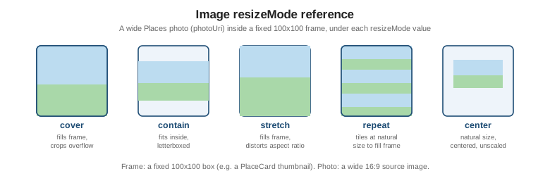
place.photoUri almost never arrives at exactly the size PlaceCard’s thumbnail box needs, so `resizeMode
decides how the image’s own pixels map onto the frame the style prop gives it:
-
cover(whatPlaceCarduses) — scales the image up until it fills the box completely on both axes, cropping whatever overflows. The safe default whenever the box’s aspect ratio is fixed and cropping a photo’s edges is acceptable. -
contain— scales the image down until it fits entirely inside the box, letterboxing the remaining space. Right for a logo or an icon that must never be cropped. -
stretch— fills the box exactly on both axes without preserving the source aspect ratio, distorting the image whenever the box and the source disagree in shape. Rarely what a photo needs; occasionally correct for a decorative background graphic authored at the same aspect ratio as its box. -
repeat— tiles the image at its natural size to fill the box, rather than scaling it. Used for a seamless background pattern, not for a photo. -
center— centers the image at its natural size, neither scaling nor cropping; if the box is larger than the image, the surrounding box background shows through.
defaultSource names a local placeholder shown while a network image’s source.uri is still loading, so
`PlaceCard’s photo slot never flashes empty white before the real photo arrives:
<Image
  source={{ uri: place.photoUri ?? undefined }}
  defaultSource={require('../../../assets/place-placeholder.png')}
  style={styles.photo}
  resizeMode="cover"
/>
defaultSource is only honored on iOS when the source is a remote { uri } image — Android ignores it in
that case and simply shows nothing until the network image resolves, so an Android-visible placeholder for a
still-loading network image needs its own conditional render (a plain View shown while a loading flag from
the image’s onLoadEnd callback is still true) rather than relying on defaultSource alone.
ImageBackground: Deprecated in Favor of a Composed View
ImageBackground — a convenience wrapper that rendered an Image behind its children in one component — is
deprecated as of React Native 0.87, Places's own baseline version. The replacement composes the same
result from a plain View and an absolutely-positioned Image, using StyleSheet.absoluteFill (a pre-built
style object equivalent to { position: 'absolute', left: 0, right: 0, top: 0, bottom: 0 }) instead of a
dedicated component:
// Before -- ImageBackground, deprecated since React Native 0.87.
import { ImageBackground, StyleSheet, Text } from 'react-native';

function PlaceCardBackground({ place }: { place: Place }) {
  return (
    <ImageBackground source={{ uri: place.photoUri ?? undefined }} style={styles.card} resizeMode="cover">
      <Text style={styles.name}>{place.name}</Text>
    </ImageBackground>
  );
}
// After -- a View composing a position: 'absolute' Image behind its children.
import { Image, StyleSheet, Text, View } from 'react-native';
function PlaceCardBackground({ place }: { place: Place }) {
return (
<View style={styles.card}>
{place.photoUri !== null && (
<Image source={{ uri: place.photoUri }} style={StyleSheet.absoluteFill} resizeMode="cover" />
)}
<Text style={styles.name}>{place.name}</Text>
</View>
);
}
const styles = StyleSheet.create({
card: { position: 'relative', padding: 12, borderRadius: 10, overflow: 'hidden' },
name: { fontSize: 16, fontWeight: '600', color: '#fff' },
});The composed form is not just a deprecation workaround — it is strictly more flexible, since the Image is now
an ordinary sibling that can be styled, animated, or conditionally omitted (as the place.photoUri !== null
check above does) independently of its siblings, instead of being locked inside a single all-or-nothing wrapper
component.
HEIC/HEIF Support
React Native 0.84 added native decoding for HEIC/HEIF — the format iOS cameras save photos in by
default since iOS 11. Before 0.84, a HEIC file picked from an iOS photo library either failed to decode or had to
be converted to JPEG/PNG first (either on-device before upload, or server-side); from 0.84 onward, Image (and
expo-image) decode .heic/.heif sources directly, so Places's "add a photo" flow no longer needs a
conversion step between picking a photo and setting it as a place’s photoUri.
expo-image: the Recommended Replacement
expo-image — installed as a normal Expo SDK package (npx expo install expo-image) — is the modern,
recommended replacement for the built-in Image in an Expo project, including Places. It is a drop-in
replacement for the props already shown above (source, a contentFit prop playing the same role as
resizeMode) plus three capabilities the built-in Image does not have:
-
placeholder— a blurhash string (a compact, ~20-30 character encoding of an image’s dominant colors and shapes) rendered instantly in place of the real photo, replacing an empty box or a generic spinner with something that already looks roughly like the photo that is about to load. -
cachePolicy—'memory','disk','memory-disk'(the default), or'none', controlling whether a previously-loaded photo is served from an in-memory cache, a persisted on-disk cache, or re-fetched every time;'memory-disk'is what Places uses so a place’s photo does not re-download every time its details screen is reopened. -
transition— a fade-in duration in milliseconds applied automatically when the real image replaces the placeholder, with no manualAnimated.Valueneeded.
import { Image } from 'expo-image';

<Image
  source={{ uri: place.photoUri }}
  placeholder={{ blurhash: 'L6PZfSi_.AyE_3t7t7R**0o#DgR4' }}
  cachePolicy="memory-disk"
  transition={300}
  style={styles.photo}
  contentFit="cover"
/>
The full PlaceDetailsScreen photo header below builds directly on this snippet.
Sizing an Image Against the Screen
A photo header, a card thumbnail, or a full-bleed hero image should almost never carry a hardcoded pixel height — that breaks the moment the same component runs on a narrower or wider device. The aspectRatio style prop,
combined with width: '100%', lets the box’s width follow its parent (typically the full screen width) while
its height is derived automatically from the ratio instead of being set independently:
<Image
  source={{ uri: place.photoUri }}
  style={{ width: '100%', aspectRatio: 16 / 9 }}
  contentFit="cover"
/>
This is the same aspectRatio property Flexbox Layout covers for
layout boxes generally — an Image is just the most common place it shows up. For a list of photos rather than
one, FlatList’s virtualization — rendering only the rows near the viewport instead of every image up front — matters more than any single image’s own sizing; Lists and
Scrolling covers lazy-loading images inside a `FlatList in full.
Vector Graphics: react-native-svg
Both Image and expo-image decode raster formats only (PNG, JPEG, WebP, HEIC/HEIF) — neither renders an
.svg file directly. react-native-svg fills that gap with a component API mirroring SVG’s own element names,
composed the same way any other React Native UI is:
import Svg, { Path, Circle } from 'react-native-svg';

<Svg width={24} height={24} viewBox="0 0 24 24">
  <Circle cx="12" cy="12" r="10" fill="#eef4fa" />
  <Path d="M8 12l3 3 5-6" stroke="#1c4b73" strokeWidth={2} fill="none" />
</Svg>
react-native-svg-transformer goes one step further and lets Metro import an .svg file directly as a React
component, rather than hand-writing its Svg/Path markup inline:
// metro.config.js
const { getDefaultConfig } = require('expo/metro-config');

const config = getDefaultConfig(__dirname);
const { transformer, resolver } = config;

config.transformer = {
  ...transformer,
  babelTransformerPath: require.resolve('react-native-svg-transformer'),
};
config.resolver = {
  ...resolver,
  assetExts: resolver.assetExts.filter((ext) => ext !== 'svg'),
  sourceExts: [...resolver.sourceExts, 'svg'],
};

module.exports = config;
import PlaceCategoryGlyph from '../../../assets/category-landmark.svg';
<PlaceCategoryGlyph width={20} height={20} />Icon Sets
Most apps need a broad, ready-made icon vocabulary (search, heart, settings gear, map pin) well before they need custom vector art. Two packages cover that need, and both render each icon as a real font glyph rather than as an SVG:
-
@expo/vector-icons— bundled with every Expo project, no extra native setup. It re-exports several popular icon families (Ionicons,MaterialIcons,FontAwesome,Feather, and others) as one package, and Metro tree-shakes an import down to only the icon families actually referenced:import { Ionicons } from '@expo/vector-icons'; <Ionicons name="heart" size={20} color={theme.colors.accent} /> -
react-native-vector-icons— the same idea for a project not on the Expo SDK. Under the bare workflow or the Community CLI, it additionally needs its font files linked as native assets (an Xcode "Copy Bundle Resources" build phase entry on iOS, anandroid/app/build.gradleapply fromline on Android) — a manual native step Expo’s own package avoids entirely by shipping the fonts as ordinary Expo assets instead.import Icon from 'react-native-vector-icons/MaterialIcons'; <Icon name="favorite" size={20} color="#c0392b" />
An app’s own icon and its splash screen — the images shown on the home screen and while the app cold-starts — are a distinct, store-submission-facing concern, generated and configured through app.json/app.config.ts
rather than rendered as a component; Building and Publishing
covers both in full and is not repeated here.
Places: a Photo Header and a Map Marker
PlaceDetailsScreen’s photo header renders `place.photoUri through expo-image, falling back to a neutral
placeholder box — using a token from Styling's theme.colors rather than a
hardcoded hex value — when a place has no photo yet:
// src/features/places/screens/PlaceDetailsScreen.tsx
import { Image } from 'expo-image';
import { StyleSheet, View } from 'react-native';
import { useTheme } from '../../../theme/ThemeProvider';
import type { Place } from '../types';

function PlacePhotoHeader({ place }: { place: Place }) {
  const { theme } = useTheme();

  if (place.photoUri === null) {
    return <View style={[styles.header, { backgroundColor: theme.colors.surfaceAlt }]} />;
  }

  return (
    <Image
      source={{ uri: place.photoUri }}
      placeholder={{ blurhash: 'L6PZfSi_.AyE_3t7t7R**0o#DgR4' }}
      cachePolicy="memory-disk"
      transition={300}
      style={styles.header}
      contentFit="cover"
    />
  );
}

const styles = StyleSheet.create({
  header: { width: '100%', aspectRatio: 16 / 9 },
});
The list and details screens also need a small pin glyph for each place’s position on a map. Rather than a
raster icon, a PlaceMarkerIcon component built directly on react-native-svg’s `Svg/Path API scales
crisply at any size and can be recolored per category with a plain prop:
// src/features/places/components/PlaceMarkerIcon.tsx
import Svg, { Path } from 'react-native-svg';

interface PlaceMarkerIconProps {
  size?: number;
  color?: string;
}

export function PlaceMarkerIcon({ size = 32, color = '#c0392b' }: PlaceMarkerIconProps) {
  return (
    <Svg width={size} height={size} viewBox="0 0 24 24" fill="none">
      <Path
        d="M12 2C7.58 2 4 5.58 4 10c0 5.25 7.05 11.32 7.35 11.57a1 1 0 0 0 1.3 0C13 21.32 20 15.25 20 10c0-4.42-3.58-8-8-8Zm0 11a3 3 0 1 1 0-6 3 3 0 0 1 0 6Z"
        fill={color}
      />
    </Svg>
  );
}
Placing PlaceMarkerIcon on an actual map surface — as a marker overlay on react-native-maps, keyed off each
place’s latitude/longitude — is covered together with the rest of Places's device integrations on
Device Capabilities, not here.
For expo-image placeholders and caching in a media pipeline, react-native-video and device-side compression, see React Native and expo-image.