Responsive Design
|
This section documents Tailwind CSS v4.x — the CSS-first configuration line, whose v4.0 release shipped in January 2025 — as published at the official Tailwind CSS documentation, which is the reference these pages are written and verified against. No specific patch version is pinned. This content was generated with the assistance of AI and should be verified against the official documentation before being relied on in production, since Tailwind iterates quickly. This section’s bibliography lists the reference material consulted while preparing these pages. |
Responsive utilities in Tailwind are ordinary utilities with a breakpoint prefix — md:flex, lg:grid-cols-3 — each compiling to a min-width media query. The full reference is
Responsive design.
Mobile-first
An unprefixed utility applies at every screen size. A prefixed utility applies at its breakpoint and every width above it. So you write the small-screen layout with unprefixed utilities and layer overrides on for wider viewports.
<!-- full width on phones, half at >=640px, one-third at >=1024px -->
<div class="w-full sm:w-1/2 lg:w-1/3">...</div>

<!-- stack on mobile, row from md up -->
<div class="flex flex-col md:flex-row">...</div>
The common mistake is reaching for sm: to style phones: sm: means "at 640px and up", so it does not
target small screens — it excludes the smallest ones. Put mobile styles in the unprefixed utility and use
sm: / md: / … only to change things on larger screens.
<!-- WRONG: text-center never applies below 640px, and applies on desktop too -->
<div class="sm:text-center"></div>

<!-- RIGHT: centre by default, left-align from small screens up -->
<div class="text-center sm:text-left"></div>
Default breakpoints
Five breakpoints ship by default. Their values are defined as rem and each maps to a min-width media
query (Tailwind v4 emits the modern range syntax @media (width >= …)).
| Prefix | Value | Pixels (16px root) | Media query |
|---|---|---|---|
|
40rem |
640px |
|
|
48rem |
768px |
|
|
64rem |
1024px |
|
|
80rem |
1280px |
|
|
96rem |
1536px |
|
Targeting a single range
To apply utilities only up to a breakpoint, use the max-* variants; stack a min and a max variant to
target one band only. For a one-off value that is not in the scale, use an arbitrary breakpoint in square
brackets.
<!-- only below md -->
<div class="max-md:hidden">visible from md up</div>

<!-- only in the md..lg band (>=768px and <1024px) -->
<div class="md:max-lg:bg-sky-100">...</div>

<!-- arbitrary breakpoints -->
<div class="min-[720px]:grid max-[600px]:flex-col">...</div>Customizing breakpoints with --breakpoint-*
In v4 the breakpoints are theme variables, so you customize them in CSS with @theme — no
tailwind.config.js needed. Add a variable to create a new breakpoint prefix; set one to initial to remove
it.
@import "tailwindcss";

@theme {
  --breakpoint-xs: 30rem;    /* new: enables xs:* utilities */
  --breakpoint-3xl: 120rem;  /* new: enables 3xl:* utilities */
  --breakpoint-2xl: initial; /* remove the default 2xl breakpoint */
}
<div class="grid grid-cols-1 xs:grid-cols-2 3xl:grid-cols-6">...</div>Because they are plain custom properties, the values are also readable at runtime via
getComputedStyle(document.documentElement).getPropertyValue('--breakpoint-md'). See
customizing your theme and
Theme variables.
Container queries
Container queries are built into Tailwind v4 — no @tailwindcss/container-queries plugin. Mark an element a
query container with the @container utility, then style its descendants with @-prefixed variants that
react to the container’s width instead of the viewport’s.
<!-- react to the container box -->
<div class="@container">
  <div class="flex flex-col @md:flex-row @lg:gap-8">...</div>
</div>

<!-- max and range container variants -->
<div class="@container">
  <div class="@max-md:hidden @sm:@max-lg:bg-sky-50">...</div>
</div>

<!-- named containers to disambiguate nesting -->
<div class="@container/main">
  <aside class="@container/side">
    <div class="@lg/main:grid @sm/side:flex">...</div>
  </aside>
</div>

<!-- arbitrary container breakpoint, and container-query length units -->
<div class="@container">
  <div class="@min-[475px]:columns-2 w-[50cqw] h-[30cqh]">...</div>
</div>
The @sm / @md / @lg container sizes have their own scale (--container-* theme variables, e.g. @sm
= 24rem), independent of the viewport breakpoints. cqw and cqh are CSS length units equal to 1% of the
query container’s width and height.
breakpoint prefix reacts to the window"] CB[Nearest @container ancestor width] --> CQ["@md:flex-row
container variant reacts to that box"]
A breakpoint prefix like md: always asks "how wide is the window?"; a container variant like @md: asks
"how wide is my container?", so the same component adapts correctly whether it sits in a wide main column or a
narrow sidebar. See Container queries.
Visualizing the breakpoint scale
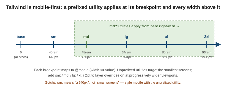
Reading the line left to right shows the mobile-first rule: an unprefixed utility covers the whole line, and each prefixed utility switches on at its tick and stays on for every wider viewport to the right.
Related pages
-
Hover, Focus, and Other States — responsive prefixes are one family of variants and stack with the rest.
-
CSS Custom Properties and Media Queries — the underlying CSS media queries and
@containerat-rule. -
Layout: Float, Flexbox & Grid — Flexbox and Grid, the layout primitives these breakpoints switch between.