Hover, Focus, and Other States
|
This section documents Tailwind CSS v4.x — the CSS-first configuration line, whose v4.0 release shipped in January 2025 — as published at the official Tailwind CSS documentation, which is the reference these pages are written and verified against. No specific patch version is pinned. This content was generated with the assistance of AI and should be verified against the official documentation before being relied on in production, since Tailwind iterates quickly. This section’s bibliography lists the reference material consulted while preparing these pages. |
Tailwind styles interactive and conditional states by prefixing a utility with a variant, so a whole state
lives in the markup: hover:bg-sky-700, focus:ring-2, dark:bg-slate-900, md:flex. This page catalogues
the variants Tailwind v4 ships. The authoritative list is
Hover, Focus, and Other States.
Pseudo-class variants
Every common interaction and structural pseudo-class has a variant. Stack as many as you need; each maps to the CSS pseudo-class of the same name.
<!-- interaction -->
<button class="bg-sky-600 hover:bg-sky-700 focus:outline-none focus-visible:ring-2
               active:bg-sky-800 disabled:opacity-50 disabled:pointer-events-none">
  Save
</button>

<!-- focus-within / focus-visible on a wrapper -->
<label class="rounded border p-2 focus-within:ring-2 focus-within:ring-sky-500">
  <input type="text" class="outline-none" />
</label>

<!-- links -->
<a href="#section" class="text-sky-600 visited:text-purple-600 target:bg-yellow-100">Jump</a>

<!-- form state -->
<input class="enabled:bg-white disabled:bg-gray-100 required:border-red-400
              valid:border-green-500 invalid:border-red-500
              in-range:border-green-500 out-of-range:border-red-500
              placeholder-shown:italic autofill:bg-yellow-50 read-only:text-gray-500" />

<!-- checkbox / radio -->
<input type="checkbox" class="checked:bg-sky-600 indeterminate:bg-gray-400" />

<!-- structural: position among siblings -->
<ul>
  <li class="py-2 first:pt-0 last:pb-0 only:py-0
             odd:bg-white even:bg-gray-50
             first-of-type:font-bold last-of-type:mb-0
             nth-3:text-sky-600 nth-[3n+1]:text-pink-600
             empty:hidden">item</li>
</ul>first, last, only, odd, even, first-of-type, last-of-type, empty, and the parametrised
nth- / nth-last- / nth-of-type-* variants target an element by its position in its parent. See
the pseudo-class
reference for the full table (hover, focus, focus-visible, focus-within, active, visited,
target, disabled / enabled, checked, indeterminate, required, valid / invalid, in-range /
out-of-range, placeholder-shown, autofill, read-only).
Pseudo-element variants
before and after generate a pseudo-element; pair them with a content-* utility (Tailwind adds
content: "" automatically when you use before: / after:, but set text with content-['…'] or a
content-(--var) arbitrary value). The rest target browser-generated pieces of an element.
<!-- ::before / ::after -->
<span class="before:content-['<'] after:content-['>'] before:mr-1 after:ml-1">tag</span>
<span class="after:content-['*'] after:text-red-500 after:ml-0.5">Required field</span>

<!-- ::placeholder / ::-webkit-file-upload-button / ::marker / ::selection -->
<input class="placeholder:text-gray-400 placeholder:italic" placeholder="you@example.com" />
<input type="file" class="file:mr-3 file:rounded file:border-0 file:bg-sky-50 file:px-3 file:py-1 file:text-sky-700" />
<ul class="marker:text-sky-500 list-disc pl-5"><li>bullet colour</li></ul>
<article class="selection:bg-pink-200 selection:text-pink-900">select some text</article>

<!-- ::first-line / ::first-letter -->
<p class="first-line:uppercase first-line:tracking-wide
          first-letter:float-left first-letter:text-5xl first-letter:font-bold first-letter:mr-2">
  Lorem ipsum dolor sit amet...
</p>

<!-- ::backdrop for <dialog>, and ::details-content for <details> -->
<dialog class="backdrop:bg-black/50">...</dialog>
<details class="details-content:mt-2 details-content:text-gray-600"><summary>More</summary>Body</details>
See Pseudo-elements.
group- and peer-
To style an element based on the state of another element, mark that other element and refer to it:
-
groupon an ancestor, thengroup-hover:,group-focus:,group-has-*:, etc. on any descendant. -
peeron a previous sibling, thenpeer-checked:,peer-invalid:,peer-has-:, etc. on a *later sibling (CSS can only look backwards, so thepeermust come first in the DOM).
<!-- group: parent hover restyles a child -->
<a href="#" class="group block rounded-lg p-4 hover:bg-sky-50">
  <h3 class="font-semibold group-hover:text-sky-700">Card title</h3>
  <p class="text-gray-500 group-hover:text-sky-600">Subtitle</p>
  <svg class="opacity-0 transition group-hover:opacity-100">...</svg>
</a>

<!-- peer: input state restyles a following label / message -->
<input type="email" class="peer border p-2" required />
<p class="invisible text-sm text-red-600 peer-invalid:visible">Enter a valid email.</p>

<!-- named groups / peers when they would nest or collide -->
<div class="group/item">
  <div class="group/edit invisible group-hover/item:visible">
    <span class="group-hover/edit:text-sky-700">Edit</span>
  </div>
</div>

<!-- group-has-* / peer-has-*: match on a descendant / sibling subtree -->
<label class="group grid grid-cols-[1fr_auto] has-[:checked]:bg-sky-50">
  <span class="group-has-[a]:underline">Has a link inside</span>
</label>
<input type="checkbox" class="peer" />
<div class="hidden peer-has-[:focus]:block">Revealed</div>
The child-combinator variants complement this: targets *direct children and * targets *all
descendants, so you can style them without adding classes to each one.
<ul class="*:rounded *:border *:p-3 **:data-[selected]:bg-sky-100">
  <li>styled by *:</li>
  <li><span data-selected>styled by **:</span></li>
</ul>has-, not-, in-*, and arbitrary variants
<!-- has-*: style an element that contains a match (:has()) -->
<label class="rounded border p-3 has-[:checked]:border-sky-500 has-[:disabled]:opacity-50">
  <input type="checkbox" /> Subscribe
</label>
<fieldset class="has-[:invalid]:border-red-500">...</fieldset>

<!-- not-*: negate another variant or a selector (:not()) -->
<button class="opacity-100 not-hover:opacity-80 not-first:mt-2 not-[.is-loading]:cursor-pointer">Go</button>

<!-- in-*: like group-* but with no `group` class -- matches any ancestor state -->
<div>
  <input />
  <p class="text-gray-400 in-focus:text-sky-600">hint reacts to a focused ancestor</p>
</div>
When no built-in variant fits, write the selector inline with an arbitrary variant — square brackets
containing a selector where & is the element the utility is on. Combine it with _ for descendant spaces.
<li class="[&.is-active]:bg-sky-100 [&.is-active]:font-semibold">Dashboard</li>
<div class="[&_p]:my-2 [&_p]:leading-relaxed [&>svg]:inline [&:nth-child(3)]:mt-4">
  <p>spaced automatically</p>
</div>
See Using arbitrary variants and has-*.
Attribute-driven variants: aria-, data-, and more
aria- and data- variants match on attributes, which keeps ARIA state and JS-toggled state in the
markup instead of in a stylesheet.
<!-- aria-*: shorthands for common boolean ARIA attributes, plus arbitrary [name=value] -->
<button aria-pressed="true" class="aria-pressed:bg-sky-700">Toggle</button>
<th aria-sort="ascending"
    class="aria-[sort=ascending]:bg-[url('/up.svg')] aria-[sort=descending]:bg-[url('/down.svg')]">
  Name
</th>
<div aria-disabled="true" class="aria-disabled:opacity-50 aria-disabled:pointer-events-none">...</div>

<!-- data-*: boolean-ish `data-active` shorthand, or arbitrary [key=value] -->
<div data-active class="opacity-60 data-active:opacity-100">tab</div>
<div data-size="large" class="data-[size=large]:p-6 data-[size=small]:p-2">panel</div>

<!-- direction, and native open / inert state -->
<blockquote class="ltr:border-l-4 rtl:border-r-4 ltr:pl-4 rtl:pr-4">...</blockquote>
<details class="[&_svg]:transition open:[&_svg]:rotate-90"><summary>Section</summary>...</details>
<div inert class="inert:opacity-50">disabled region</div>
See aria-* states, data attributes, and RTL support.
Media and feature variants
These wrap the utility in an @media (or @supports) query rather than a selector.
<!-- responsive: min-width breakpoints, mobile-first (see the Responsive design page) -->
<div class="grid grid-cols-1 sm:grid-cols-2 lg:grid-cols-4">...</div>

<!-- colour scheme -->
<div class="bg-white text-gray-900 dark:bg-slate-900 dark:text-slate-100">...</div>

<!-- user preferences -->
<div class="transition-none motion-safe:transition-all motion-reduce:transition-none">...</div>
<div class="border contrast-more:border-2 contrast-less:border-0">...</div>
<button class="border forced-colors:border-[ButtonBorder]">OK</button>

<!-- print -->
<nav class="print:hidden">...</nav>
<article class="hidden print:block">...</article>

<!-- feature queries and input capability -->
<div class="supports-[display:grid]:grid supports-[backdrop-filter]:backdrop-blur">...</div>
<button class="p-2 pointer-fine:p-1 pointer-coarse:p-4">tap target</button>
<div class="portrait:flex-col landscape:flex-row flex">...</div>
See media-query variants, Dark mode, and Responsive design.
Stacking order and custom variants
Variants stack by chaining prefixes. In v4 they read left-to-right, matching CSS reading order; v3 read them right-to-left, so a chain like the one below produced a different selector between the two versions.
<!-- v4: "for every direct child, on the first one, when the group is hovered, set padding-top to 0" -->
<ul class="group">
  <li class="*:first:group-hover:pt-0">...</li>
</ul>

<!-- order matters: dark, then hover, then md -->
<div class="dark:hover:md:bg-slate-800">...</div>
Define a reusable variant once with @custom-variant in your CSS (the v4 replacement for a v3
plugin() addVariant call). The short form takes a selector; the block form can emit an at-rule.
@import "tailwindcss";

/* selector form: & is the styled element */
@custom-variant is-active (&.is-active, &[data-active="true"]);
@custom-variant not-last (&:not(:last-child));

/* at-rule form */
@custom-variant hocus (&:hover, &:focus);
@custom-variant supports-grid {
  @supports (display: grid) {
    & {
      @slot;
    }
  }
}
<li class="is-active:bg-sky-100 not-last:border-b hocus:underline supports-grid:grid">Reports</li>Visualizing group and peer
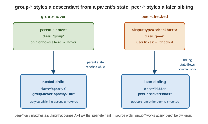
group- lets a descendant react to a marked ancestor’s state at any depth; peer- lets an element react
to a marked earlier sibling’s state — never a later one — because the underlying CSS sibling combinator
only looks backwards.
Related pages
-
Responsive Design — the breakpoint variants and container queries in depth.
-
CSS Custom Properties and Media Queries — the plain-CSS media and feature queries these variants compile to.
-
Web Accessibility —
aria-*,forced-colors, andmotion-reducein context.