Navigation Components
|
This section documents Bootstrap 5.x as implemented by the official Bootstrap project. No specific patch version is pinned. Unlike the other reference sections on this site, no single reference book underpins it: the content was generated with the assistance of AI from general knowledge of Bootstrap, and should be verified against the current official documentation at getbootstrap.com/docs before relying on it in production. This section’s bibliography lists the reference material consulted while preparing these pages. |
Bootstrap groups three distinct navigation patterns under this page: the navbar, which sits at the top (or bottom) of a page and holds primary site navigation; breadcrumbs, a small trail showing the user’s location within a hierarchy; and pagination, a control for moving between pages of a list. All three are built from plain markup plus classes — none require JavaScript on their own, though the navbar’s collapse behavior does (covered below).
Navbar
Anatomy
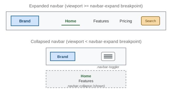
A navbar is a <nav class="navbar"> wrapping a brand, a toggler button (for small screens), and a collapsible
container holding the actual nav links:
<nav class="navbar navbar-expand-lg navbar-light bg-light">
  <div class="container-fluid">
    <a class="navbar-brand" href="#">Brand</a>

    <button class="navbar-toggler" type="button" data-bs-toggle="collapse"
            data-bs-target="#main-nav" aria-controls="main-nav"
            aria-expanded="false" aria-label="Toggle navigation">
      <span class="navbar-toggler-icon"></span>
    </button>

    <div class="collapse navbar-collapse" id="main-nav">
      <ul class="navbar-nav me-auto mb-2 mb-lg-0">
        <li class="nav-item">
          <a class="nav-link active" aria-current="page" href="#">Home</a>
        </li>
        <li class="nav-item">
          <a class="nav-link" href="#">Features</a>
        </li>
        <li class="nav-item">
          <a class="nav-link" href="#">Pricing</a>
        </li>
      </ul>
      <form class="d-flex" role="search">
        <input class="form-control me-2" type="search" placeholder="Search" aria-label="Search">
        <button class="btn btn-outline-success" type="submit">Search</button>
      </form>
    </div>
  </div>
</nav>
navbar-expand-lg is the breakpoint at which the navbar switches from its collapsed (mobile) layout to its
expanded (desktop) layout — below lg, the .navbar-collapse container is hidden and only the brand and
toggler button show; at lg and above, .navbar-collapse is always visible and the toggler disappears.
Bootstrap ships .navbar-expand-{sm,md,lg,xl,xxl} for every grid breakpoint, plus a bare .navbar-expand that
never collapses at all.
Color schemes
Bootstrap 5.3’s text-color scheme for a navbar is set with the data-bs-theme attribute, not a
.navbar-light/.navbar-dark class pair — both classes still exist for backward compatibility but are
deprecated as of 5.2.0 and emit no CSS in 5.3 (.navbar-light’s entire rule set is a deprecation warning, with
nothing behind it). Light text is the default, so `data-bs-theme="dark" is the one attribute that actually
needs adding, on the .navbar itself or an ancestor, whenever it sits on a dark background — independently of
what actually produces that background (a .bg-* utility or a custom color):
<nav class="navbar bg-light">...</nav>                                 <!-- light text is the default -->
<nav class="navbar bg-primary" data-bs-theme="dark">...</nav>
<nav class="navbar bg-dark" data-bs-theme="dark">...</nav>
<nav class="navbar" data-bs-theme="dark" style="background-color: #1a1a2e;">...</nav>
Forgetting data-bs-theme="dark" on a dark-background navbar renders dark text on a dark background, since the
default text scheme assumes a light one.
The toggler and the collapse
The .navbar-toggler button and the .collapse.navbar-collapse element it controls are linked through
Bootstrap’s Collapse component (see
Interactive Components for the underlying JavaScript API):
data-bs-toggle="collapse" and data-bs-target="#main-nav" wire the click, and aria-expanded/
aria-controls on the button plus a matching id on the target keep the pair accessible to assistive
technology, announcing whether the menu is currently open. .navbar-toggler-icon is an empty <span> styled
with a background-image hamburger icon — no external icon library is required.
Dropdowns and other content inside a navbar
A navbar’s <ul class="navbar-nav"> can hold ordinary nav links, but also .dropdown items (see
Interactive Components), text, and even a second <ul> on the
opposite side, using .me-auto/.ms-auto to push one group to the far edge:
<ul class="navbar-nav me-auto">
  <li class="nav-item dropdown">
    <a class="nav-link dropdown-toggle" href="#" role="button" data-bs-toggle="dropdown" aria-expanded="false">
      Products
    </a>
    <ul class="dropdown-menu">
      <li><a class="dropdown-item" href="#">Widgets</a></li>
      <li><a class="dropdown-item" href="#">Gadgets</a></li>
    </ul>
  </li>
</ul>
Breadcrumbs
A breadcrumb trail is an ordered list (<ol>, since order carries meaning — root to current page) with
.breadcrumb, each step wrapped in .breadcrumb-item:
<nav aria-label="breadcrumb">
  <ol class="breadcrumb">
    <li class="breadcrumb-item"><a href="/">Home</a></li>
    <li class="breadcrumb-item"><a href="/library">Library</a></li>
    <li class="breadcrumb-item active" aria-current="page">Data</li>
  </ol>
</nav>- The separator between items (a
/by default) is generated purely with CSScontenton `.breadcrumb-item -
before`, so it is never present in the actual text read by a screen reader; it can be restyled per-theme with the
--bs-breadcrumb-dividerCSS variable:
.breadcrumb {
  --bs-breadcrumb-divider: ">";
}
Two structural details matter for accessibility: the wrapping <nav aria-label="breadcrumb"> identifies the
whole trail as a navigation landmark distinct from the main navbar, and .active plus aria-current="page" on
the final, current-page item — which should not be a link, since navigating to the current page is meaningless — tells assistive technology which step represents "here".
Pagination
Pagination renders a row of page links, built the same way as breadcrumbs — a semantic list wrapped in a <nav
aria-label="…"> landmark:
<nav aria-label="Search results pages">
  <ul class="pagination">
    <li class="page-item disabled">
      <a class="page-link" href="#" tabindex="-1" aria-disabled="true">Previous</a>
    </li>
    <li class="page-item active" aria-current="page">
      <a class="page-link" href="#">1</a>
    </li>
    <li class="page-item"><a class="page-link" href="#">2</a></li>
    <li class="page-item"><a class="page-link" href="#">3</a></li>
    <li class="page-item">
      <a class="page-link" href="#">Next</a>
    </li>
  </ul>
</nav>
.page-item.active marks the current page (again paired with aria-current="page"), and .page-item.disabled
marks a link that cannot currently be activated — typically "Previous" on page 1 or "Next" on the last page.
tabindex="-1" and aria-disabled="true" on a disabled .page-link are both necessary: .disabled alone is
only a visual style (a link element has no native disabled attribute the way a <button> does), so without
them the link would still be focusable and clickable by keyboard.
Sizing follows the same -sm/-lg pattern as buttons and form controls, and .justify-content-* utilities
(see Layout: Float, Flexbox & Grid) center or right-align the whole list:
<ul class="pagination pagination-lg justify-content-center">
  <li class="page-item"><a class="page-link" href="#">1</a></li>
  <li class="page-item"><a class="page-link" href="#">2</a></li>
</ul>
For the full set of navbar breakpoints, color utilities, and pagination sizing options, see the official Navbar docs, the official Breadcrumb docs, and the official Pagination docs.