Theming and Styling
|
This section documents the current Vaadin release line — Vaadin 24 LTS / 25.x, Java 17+, Spring Boot 3 / Jakarta EE 10 — as published at the official Vaadin documentation, which is the reference these pages are written and verified against. No specific patch version is pinned. Flow (server-side Java) is the authoring style used throughout, with Hilla / React shown where it differs; Vaadin 7 and the pre-Flow architecture appear only as migration contrast. This content was generated with the assistance of AI and should be verified against the official documentation before being relied on in production, since Vaadin ships major releases roughly twice a year and its ecosystem iterates. This section’s bibliography lists the reference material consulted while preparing these pages. |
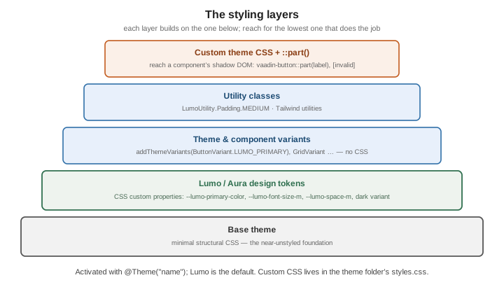
Vaadin components are styled through an application theme — a folder of CSS plus a set of design tokens — not through per-component stylesheets scattered across views. This page follows the Styling documentation. Where Vaadin 7 shipped hand-written Sass themes, the current model is CSS custom properties with a documented styling API.
The theme folder
A theme lives under src/main/frontend/themes/<name>/ with a styles.css entry point and a theme.json
manifest, activated with @Theme on the class implementing AppShellConfigurator:
@Theme("my-app")
public class AppShell implements AppShellConfigurator { }
// src/main/frontend/themes/my-app/theme.json
{
"lumoImports": ["typography", "color", "spacing", "badge", "utility"],
"assets": {
"@fontsource/inter": { "*.css": "", "files/*": "fonts" }
}
}styles.css is where your rules go; @import additional files from the same folder. See
Application theme.
Base, Lumo and Aura
Every project builds on one foundation theme:
| Theme | What it is |
|---|---|
Base |
A minimal, near-unstyled foundation — structural CSS only. Start here to build a design system from scratch. |
Lumo |
The default. A complete design language exposed as CSS custom properties, with light and dark variants and a large utility-class set. |
Aura |
A newer, higher-contrast alternative to Lumo with the same token approach. |
Lumo design tokens
Lumo’s decisions are CSS custom properties you override in styles.css. They fall into groups — color,
typography, size and space, shape, elevation, interaction:
html {
  --lumo-primary-color: #2f6f4f;
  --lumo-primary-text-color: var(--lumo-primary-color);
  --lumo-border-radius-m: 4px;
  --lumo-font-family: "Inter", sans-serif;
  --lumo-font-size-m: 0.9375rem;
  --lumo-space-m: 0.75rem;
}
The dark variant is a class on <html>; apply it globally or toggle it at runtime:
@Theme(themeClass = Lumo.class, variant = Lumo.DARK)
public class AppShell implements AppShellConfigurator { }

// or per session
UI.getCurrent().getElement().getThemeList().add(Lumo.DARK);
See Lumo and its style properties.
Theme and component variants
A theme variant restyles a component through a built-in name — no CSS:
saveButton.addThemeVariants(ButtonVariant.LUMO_PRIMARY, ButtonVariant.LUMO_SUCCESS);
grid.addThemeVariants(GridVariant.LUMO_COMPACT, GridVariant.LUMO_ROW_STRIPES);
emailField.addThemeVariants(TextFieldVariant.LUMO_SMALL);
Custom variants are defined in CSS with [theme~="…"] selectors and applied with
element.getThemeList().add("…").
Utility classes
LumoUtility is a set of constants for one-off spacing, layout and typography, so you rarely write a
stylesheet for small tweaks:
import com.vaadin.flow.theme.lumo.LumoUtility;

layout.addClassNames(
        LumoUtility.Padding.MEDIUM,
        LumoUtility.Gap.SMALL,
        LumoUtility.Display.FLEX,
        LumoUtility.FlexDirection.COLUMN);
Tailwind can be added to the theme’s build for its full utility set; see Tailwind Reference and Utility classes. For preprocessing the theme CSS with Sass, see Sass Reference.
Custom CSS
Beyond the theme styles.css, @CssImport loads a stylesheet into the application (optionally scoped to one
component’s shadow tree with themeFor), and @StyleSheet links an external one:
@CssImport("./styles/report-view.css")
@CssImport(value = "./styles/grid-overrides.css", themeFor = "vaadin-grid")
public class ReportView extends VerticalLayout { }
Styling a component’s internals
A component’s markup lives in a shadow root, so ordinary descendant selectors do not reach it. Target its
documented parts and state attributes from the theme stylesheet with ::part():
vaadin-button::part(label) { text-transform: uppercase; letter-spacing: 0.02em; }
vaadin-text-field[invalid]::part(input-field) { border-color: var(--lumo-error-color); }
vaadin-grid::part(overdue) { background: var(--lumo-error-color-10pct); }   /* a part-name generator */
Each component page under Components lists its parts and states. See Styling components.
See also
-
Responsive Design and PWA — breakpoint utilities and responsive layouts.
-
UI Component Libraries — the styling section in brief, plus add-ons.
-
Tailwind Reference and Sass Reference — utility CSS and preprocessing.
-
Light and Dark Theming with CSS — light/dark theming at the CSS-platform level.