Adaptive Layouts, Edge-to-Edge and Large Screens
|
This content was generated with the assistance of AI and should be verified against the official documentation of Android before being relied on in production. See the section bibliography for the reference material consulted while preparing these pages. |
Android now runs on a much wider range of windows than a single phone screen: folding phones that unfold into a
tablet-sized display, tablets, Chromebooks that resize an app’s window like a desktop application, "desktop
windowing" on large-screen phones and tablets themselves, and headsets that place an app’s window in 3D space.
Adaptive app design means writing TrailMate once and letting its layout respond to whatever window it is given,
rather than shipping a separate phone and tablet app. This page covers window size classes and
currentWindowAdaptiveInfo; the canonical layouts Compose ships for the most common adaptive patterns
(list-detail, supporting pane, feed); NavigationSuiteScaffold for top-level navigation chrome; fold-aware
layouts with WindowInfoTracker and FoldingFeature; the Android 17 / API 37 baseline’s orientation and
resizability rules; multi-window and keyboard/mouse/stylus input; and edge-to-edge drawing with WindowInsets in
both Compose and Views. It targets the same baseline as the rest of the section — compileSdk = 37,
targetSdk = 36, Compose BOM 2026.09.00 (material3-adaptive 1.3.0), androidx.window 1.4.0 — and
builds on layout and state material already covered on
Compose Layouts, Modifiers and Lazy Lists and
Navigation in Compose (Navigation Compose and Navigation 3), which
already introduced NavigationSuiteScaffold and Navigation 3’s rememberListDetailSceneStrategy from the angle
of navigation; this page covers the same adaptive mechanisms from the angle of layout and window state, plus the
platform behavior (targetSdk rules, insets, multi-window) that applies regardless of which navigation library an
app uses.
The Device Range: Foldables, Tablets, Desktop Windowing, ChromeOS and XR
"Large screen" is no longer one category. TrailMate’s window can be:
| Device class | What changes for the app |
|---|---|
Foldable phone |
The window can change shape while the app keeps running, not just at launch: unfolding a book-style foldable turns a compact phone window into an expanded, tablet-sized one, and a flip-style foldable can present a small "cover screen" window before it is opened at all. The app also needs to know about the fold itself — its position, orientation and whether it is fully open, closed or held half-open ("tabletop posture") — not just the resulting window size. |
Tablet |
A larger, generally fixed window (though still resizable in split-screen and freeform multi-window), where a single-pane phone layout wastes the extra width. This is the classic case canonical layouts target. |
Desktop windowing (Android 14+) and ChromeOS |
The user resizes, moves and can arbitrarily narrow the app’s window like a desktop application window, so the window size class an app sees on the same physical device can range from compact to expanded depending on how the user has sized the window, not a fixed property of the device. Mouse, trackpad and keyboard become primary input methods alongside touch. |
XR (Android XR) |
The window is a 2D or spatial panel placed in 3D space by the user; an unmodified adaptive app already renders correctly in a 2D panel, and the same window size class and canonical-layout APIs apply. |
The unifying idea across all of these is that an adaptive app never asks "what device am I running on"; it asks "what window do I currently have", because the answer can change at runtime on every one of them. See Android Developers — Build adaptive apps and Android Developers — Get started with adaptive apps in Compose.
Window Size Classes and currentWindowAdaptiveInfo
A window size class buckets the app’s current window — not the physical screen — into COMPACT,
MEDIUM or EXPANDED for width and height, based on breakpoints (600dp and 840dp for width) chosen from real
device data rather than raw pixel dimensions. currentWindowAdaptiveInfo(), a @Composable function from
androidx.compose.material3.adaptive, is the entry point most Compose screens need; it returns a
WindowAdaptiveInfo bundling both the size class and fold posture (covered below) and recomposes automatically
when either changes, which is exactly what happens when a foldable is opened or a desktop window is resized:
// app/build.gradle.kts
dependencies {
    implementation(platform("androidx.compose:compose-bom:2026.09.00"))
    implementation("androidx.compose.material3.adaptive:adaptive")               // 1.3.0, via BOM
    implementation("androidx.compose.material3.adaptive:adaptive-layout")
    implementation("androidx.compose.material3.adaptive:adaptive-navigation")
    implementation("androidx.compose.material3.adaptive:adaptive-navigation-suite")
    implementation("androidx.compose.material3.adaptive:adaptive-navigation3") // Navigation 3 scene strategy
}// feature/trails/src/main/kotlin/com/example/trailmate/feature/trails/TrailListScreen.kt
import androidx.compose.material3.adaptive.currentWindowAdaptiveInfo
import androidx.compose.runtime.Composable
import androidx.window.core.layout.WindowSizeClass
import androidx.window.core.layout.WindowWidthSizeClass
@Composable
fun TrailListRoute() {
val windowAdaptiveInfo = currentWindowAdaptiveInfo()
val widthSizeClass = windowAdaptiveInfo.windowSizeClass.windowWidthSizeClass
when (widthSizeClass) {
WindowWidthSizeClass.COMPACT -> TrailListCompact()
WindowWidthSizeClass.MEDIUM, WindowWidthSizeClass.EXPANDED -> TrailListAndDetail()
else -> TrailListCompact()
}
}WindowSizeClass (from androidx.window.core.layout, the same type Views code reads through
WindowSizeClass.compute()) is shared between Compose and Views, so a single mental model — and, on a
multi-module codebase, a single width/height class computation — covers both UI toolkits. Reaching for a raw
configuration.screenWidthDp comparison instead loses this shared vocabulary and tends to hard-code breakpoints
that drift from Google’s own guidance as new device shapes appear. See
Android Developers — Support different screen sizes with window size classes and
Android Developers — Use window
size classes with Views.
Canonical Layouts: List-Detail, Supporting Pane and Feed
Rather than every app inventing its own breakpoint logic, Compose ships canonical layouts: ready-made, adaptive multi-pane scaffolds for the handful of arrangements that cover most apps. Choosing one is mostly a matter of matching TrailMate’s screens to the closest pattern:
| Canonical layout | Shape |
|---|---|
TrailMate example |
List-detail |
A list pane and a detail pane; on a narrow window only one pane shows at a time, on a wide window both show side by side. |
|
Supporting pane |
A main pane plus a smaller supporting pane that adds context without taking over the screen; the supporting pane can be dismissed entirely on a narrow window. |
A trail’s map (main pane) with the day’s weather and elevation profile as a supporting pane that collapses on a phone. |
Feed |
A single scrollable collection whose item layout changes with width — a single column of cards on a phone, a multi-column staggered grid on a tablet or desktop window — without introducing a second pane at all. |
The trail list itself, shown as a single list on a phone and a two- or three-column grid of trail cards on a wider window. |
ListDetailPaneScaffold and NavigableListDetailPaneScaffold
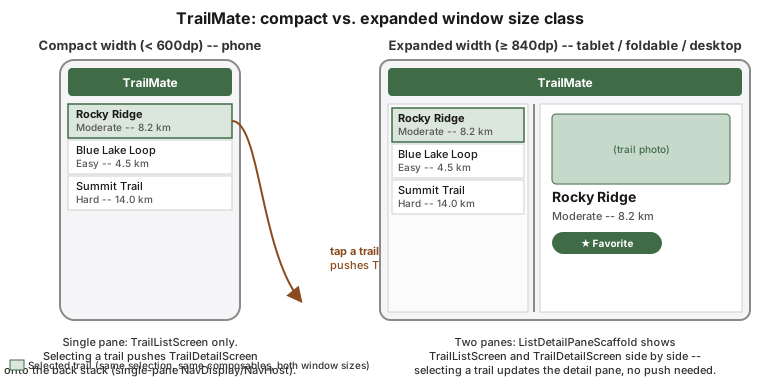
ListDetailPaneScaffold renders up to three roles — List, Detail and an optional Extra — and decides on
its own, from the current window size, whether to show one pane at a time or several side by side. A
ThreePaneScaffoldNavigator (created with rememberListDetailPaneScaffoldNavigator()) tracks which pane is
currently focused and exposes navigateTo/navigateBack, so the same call that "opens a trail" on a phone
(replacing the list with the detail pane) simply focuses the already-visible detail pane on a tablet. Both
navigator functions are suspend functions (they can run a pane transition), so a click handler launches them
in a scope from rememberCoroutineScope() rather than calling them directly:
// feature/trails/src/main/kotlin/com/example/trailmate/feature/trails/TrailListDetailScreen.kt
import androidx.compose.material3.adaptive.layout.AnimatedPane
import androidx.compose.material3.adaptive.layout.ListDetailPaneScaffold
import androidx.compose.material3.adaptive.layout.ListDetailPaneScaffoldRole
import androidx.compose.material3.adaptive.navigation.rememberListDetailPaneScaffoldNavigator
import androidx.compose.runtime.Composable
import androidx.compose.runtime.rememberCoroutineScope
import kotlinx.coroutines.launch

@Composable
fun TrailListDetailScreen(
    trails: List<Trail>,
    onSettingsClick: () -> Unit,
) {
    val navigator = rememberListDetailPaneScaffoldNavigator<String>()
    val scope = rememberCoroutineScope()

    ListDetailPaneScaffold(
        directive = navigator.scaffoldDirective,
        value = navigator.scaffoldValue,
        listPane = {
            AnimatedPane {
                TrailListScreen(
                    trails = trails,
                    onTrailClick = { trailId ->
                        scope.launch { navigator.navigateTo(ListDetailPaneScaffoldRole.Detail, trailId) }
                    },
                    onSettingsClick = onSettingsClick,
                )
            }
        },
        detailPane = {
            AnimatedPane {
                navigator.currentDestination?.contentKey?.let { trailId ->
                    TrailDetailScreen(
                        trailId = trailId,
                        onBackClick = { scope.launch { navigator.navigateBack() } },
                    )
                }
            }
        },
    )
}On a compact window the scaffold shows only the listPane until navigateTo is called, then only the
detailPane, with navigateBack() reversing it — effectively a single-pane, phone-style flow. On a wide
window it shows both panes side by side from the start, and navigateTo simply updates which trail is
highlighted and shown in the already-visible detail pane, with no navigation transition at all. AnimatedPane
supplies the enter/exit motion for the single-pane case for free.
NavigableListDetailPaneScaffold is the same scaffold with the navigator’s back handling built in: it takes the
navigator itself instead of directive/value, and handles system back (including predictive back) by calling
navigateBack() for you, so a detail pane is popped before back leaves the screen. It is still driven by the
scaffold’s own navigator, not by an app-level back stack — it is not a Navigation 3 integration.
The Navigation 3 integration is a separate API: rememberListDetailSceneStrategy<NavKey>(), from
androidx.compose.material3.adaptive:adaptive-navigation3, is a SceneStrategy that NavDisplay uses to lay out
ordinary back-stack entries as list and detail panes. Each entry is tagged with ListDetailSceneStrategy.listPane(),
ListDetailSceneStrategy.detailPane() or ListDetailSceneStrategy.extraPane() metadata, and opening a trail is a
plain backStack.add(TrailDetail(trailId)) rather than a navigator call:
// app/src/main/kotlin/com/example/trailmate/TrailMateNavDisplay.kt
import androidx.compose.material3.adaptive.ExperimentalMaterial3AdaptiveApi
import androidx.compose.material3.adaptive.navigation3.ListDetailSceneStrategy
import androidx.compose.material3.adaptive.navigation3.rememberListDetailSceneStrategy
import androidx.navigation3.runtime.NavKey
import androidx.navigation3.runtime.entryProvider
import androidx.navigation3.runtime.rememberNavBackStack
import androidx.navigation3.ui.NavDisplay

@OptIn(ExperimentalMaterial3AdaptiveApi::class)
@Composable
fun TrailMateNavDisplay() {
    val backStack = rememberNavBackStack(TrailList)
    val listDetailStrategy = rememberListDetailSceneStrategy<NavKey>()

    NavDisplay(
        backStack = backStack,
        onBack = { backStack.removeLastOrNull() },
        sceneStrategies = listOf(listDetailStrategy),
        entryProvider = entryProvider {
            entry<TrailList>(metadata = ListDetailSceneStrategy.listPane()) {
                TrailListScreen(onTrailClick = { trailId -> backStack.add(TrailDetail(trailId)) })
            }
            entry<TrailDetail>(metadata = ListDetailSceneStrategy.detailPane()) { key ->
                TrailDetailScreen(trailId = key.trailId, onBackClick = { backStack.removeLastOrNull() })
            }
        },
    )
}Use ListDetailPaneScaffold (or NavigableListDetailPaneScaffold) when a screen’s own navigator state is enough
(as in the first example); use the scene strategy when the list-detail pair must also be part of the app’s
shared Navigation 3 back stack, so that a deep link can land directly on a detail entry and predictive back
pops the detail entry before leaving the screen.
Navigation in Compose (Navigation Compose and Navigation 3) covers
scenes from the navigation side. See
Android Developers — Canonical layouts for adaptive apps,
Android Developers — Build a
list-detail layout and
Android Developers — Navigation 3 — Create
custom layouts using Scenes.
Supporting Pane and Feed
SupportingPaneScaffold follows the same shape as ListDetailPaneScaffold but with SupportingPaneScaffoldRole
.Main/.Supporting/.Extra roles: the main pane is never hidden, and the supporting pane is dropped entirely
(not just navigated away from) when the window is too narrow to show it usefully:
// feature/trails/src/main/kotlin/com/example/trailmate/feature/trails/TrailMapScreen.kt
import androidx.compose.material3.adaptive.layout.AnimatedPane
import androidx.compose.material3.adaptive.layout.SupportingPaneScaffold
import androidx.compose.material3.adaptive.layout.SupportingPaneScaffoldRole
import androidx.compose.material3.adaptive.navigation.rememberSupportingPaneScaffoldNavigator

@Composable
fun TrailMapScreen(trail: Trail) {
    val navigator = rememberSupportingPaneScaffoldNavigator<Unit>()

    SupportingPaneScaffold(
        directive = navigator.scaffoldDirective,
        value = navigator.scaffoldValue,
        mainPane = { AnimatedPane { TrailMapContent(trail = trail) } },
        supportingPane = { AnimatedPane { TrailWeatherAndElevation(trail = trail) } },
    )
}A feed needs no dedicated scaffold at all: it is a single LazyVerticalStaggeredGrid (or LazyVerticalGrid)
whose column count is derived from the window size class, so `TrailListScreen’s own item layout — not a second
pane — is what adapts:
// feature/trails/src/main/kotlin/com/example/trailmate/feature/trails/TrailListScreen.kt
import androidx.compose.foundation.lazy.staggeredgrid.LazyVerticalStaggeredGrid
import androidx.compose.foundation.lazy.staggeredgrid.StaggeredGridCells
import androidx.window.core.layout.WindowWidthSizeClass

@Composable
fun TrailFeed(trails: List<Trail>, widthSizeClass: WindowWidthSizeClass) {
    val columns = when (widthSizeClass) {
        WindowWidthSizeClass.COMPACT -> 1
        WindowWidthSizeClass.MEDIUM -> 2
        else -> 3
    }
    LazyVerticalStaggeredGrid(columns = StaggeredGridCells.Fixed(columns)) {
        items(trails, key = { it.id }) { trail -> TrailCard(trail) }
    }
}
See Android Developers — Canonical layouts for adaptive apps and
Compose Layouts, Modifiers and Lazy Lists for
LazyVerticalStaggeredGrid and lazy-list fundamentals in general.
NavigationSuiteScaffold for Top-Level Navigation Chrome
Canonical layouts adapt a screen’s content; NavigationSuiteScaffold adapts the navigation chrome around
every screen — TrailMate’s bottom bar on a phone — picking a bottom navigation bar, a navigation rail or a
permanent navigation drawer purely from the current window size class:
| Width size class | NavigationSuiteScaffold shows |
|---|---|
Compact |
Bottom navigation bar ( |
Medium |
Navigation rail ( |
Expanded |
Navigation rail, or a permanent navigation drawer for apps with more top-level destinations |
Navigation in Compose (Navigation Compose and Navigation 3) shows the
full NavigationSuiteScaffold wiring for TrailMate’s three top-level destinations, including how its item
selection state is kept in sync with either navigation library’s back stack; this page’s contribution is the
underlying rule — the same WindowAdaptiveInfo this whole page is about is what NavigationSuiteScaffold
reads to make that choice, so a screen’s canonical layout (list-detail, supporting pane) and its surrounding
navigation chrome always agree about the current window, without either one recomputing the size class itself.
See
Android Developers — Build adaptive navigation and
Android Developers — Add navigation elements with NavigationSuiteScaffold.
Foldables: WindowInfoTracker, FoldingFeature and Tabletop Posture
Window size classes describe the shape of the window; they do not describe a fold running through the middle
of it. A book-style foldable unfolded flat and a tablet of the same size both report an expanded width size
class, but only the foldable has a hinge an app may want to avoid placing content across, or fold flat, the
hinge can be half-open, producing a "tabletop" posture where the device sits like a laptop. WindowInfoTracker
(from androidx.window.layout, part of androidx.window 1.4.0) exposes this as a Flow of WindowLayoutInfo,
whose displayFeatures list contains zero or more FoldingFeature entries:
// feature/trails/src/main/kotlin/com/example/trailmate/feature/trails/PhotoCaptureScreen.kt
import androidx.window.layout.FoldingFeature
import androidx.window.layout.WindowInfoTracker
import androidx.window.layout.WindowLayoutInfo
import androidx.lifecycle.compose.collectAsStateWithLifecycle
import androidx.compose.runtime.Composable
import androidx.compose.ui.platform.LocalContext

@Composable
fun rememberFoldingFeature(): FoldingFeature? {
    val context = LocalContext.current
    val windowLayoutInfo by remember(context) {
        WindowInfoTracker.getOrCreate(context).windowLayoutInfo(context as android.app.Activity)
    }.collectAsStateWithLifecycle(initialValue = WindowLayoutInfo(emptyList()))

    return windowLayoutInfo.displayFeatures.filterIsInstance<FoldingFeature>().firstOrNull()
}

@Composable
fun PhotoCaptureScreen(onPhotoTaken: (android.net.Uri) -> Unit) {
    val foldingFeature = rememberFoldingFeature()
    val isTabletop = foldingFeature?.state == FoldingFeature.State.HALF_OPENED &&
        foldingFeature.orientation == FoldingFeature.Orientation.HORIZONTAL

    if (isTabletop) {
        // Camera preview above the hinge, capture controls below it -- the device rests like a small easel.
        TabletopCameraLayout(onPhotoTaken = onPhotoTaken)
    } else {
        FullScreenCameraLayout(onPhotoTaken = onPhotoTaken)
    }
}FoldingFeature.orientation (HORIZONTAL/VERTICAL) gives the hinge’s axis, and FoldingFeature.state
(FLAT/HALF_OPENED) gives whether the device is unfolded flat or held open at an angle; occlusionType and
isSeparating additionally describe whether the hinge covers content or splits the window into two logically
separate areas. TrailMate uses this for exactly one screen, PhotoCaptureScreen — a tabletop-posture hike photo
capture where the preview sits in the upper half and the shutter controls sit in the lower half, mirroring a
laptop’s screen-and-keyboard split — and otherwise relies on window size classes alone, since most layout
decisions don’t need to know about the hinge specifically. See
Android
Developers — Make your app fold-aware and
Android Developers — FoldingFeature.
Figure: Choosing a Layout for the Current Window
targetSdk 36/37: Orientation, Resizability and the Android 17 Opt-Out Removal
Large-screen enforcement tightened over three consecutive releases, and TrailMate’s own targetSdk = 36 already
sits inside this window:
| targetSdk | Behavior |
|---|---|
35 (Android 15) |
Edge-to-edge is enforced: an app can no longer opt out of drawing behind the system bars. Orientation and
resizability restrictions ( |
36 (Android 16) — TrailMate’s baseline |
The edge-to-edge opt-out API itself is removed, so it has no effect even if called. Predictive back animations
are on by default, and the system stops dispatching |
37 (Android 17) |
The |
The opt-out, for reference, is a single manifest property — useful only as a stopgap while a screen is fixed, because it stops working once the app targets API 37:
<!-- app/src/main/AndroidManifest.xml -->
<activity
    android:name=".MainActivity"
    android:exported="true">
    <property
        android:name="android.window.PROPERTY_COMPAT_ALLOW_RESTRICTED_RESIZABILITY"
        android:value="true" />
</activity>The practical consequence for TrailMate is that any screen written assuming a fixed portrait orientation or a
non-resizable window (a common shortcut for a photo-capture or camera screen) is stretched to fill a landscape
tablet window rather than locked to portrait, from the moment the app targets Android 16, and that this can no
longer be worked around at all once the app targets Android 17. The fix is architectural, not a manifest flag: build every screen — including
PhotoCaptureScreen above — to lay out correctly at any width and any orientation, using window size classes
and the canonical layouts on this page, rather than relying on the platform to constrain the window on the app’s
behalf. See
Android Developers — Behavior changes:
apps targeting Android 15,
Android Developers — Behavior changes: apps
targeting Android 16,
Android Developers — Orientation
and resizability restrictions are ignored and
Android
Developers — Orientation, aspect ratio and resizability.
Multi-Window and Desktop Windowing
Split-screen multi-window (two apps side by side), picture-in-picture and freeform/desktop windowing (Android 14+,
and the default interaction model on ChromeOS and large-screen desktop mode) all place TrailMate in a window
that is smaller than, and independently resizable from, the full display — which is exactly the situation window
size classes are designed for: a resize during desktop windowing recomposes currentWindowAdaptiveInfo() the
same way opening a foldable does, with no separate multi-window-specific API needed for layout. What multi-window
does add is Activity.isInMultiWindowMode and the onMultiWindowModeChanged() callback for the handful of
behaviors that genuinely depend on being shared screen space rather than just a smaller window — pausing a
video’s autoplay, or throttling a foreground service’s UI updates, when the user can see TrailMate’s window is
not focused. android:resizeableActivity (declared per-activity in the manifest) opts an activity in or out of
multi-window on the API levels where that flag still applies, subject to the targetSdk 36/37 restrictions above
overriding it on large displays regardless of its value. See
Android Developers — Multi-window
support and
Android
Developers — Support different display sizes.
Keyboard, Mouse and Stylus Input
Desktop windowing and ChromeOS make keyboard and mouse first-class input methods, not just an accessibility fallback, and a hiking app’s photo annotation screen benefits directly from stylus input. Compose exposes all three without a separate "desktop mode":
-
Keyboard.
Modifier.onKeyEvent { keyEvent → … }intercepts key presses on a focusable node;Tab/Shift+Tabfocus traversal and arrow-key navigation inside lists work automatically for standard components, andModifier.focusable()plusFocusRequesterextend it to custom ones. -
Mouse and trackpad.
Modifier.pointerHoverIcon(PointerIcon.Hand)shows the right cursor over a clickable trail card;Modifier.onPointerEvent(PointerEventType.Scroll)reads mouse-wheel and trackpad scroll deltas for custom scrollable content, on top of the scrolling everyLazy*list already supports for free. -
Stylus.
PointerEvent’s `PointerInputChange.typereportsPointerType.Stylus, and pressure is available through the underlyingMotionEvent(Modifier.pointerInteropFilterwhen raw pressure or tilt is needed) — useful for a "mark this spot on the trail photo" annotation tool that should feel different under a stylus than under a fingertip.
// feature/trails/src/main/kotlin/com/example/trailmate/feature/trails/TrailCard.kt
import androidx.compose.ui.input.pointer.PointerIcon
import androidx.compose.ui.input.pointer.PointerEventType
import androidx.compose.ui.input.pointer.pointerHoverIcon
import androidx.compose.ui.input.pointer.pointerInput
import androidx.compose.ui.input.pointer.PointerType

Modifier
    .pointerHoverIcon(PointerIcon.Hand)
    .pointerInput(Unit) {
        awaitPointerEventScope {
            while (true) {
                val event = awaitPointerEvent()
                if (event.type == PointerEventType.Press &&
                    event.changes.first().type == PointerType.Stylus
                ) {
                    // Treat a stylus tap differently from a finger tap, e.g. start an annotation.
                }
            }
        }
    }
See Android Developers — Handle input in Compose and Android Developers — Drag, swipe and fling, which Compose Animation and Gestures covers in more depth for touch gestures specifically.
Edge-to-Edge: enableEdgeToEdge and Compose WindowInsets
Edge-to-edge means an app’s content draws underneath the status bar and navigation bar rather than leaving them
as opaque bands the layout stops short of; it has been enforced since targetSdk 35, so TrailMate’s
MainActivity calls enableEdgeToEdge() as a matter of course rather than as an opt-in feature:
// app/src/main/kotlin/com/example/trailmate/MainActivity.kt
import androidx.activity.ComponentActivity
import androidx.activity.compose.setContent
import androidx.activity.enableEdgeToEdge

class MainActivity : ComponentActivity() {
    override fun onCreate(savedInstanceState: Bundle?) {
        super.onCreate(savedInstanceState)
        enableEdgeToEdge()
        setContent { TrailMateTheme { TrailMateApp() } }
    }
}Once content draws under the system bars, it must also avoid being obscured by them where it matters — WindowInsets is how a Compose screen reads how much space the status bar, navigation bar, display cutout and
on-screen keyboard each occupy, so it can pad or offset its own content by exactly that much and no more:
WindowInsets value |
What it covers |
|---|---|
|
The status bar alone. |
|
The gesture/3-button navigation bar alone. |
|
The union of every inset a screen should not draw content under — status bars, navigation bars, display cutout and IME combined. The default choice for "pad my content so nothing important is obscured". |
|
The on-screen keyboard, changing live as it animates in and out. |
|
|
Scaffold already reads safeDrawing for its own bars (topBar, bottomBar) through its
contentWindowInsets parameter, and passes the remaining inset down to its content lambda as a
PaddingValues, so a screen built on Scaffold applies that padding once and is automatically correct:
// feature/trails/src/main/kotlin/com/example/trailmate/feature/trails/TrailListScreen.kt
import androidx.compose.material3.Scaffold
import androidx.compose.material3.TopAppBar
import androidx.compose.foundation.layout.imePadding
import androidx.compose.foundation.layout.padding
import androidx.compose.foundation.lazy.LazyColumn

@Composable
fun TrailListScreen(trails: List<Trail>, onTrailClick: (String) -> Unit) {
    Scaffold(
        topBar = { TopAppBar(title = { Text("TrailMate") }) },
    ) { innerPadding ->
        LazyColumn(contentPadding = innerPadding) {
            items(trails, key = { it.id }) { trail ->
                TrailRow(trail = trail, onClick = { onTrailClick(trail.id) })
            }
        }
    }
}A screen with a text field — TrailMate’s hike-notes editor — additionally needs Modifier.imePadding() on the
scrollable content itself, so the keyboard’s appearance pushes the input field above it instead of the field
staying pinned under a now-covering keyboard:
// feature/trails/src/main/kotlin/com/example/trailmate/feature/trails/HikeNotesEditor.kt
import androidx.compose.foundation.layout.imePadding
import androidx.compose.foundation.layout.navigationBarsPadding
import androidx.compose.foundation.text.BasicTextField

BasicTextField(
    value = notesText,
    onValueChange = onNotesChange,
    modifier = Modifier
        .imePadding()
        .navigationBarsPadding(),
)A common mistake is applying safeDrawing (or statusBarsPadding()/navigationBarsPadding()) and letting a
parent Scaffold also consume the same inset, which double-pads the content; Modifier.consumeWindowInsets(…)
marks an inset as already handled by an ancestor so a descendant that also reads it does not pad twice. See
Android Developers — Compose insets and
Android Developers — System bars in
Compose.
Edge-to-Edge in the Views System
TrailMate’s legacy, Views-based screens (introduced on
Views, XML Layouts, View Binding and Material Components) reach the
same result with ViewCompat.setOnApplyWindowInsetsListener, which delivers a WindowInsetsCompat to a specific
view and expects the listener to return the insets it did not consume, so a nested listener further down the
tree still sees what is left:
// feature/trails/src/main/kotlin/com/example/trailmate/feature/trails/TrailListFragment.kt
import androidx.core.view.ViewCompat
import androidx.core.view.WindowInsetsCompat

override fun onViewCreated(view: View, savedInstanceState: Bundle?) {
    super.onViewCreated(view, savedInstanceState)
    ViewCompat.setOnApplyWindowInsetsListener(binding.recyclerView) { v, insets ->
        val safeDrawing = insets.getInsets(WindowInsetsCompat.Type.systemBars() or WindowInsetsCompat.Type.ime())
        v.updatePadding(bottom = safeDrawing.bottom)
        insets
    }
}WindowInsetsCompat.Type mirrors the Compose WindowInsets categories (systemBars(), displayCutout(),
ime()), and ViewCompat.setOnApplyWindowInsetsListener works down to API 21 through
androidx.core:core-ktx, unlike the platform’s own View.setOnApplyWindowInsetsListener which needs API 20+
and has no automatic backward compatibility for older insets behavior. See
Android Developers — Display content
edge-to-edge and Android Developers — Window
insets.
Display Cutouts and System Bar Appearance
A display cutout (a notch or a punch-hole camera) is exposed the same way as any other inset — WindowInsets.displayCutout in Compose, WindowInsetsCompat.Type.displayCutout() in Views — and by default a
portrait activity is laid out to avoid it, while android:windowLayoutInDisplayCutoutMode in a theme or
Window.attributes.layoutInDisplayCutoutMode at runtime controls whether an activity is instead allowed to draw
into the cutout area (shortEdges, useful for a full-bleed trail photo) or is kept clear of it entirely
(never).
System bar appearance — whether the status bar and navigation bar icons are drawn light-on-dark or
dark-on-light — is set from WindowInsetsControllerCompat, and should track TrailMate’s own light/dark theme
rather than a fixed choice, since a photo-heavy screen with a dark background needs light system bar icons even
if the rest of the app is in its light theme:
// app/src/main/kotlin/com/example/trailmate/MainActivity.kt
import androidx.core.view.WindowCompat
import androidx.core.view.WindowInsetsControllerCompat

val insetsController = WindowCompat.getInsetsController(window, window.decorView)
insetsController.isAppearanceLightStatusBars = !isDarkTheme
insetsController.isAppearanceLightNavigationBars = !isDarkThemeWindowCompat.getInsetsController is the same entry point Compose’s enableEdgeToEdge() uses internally,
so calling it directly (for example, from a SideEffect when TrailMate’s theme changes at runtime) composes
correctly with the rest of the edge-to-edge setup on this page. See
Android Developers — Display content
edge-to-edge and
Android Developers — System bars
(design guidance).
The Adaptive App Quality Guidelines
Google publishes a dedicated adaptive app quality checklist alongside the general core app quality guidelines, specifically for the device range this page covers. Its recurring themes, applied to TrailMate, are:
-
No hard-coded orientation lock or fixed aspect ratio, for the reasons the targetSdk 36/37 section above makes unavoidable from Android 17 onward.
-
No stretched or letterboxed UI on large screens — the canonical layouts on this page exist specifically so a tablet or desktop window gets a genuinely different, wider layout instead of a phone layout stretched or centered with empty margins.
-
Correct behavior across resizes, not just at launch — verified by resizing TrailMate’s window live in desktop windowing or by folding/unfolding a foldable emulator, not just by testing a fixed set of screen sizes.
-
Keyboard, mouse and stylus support on the screens most likely to be used with them (TrailMate’s trail list and hike-notes editor), not touch-only interaction assumed everywhere.
-
Edge-to-edge with correctly inset content, so no interactive element sits under a system bar or the display cutout, and text does not sit under an animating IME.
References
-
Android Developers — Get started with adaptive apps in Compose
-
Android Developers — Support different screen sizes with window size classes
-
Android Developers — Navigation 3 — Create custom layouts using Scenes
-
Android Developers — Add navigation elements with NavigationSuiteScaffold
-
Android Developers — Behavior changes: apps targeting Android 15
-
Android Developers — Behavior changes: apps targeting Android 16
-
Android Developers — Orientation and resizability restrictions are ignored
-
Android Developers — Orientation, aspect ratio and resizability