SwiftUI Layout
|
This content was generated with the assistance of AI and should be verified against the official documentation before being relied on in production; see the section bibliography for the reference material consulted while preparing these pages. |
Layout is where SwiftUI differs most from the frameworks it replaces. There are no constraints to solve and no
frames to set from outside: every view decides its own size, inside limits its parent offers, and the parent then
decides where to put it. Once that negotiation is clear, stacks, grids, frame, Spacer and even custom layout
containers all follow from it. This page is written against iOS, iPadOS, macOS, watchOS and visionOS 27,
built with Xcode 27 and Swift 6.4, with FieldNotes keeping a deployment minimum of 26. Most layout
APIs here have existed for several releases and need no availability checks at that minimum; the exceptions are
ArrangementView, ReservedRegion and the hinge APIs for the foldable iPhone Duo, which are new in iOS 27.1
and iPadOS 27.1 and are guarded accordingly.
This page assumes the view and modifier model from SwiftUI Views and Modifiers: modifiers wrap views, and wrapping order matters. Lists, tables and outline views, which are layout containers with their own behaviour (selection, swipe actions, reordering), have their own page, Lists, Tables and Collections.
How SwiftUI Layout Works: Propose, Choose, Place
Every layout pass is a conversation between a parent and each of its children, in three steps:
-
The parent proposes a size. The proposal is a
ProposedViewSize: an optional width and an optional height. A concrete value means "you have this much room";0asks for the view’s minimum size;.infinityasks for its maximum;nilasks for its ideal size. -
The child chooses its own size. It may use the proposal, ignore it, or take part of it. A
Textwraps or truncates to fit the proposed width but never grows beyond its content; aColoror aSpacertakes whatever it is offered; anImagewithout.resizable()always reports its natural pixel size. Whatever the child answers is final: the parent cannot overrule it. -
The parent places the child. The parent positions the child inside its own coordinate space, using its alignment. It cannot resize the child at this point, only move it.
Containers apply the same protocol recursively. An HStack given a width first asks each child how flexible it
is, offers space to the least flexible children first, divides what remains among the flexible ones (in order
of layoutPriority), reports its own size as the union of its children plus spacing, and finally places them
side by side. That is why an Image next to a long Text keeps its size while the text wraps: the image is
inflexible, so it is served first.
Here is the header row of NoteRow, and the negotiation it triggers inside a list row that is 390 points wide:
HStack(spacing: 8) {
    Image(systemName: notebook.symbolName)   // inflexible: always its symbol size
        .foregroundStyle(.tint)
    Text(note.title)                         // flexible: wraps or truncates to the width it gets
        .font(.headline)
        .lineLimit(1)
    Spacer(minLength: 8)                     // fully flexible: takes whatever is left
    Text(note.createdAt, style: .relative)   // flexible, but should never truncate
        .font(.caption)
        .foregroundStyle(.secondary)
        .fixedSize()                         // "use your ideal size, ignore the proposal"
}Figure: Layout Negotiation for a NoteRow Header
Two modifiers tune the negotiation directly. .layoutPriority(_:) tells a stack which flexible child to serve
first (the default is 0), and .fixedSize() makes a view answer with its ideal size regardless of the proposal,
which is how the relative date above avoids ever being truncated to "3 m…".
HStack {
    Text(note.title)
        .lineLimit(1)
        .layoutPriority(1)       // gets its space before the notebook name
    Text(notebook.name)
        .lineLimit(1)
        .foregroundStyle(.secondary)
}Stacks and Lazy Stacks
HStack, VStack and ZStack are the workhorse containers. Each takes an alignment (the cross axis for the
two linear stacks, both axes for ZStack) and, for the linear stacks, a spacing; omitting spacing lets
SwiftUI choose platform-appropriate spacing between each pair of children. NotebookTile, the tile used by the
notebook grid below, uses all three:
struct NotebookTile: View {
    let notebook: Notebook
    let noteCount: Int

    var body: some View {
        ZStack(alignment: .topTrailing) {
            VStack(alignment: .leading, spacing: 6) {
                Image(systemName: notebook.symbolName)
                    .font(.title2)
                    .foregroundStyle(.tint)
                Text(notebook.name)
                    .font(.headline)
                HStack(spacing: 4) {
                    Image(systemName: "note.text")
                    Text("\(noteCount) notes")
                }
                .font(.caption)
                .foregroundStyle(.secondary)
            }
            .padding()
            .frame(maxWidth: .infinity, alignment: .leading)
            .background(.regularMaterial, in: .rect(cornerRadius: 14))

            if noteCount == 0 {
                Text("Empty")
                    .font(.caption2.bold())
                    .padding(6)
            }
        }
    }
}Lazy Stacks
A VStack creates and measures all of its children up front, which is fine for a dozen views and wasteful for
a thousand. Inside a ScrollView, LazyVStack and LazyHStack create children only as they approach the
visible region and discard them once they scroll away. The FieldNotes timeline, which shows every note grouped
by notebook with sticky headers, is a lazy stack:
struct NoteTimeline: View {
    @Environment(NoteStore.self) private var store

    var body: some View {
        ScrollView {
            LazyVStack(alignment: .leading, spacing: 12, pinnedViews: [.sectionHeaders]) {
                ForEach(store.notebooks) { notebook in
                    Section {
                        ForEach(store.notes.filter { $0.notebookID == notebook.id }) { note in
                            NoteRow(note: note)
                                .padding(.horizontal)
                        }
                    } header: {
                        Label(notebook.name, systemImage: notebook.symbolName)
                            .font(.headline)
                            .padding(.horizontal)
                            .padding(.vertical, 6)
                            .frame(maxWidth: .infinity, alignment: .leading)
                            .background(.bar)
                    }
                }
            }
        }
    }
}Laziness has consequences that Apple’s WWDC26 session Dive into lazy stacks and scrolling with SwiftUI spells out, and they shape how FieldNotes builds its scrolling screens:
-
Off-screen sizes are estimates. A lazy stack has not measured the rows it has not loaded, so it estimates their height from the rows it has seen. The total content height, and therefore the scroll offset, can shift as more rows are measured — for example after rotating an iPhone, when rows become shorter.
-
The cross-axis size comes from the first child. A
LazyVStackcannot know its widest child without loading all of them, so its ideal width is that of its first subview; aLazyHStackinside a vertical scroll view takes the height of its first subview. Give children in a horizontal lazy stack a fixed height (a line limit on text, a fixed frame on images) so later, taller items are not clipped. -
Don’t move rows outside their laid-out frame. A
.scrollTransitionor.offsetthat pushes a row into the visible region does not make the stack load it; it loads rows based on their original position. -
Prefer relative visibility to absolute offsets. Because the content offset is estimated, logic such as "hide this button after scrolling 100 points" can flicker; asking which rows are visible is stable. The scrolling section below shows both.
From the 27 releases, stacks, grids and custom layouts (not just List) also support drag-to-reorder and swipe
actions; those are covered on Lists, Tables and
Collections.
Grids and Lazy Grids
Grid lays out a fixed set of views in rows and columns, where each column is as wide as its widest cell and
each row as tall as its tallest. It measures every cell, so it suits small, two-dimensional content such as the
metadata block at the top of NoteDetail:
Grid(alignment: .leading, horizontalSpacing: 12, verticalSpacing: 8) {
    GridRow {
        Text("Created")
            .foregroundStyle(.secondary)
            .gridColumnAlignment(.trailing)       // the whole label column aligns trailing
        Text(note.createdAt, format: .dateTime)
    }
    GridRow {
        Text("Notebook")
            .foregroundStyle(.secondary)
        Label(notebook.name, systemImage: notebook.symbolName)
    }
    Divider()                                    // a view outside a GridRow spans every column
        .gridCellUnsizedAxes(.horizontal)        // ...without widening the grid
    GridRow {
        Text("Tags")
            .foregroundStyle(.secondary)
        TagStrip(tags: note.tags)
            .gridCellColumns(1)
    }
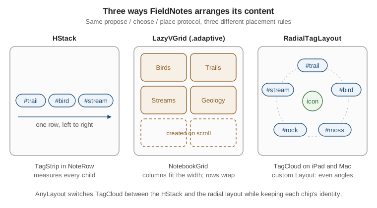
}LazyVGrid and LazyHGrid are the lazy, scrolling counterparts. You describe the columns (or rows) with
GridItems — .fixed, .flexible, or .adaptive, which fits as many columns as the width allows — and the
grid fills them with as many items as the data has, creating them only as they scroll into view. The notebook
grid on iPad and Mac uses an adaptive column, so it shows two tiles side by side on a narrow window and five on
a wide one without any size-class code:
struct NotebookGrid: View {
    @Environment(NoteStore.self) private var store
    private let columns = [GridItem(.adaptive(minimum: 150, maximum: 240), spacing: 16)]

    var body: some View {
        ScrollView {
            LazyVGrid(columns: columns, alignment: .leading, spacing: 16) {
                ForEach(store.notebooks) { notebook in
                    NotebookTile(
                        notebook: notebook,
                        noteCount: store.notes.count(where: { $0.notebookID == notebook.id })
                    )
                }
            }
            .padding()
        }
    }
}Choosing a container is mostly a question of how much content there is and whether it has two dimensions:
| Container | Use it for | FieldNotes |
|---|---|---|
|
A handful of views on one axis, or layered. |
|
|
Long or unbounded single-axis content with a custom look. |
|
|
Small two-dimensional content whose columns must line up. |
|
|
Long two-dimensional content with uniform items. |
|
|
Rows with system selection, editing, swipe actions and platform styling. |
|
frame, padding and Spacer
These three modifiers do most of the fine-tuning in real layouts, and all three are wrappers that take part in the negotiation like any other view:
-
paddingproposes the offered size minus its insets to its child, then reports the child’s size plus the insets. Without arguments it uses a platform-appropriate default on every edge. -
frame(width:height:alignment:)creates a fixed-size box and proposes exactly that size to its child. The child may still choose to be smaller, in which casealignmentpositions it inside the box. -
frame(minWidth:idealWidth:maxWidth:minHeight:idealHeight:maxHeight:alignment:)creates a flexible box.maxWidth: .infinityis the idiom for "fill the available width", and pairing it with an alignment is the SwiftUI replacement for a leading-aligned label that stretches. -
Spaceris a flexible, empty view that expands along the axis of its stack, pushing its siblings apart;Spacer(minLength:)keeps at least that much room even when space runs short.
HStack(alignment: .top, spacing: 12) {
    Image(systemName: notebook.symbolName)
        .font(.title3)
        .frame(width: 28, height: 28)                     // fixed box: icons line up in a column
    VStack(alignment: .leading) {
        Text(note.title).font(.headline)
        Text(note.body).lineLimit(3)
    }
    .frame(maxWidth: .infinity, alignment: .leading)      // fill the width, content leading
}
.padding(.vertical, 8)
.padding(.horizontal)A frame does not stretch its content; it only offers more room. Text("Pinned").frame(width: 200) is still a
short text, centred inside a 200-point box. To fill the box, the content must itself be flexible — a Color, a
shape, a .resizable() image — or be wrapped in a flexible frame as above.
Alignment and Alignment Guides
Stacks align their children along the cross axis using alignment guides: every view exposes named guides
(.leading, .center, .firstTextBaseline, …), and the stack lines up the same guide of every child. You can
override where a view reports a guide with .alignmentGuide(_:computeValue:), and you can define entirely new
guides with a custom AlignmentID.
The notebook header in the sidebar shows an icon next to a two-line block (name and note count). Centring the
icon on the whole block looks wrong, and .firstTextBaseline puts it too low for a large symbol. A custom
vertical alignment centres the icon on the first line only:
extension VerticalAlignment {
    private enum NotebookTitleCenter: AlignmentID {
        static func defaultValue(in dimensions: ViewDimensions) -> CGFloat {
            dimensions[VerticalAlignment.center]
        }
    }

    static let notebookTitleCenter = VerticalAlignment(NotebookTitleCenter.self)
}

struct NotebookHeader: View {
    let notebook: Notebook
    let noteCount: Int

    var body: some View {
        HStack(alignment: .notebookTitleCenter, spacing: 10) {
            Image(systemName: notebook.symbolName)
                .font(.title)                               // uses the default: its own centre
            VStack(alignment: .leading, spacing: 2) {
                Text(notebook.name)
                    .font(.headline)
                    .alignmentGuide(.notebookTitleCenter) { d in d[VerticalAlignment.center] }
                Text("\(noteCount) notes")
                    .font(.caption)
                    .foregroundStyle(.secondary)
            }
        }
    }
}Because the VStack does not set a value for the custom guide itself, it passes up the value from the child
that does, so the stack’s "title centre" is the centre of the name line, and the HStack lines the icon’s centre
up with it. The same technique aligns labels across unrelated stacks (a custom HorizontalAlignment shared by a
column of form rows) without a Grid.
Reading Geometry
Sometimes a view needs to know a size: a carousel card should be one third of the screen, a toolbar should collapse when its container narrows. SwiftUI offers three tools, from most to least preferred.
containerRelativeFrame
containerRelativeFrame(_:alignment:) sizes a view relative to its nearest container — the window or screen,
a NavigationSplitView column, a NavigationStack, a tab, or a scroll view — minus that container’s safe area.
The count:span:spacing: variant divides the container into equal tracks, which is exactly what a paging
carousel needs. The pinned-notes carousel at the top of NoteList shows one card per page on iPhone and three on
iPad:
struct PinnedCarousel: View {
    let pinned: [Note]
    @Environment(\.horizontalSizeClass) private var sizeClass

    var body: some View {
        ScrollView(.horizontal) {
            LazyHStack(spacing: 12) {
                ForEach(pinned) { note in
                    NoteRow(note: note)
                        .padding()
                        .frame(height: 120, alignment: .topLeading)
                        .background(.regularMaterial, in: .rect(cornerRadius: 14))
                        .containerRelativeFrame(
                            .horizontal,
                            count: sizeClass == .compact ? 1 : 3,
                            span: 1,
                            spacing: 12
                        )
                }
            }
            .scrollTargetLayout()
        }
        .scrollTargetBehavior(.viewAligned)
        .contentMargins(.horizontal, 16, for: .scrollContent)
        .scrollIndicators(.hidden)
    }
}Apps built with the 27 SDKs also get a fix here: containerRelativeFrame inside a ScrollView now applies
safe-area insets on the non-scrolling axis as well, so a vertically sized card in a horizontal scroll view no
longer extends under the navigation bar or home indicator.
onGeometryChange
onGeometryChange(for:of:action:) reads the geometry of the view it is attached to without changing its
layout. You provide two closures: one that turns the GeometryProxy into a small Equatable value, and one that
runs only when that value changes. Converting to the least information you need (a Bool rather than a
CGSize) keeps updates rare. NoteEditor uses it to decide whether its tag editor sits beside or below the text:
struct NoteEditor: View {
    let noteID: Note.ID
    @Environment(NoteStore.self) private var store
    @State private var isWide = false

    var body: some View {
        let note = store.notes.first { $0.id == noteID }
        let layout = isWide ? AnyLayout(HStackLayout(alignment: .top)) : AnyLayout(VStackLayout())
        layout {
            TextEditor(text: .constant(note?.body ?? ""))    // editing is wired to state on the next page
            TagStrip(tags: note?.tags ?? [])
                .frame(maxWidth: isWide ? 220 : .infinity, alignment: .leading)
        }
        .onGeometryChange(for: Bool.self) { proxy in
            proxy.size.width > 600
        } action: { newValue in
            isWide = newValue
        }
    }
}GeometryReader
GeometryReader is the oldest tool and the bluntest. It is a container that accepts all the space it is
offered, places its content at its top-leading corner, and passes a GeometryProxy to its content closure. Used
as the main content of a screen, it tends to break layouts, because it is greedy and does not size to its
content. It is still the right tool when the drawing itself depends on the size, and it is safe inside a
background or overlay, where it simply matches the size of the view it decorates. The word-goal bar under
NoteEditor is such a case:
Capsule()
    .fill(.quaternary)
    .frame(height: 6)
    .overlay(alignment: .leading) {
        GeometryReader { proxy in
            Capsule()
                .fill(.tint)
                .frame(width: proxy.size.width * min(progress, 1))
        }
    }
    .accessibilityElement()
    .accessibilityLabel("Word goal")
.accessibilityValue(Text(progress, format: .percent))| Tool | Affects layout? | Reach for it when |
|---|---|---|
|
Yes: it sets the view’s size from the container’s. |
A view should be a fraction of the screen, column or scroll view. |
|
No: it only reports. |
You need to react to a size or position, typically by updating state. |
|
Yes: it fills all offered space. |
Drawing depends on size, ideally inside |
ViewThatFits
ViewThatFits takes several alternatives, in order of preference, and shows the first one whose ideal size
fits the proposal on the constrained axes. It replaces a lot of manual size-class and geometry code for the
common case of "the full version if there is room, a compact one otherwise". The action bar at the bottom of
NoteDetail shows labelled buttons on a wide screen, icon-only buttons on a narrow one, and a single menu on
the narrowest, reusing the same buttons each time:
struct NoteActions: View {
    let note: Note
    @Environment(NoteStore.self) private var store

    var body: some View {
        ViewThatFits(in: .horizontal) {
            HStack { buttons }
            HStack { buttons }.labelStyle(.iconOnly)
            Menu("Actions", systemImage: "ellipsis.circle") { buttons }
        }
    }

    @ContentBuilder
    private var buttons: some View {
        Button("Pin", systemImage: note.isPinned ? "pin.slash" : "pin") { store.togglePin(note) }
        ShareLink(item: note.body)
        Button("Delete", systemImage: "trash", role: .destructive) { store.delete(note) }
    }
}ViewThatFits measures the alternatives but shows only one, so each keeps its own identity: switching between
them re-creates the chosen view. Keep the alternatives stateless, as above, and hold any state in the parent.
Custom Layouts: a Radial Tag Layout
When no built-in container fits, conform a type to the Layout protocol and implement the same two steps
SwiftUI’s own containers do: sizeThatFits(proposal:subviews:cache:) answers "how big are you for this
proposal?", and placeSubviews(in:proposal:subviews:cache:) positions every subview in the bounds the parent
finally granted. Subviews arrive as LayoutSubview proxies, which you can ask for their size under any proposal
and then place(at:anchor:proposal:); you never touch the views themselves.
On iPad and Mac, NoteDetail shows a note’s tags arranged in a circle around the note’s notebook icon. The
layout, adapted from Apple’s WWDC22 custom-layout sample, lives in FieldNotesUI:
import SwiftUI

public struct RadialTagLayout: Layout {
    public init() {}

    public func sizeThatFits(
        proposal: ProposedViewSize,
        subviews: Subviews,
        cache: inout Void
    ) -> CGSize {
        // Take the proposed square, or a sensible default when asked for an ideal size.
        let fallback: CGFloat = 240
        let width = proposal.width.flatMap { $0.isFinite ? $0 : nil } ?? fallback
        let height = proposal.height.flatMap { $0.isFinite ? $0 : nil } ?? fallback
        let side = min(width, height)
        return CGSize(width: side, height: side)
    }

    public func placeSubviews(
        in bounds: CGRect,
        proposal: ProposedViewSize,
        subviews: Subviews,
        cache: inout Void
    ) {
        guard !subviews.isEmpty else { return }

        // Measure every chip at its ideal size, and keep the largest one inside the bounds.
        let sizes = subviews.map { $0.sizeThatFits(.unspecified) }
        let largest = sizes.reduce(CGSize.zero) {
            CGSize(width: max($0.width, $1.width), height: max($0.height, $1.height))
        }
        let radius = max(0, min(bounds.width - largest.width, bounds.height - largest.height) / 2)
        let step = 2 * Double.pi / Double(subviews.count)

        for (index, subview) in subviews.enumerated() {
            let angle = step * Double(index) - Double.pi / 2      // start at 12 o'clock
            let point = CGPoint(
                x: bounds.midX + radius * cos(angle),
                y: bounds.midY + radius * sin(angle)
            )
            subview.place(at: point, anchor: .center, proposal: .unspecified)
        }
    }
}A Layout is used exactly like a stack, because Layout types can be called with a content closure:
ZStack {
    Image(systemName: notebook.symbolName)
        .font(.largeTitle)
        .foregroundStyle(.tint)
    RadialTagLayout {
        ForEach(note.tags, id: \.self) { tag in
            TagChip(tag)
        }
    }
}
.frame(width: 260, height: 260)A few protocol features are worth knowing before writing a bigger layout: a cache type (instead of Void)
stores measurements between the two calls; LayoutValueKey with .layoutValue(key:value:) lets a subview pass
a custom value, such as a rank or weight, to its container; and spacing on each subview reports the preferred
distance to its neighbours, so a custom container can respect platform spacing the way stacks do.
Switching Layouts with AnyLayout
AnyLayout is a type-erased Layout. Choosing between two layouts with it — rather than with an if/else
around two different containers — keeps the same subviews with the same identity and state, so SwiftUI can
animate each chip from its old position to its new one. The built-in stacks have Layout versions for exactly
this purpose: HStackLayout, VStackLayout, ZStackLayout and GridLayout.
struct AdaptiveTagChips: View {
    let tags: [String]
    @Environment(\.horizontalSizeClass) private var sizeClass

    var body: some View {
        let layout = sizeClass == .regular && tags.count > 3
            ? AnyLayout(RadialTagLayout())
            : AnyLayout(HStackLayout(spacing: 6))

        layout {
            ForEach(tags, id: \.self) { tag in
                TagChip(tag)
            }
        }
        .animation(.smooth, value: sizeClass)
    }
}
Size Classes and Adaptive Layout
A size class is a coarse description of the space available: .compact or .regular, separately for width
and height, read from the environment as \.horizontalSizeClass and \.verticalSizeClass. Size classes change
at run time — when an iPhone rotates, or when an iPad window is resized or placed in a narrow slot — and
SwiftUI re-evaluates every view that reads them.
| Situation | Width | Height |
|---|---|---|
iPhone, portrait |
compact |
regular |
iPhone, landscape (most models) |
compact |
compact |
iPad, full screen |
regular |
regular |
iPad, a narrow window or slot |
compact |
regular |
FieldNotes uses the width class for structural decisions only — one card per carousel page or three, a
radial tag cloud or a row — and leaves fine-grained adaptation to tools that look at the actual space:
adaptive grid columns, ViewThatFits and onGeometryChange. That split matters most on iPadOS and macOS, where
windows can be any size and a size class alone is too coarse. The Human Interface Guidelines' Layout page lists
the size classes of every device.
struct NoteDetailLayout: View {
    let note: Note
    let notebook: Notebook
    @Environment(\.horizontalSizeClass) private var sizeClass

    var body: some View {
        let layout = sizeClass == .compact
            ? AnyLayout(VStackLayout(alignment: .leading, spacing: 16))
            : AnyLayout(HStackLayout(alignment: .top, spacing: 24))

        layout {
            NoteEditor(noteID: note.id)
            NoteMetadata(note: note, notebook: notebook)     // the Grid shown earlier
                .frame(maxWidth: sizeClass == .compact ? .infinity : 280)
        }
        .padding()
    }
}Multiplatform decisions that are not about space — a Mac-only Settings scene, a watch-only layout — belong in
#if os(…) blocks and separate views, as described on One
Codebase for iOS, iPadOS, macOS, watchOS and visionOS.
Scrolling: Position and Geometry
A ScrollView proposes an unlimited size along its scrolling axis, so its content takes its ideal length
there, and it scrolls whatever does not fit. Two families of modifiers let code take part in scrolling.
Controlling the Position with ScrollPosition
scrollPosition(_:anchor:) binds a scroll view to a ScrollPosition value. The value can scroll to a view by
identity, to an edge, or to an offset, and it is kept up to date as the user scrolls. For identity-based
positions, mark the container that holds the scroll targets with .scrollTargetLayout(); its ForEach supplies
the IDs. A later version of NoteTimeline uses it for a "Jump to pinned" button and a "Back to top" button:
struct NoteTimeline: View {
    @Environment(NoteStore.self) private var store
    @State private var position = ScrollPosition(idType: Note.ID.self)

    var body: some View {
        ScrollView {
            LazyVStack(alignment: .leading, spacing: 12) {
                ForEach(store.notes) { note in
                    NoteRow(note: note)
                }
            }
            .scrollTargetLayout()
        }
        .scrollPosition($position)
        .toolbar {
            Button("Jump to Pinned", systemImage: "pin") {
                if let pinned = store.notes.first(where: \.isPinned) {
                    withAnimation { position.scrollTo(id: pinned.id, anchor: .top) }
                }
            }
            Button("Back to Top", systemImage: "arrow.up") {
                withAnimation { position.scrollTo(edge: .top) }
            }
        }
    }
}As the user scrolls, position.viewID(type: Note.ID.self) reports the top-most visible note, which FieldNotes
stores to restore the timeline where the user left it. In apps built with the 27 SDKs, tapping the status bar to
scroll to the top also updates a bound ScrollPosition correctly; earlier SDKs could leave it stale.
Reacting to Scroll Geometry
onScrollGeometryChange(for:of:action:) works like onGeometryChange but for the scroll view’s own geometry:
content offset, content size, container size and insets, delivered as a ScrollGeometry. The transform closure
reduces it to the value you care about, and the action receives the old and new values when it changes. Here it
drives the visibility of the floating capture button, which hides once the user has scrolled more than a screen:
ScrollView {
    // ... the timeline ...
}
.onScrollGeometryChange(for: Bool.self) { geometry in
    geometry.contentOffset.y + geometry.contentInsets.top > geometry.containerSize.height
} action: { _, isScrolledFar in
    withAnimation { showsCaptureButton = !isScrolledFar }
}Because the timeline is a lazy stack, its content offset is partly estimated (see Lazy Stacks above), so a
threshold on the absolute offset can shift as rows are measured. When the rule is really about content ("hide the
button once the first notes are off screen"), onScrollTargetVisibilityChange(idType:threshold:_:) is steadier,
because it reports which scroll targets are visible rather than an offset:
ScrollView {
    LazyVStack {
        ForEach(store.notes) { NoteRow(note: $0) }
    }
    .scrollTargetLayout()
}
.onScrollTargetVisibilityChange(idType: Note.ID.self, threshold: 0.8) { visibleIDs in
    let firstIDs = store.notes.prefix(3).map(\.id)
    withAnimation { showsCaptureButton = visibleIDs.contains(where: firstIDs.contains) }
}iPhone Duo: ArrangementView and ReservedRegion (New in iOS 27.1)
iOS 27.1 ships alongside iPhone Duo, Apple’s first foldable iPhone, and adds layout APIs for screens that can
fold, have a hinge, or have hardware cut into them. They are available on iOS 27.1 and iPadOS 27.1 only — not macOS, watchOS or visionOS — so the FieldNotes code below sits inside #if os(iOS) and an
if #available(iOS 27.1, *) check, with the existing layout as the fallback.
ArrangementView
ArrangementView holds a primary and a secondary view and chooses how to arrange them from the context:
available size, size class and hardware features such as the fold. Its style decides the family of
arrangements:
-
.split(what.automaticresolves to) places the two side by side along one or more axes and adapts the axis to the space;.split.axes(_:)restricts which axes it may use, and.splitArrangementLayoutRatio(_:)sets a view’s preferred share of the space. -
.overlaylayers the primary view over the secondary one, as for player controls over video. When the environment changes — for example, when a foldable device is folded or opened — it can transition to a side-by-side layout;.overlay.axes(_:)restricts the axes it may use for that.
.automatic is the default style.
FieldNotes uses a split arrangement in NoteDetail: the editor is primary, and a reference panel with the
note’s photos and location is secondary. Apple describes the split style as adapting its axis to the available
size and size class, so FieldNotes does not decide the arrangement itself: the same code yields one layout in a
narrow space and another when iPhone Duo is opened, and the fold is one of the inputs SwiftUI takes into
account.
struct NoteDetail: View {
    let note: Note

    var body: some View {
        #if os(iOS)
        if #available(iOS 27.1, *) {
            ArrangementView {
                NoteEditor(noteID: note.id)
                    .splitArrangementLayoutRatio(0.6)
            } secondary: {
                NoteReferencePanel(note: note)
            }
            .arrangementViewStyle(.split)
        } else {
            NoteEditor(noteID: note.id)
        }
        #else
        NoteEditor(noteID: note.id)
        #endif
    }
}

@available(iOS 27.1, *)
struct NoteReferencePanel: View {
    let note: Note
    @Environment(\.splitArrangementAxis) private var axis   // nil when not inside a split arrangement

    var body: some View {
        let layout = axis == .horizontal
            ? AnyLayout(VStackLayout(spacing: 12))
            : AnyLayout(HStackLayout(spacing: 12))
        layout {
            NotePhotos(note: note)
            NoteLocationMap(note: note)
        }
    }
}The secondary panel reads \.splitArrangementAxis to flip its own layout: when the arrangement splits
horizontally (two columns), the panel stacks its photos above the map; when it splits vertically, it puts them
side by side.
ReservedRegion
A ReservedRegion describes part of a view’s coordinate space that hardware reserves. Its kind is either
.occlusion (something covers the screen, such as a camera housing) or .division (something splits it, such
as the hinge). Each region has a frame (including margins for interactive content), an isActive flag and a
stable id. You query the regions that intersect a view from a GeometryProxy with
reservedRegions(kind:options:layoutDirectionBehavior:); by default the frames are mirrored for right-to-left
languages, so they line up with your own mirrored layout.
CaptureButton, the floating button that starts a new note from the camera, must never sit on the fold, where it
is hard to press and visually split in two. NoteList moves it above the hinge when the hinge runs horizontally
across the button’s corner:
#if os(iOS)
@available(iOS 27.1, *)
struct CaptureOverlay: View {
    var startCapture: () -> Void

    var body: some View {
        GeometryReader { proxy in
            let hinge = proxy.reservedRegions(kind: .division).first(where: \.isActive)
            let liftAboveHinge: CGFloat = {
                guard let hinge, hinge.frame.width > hinge.frame.height else { return 0 }
                return max(0, proxy.size.height - hinge.frame.minY)
            }()

            CaptureButton(action: startCapture)
                .padding(16)
                .padding(.bottom, liftAboveHinge)
                .frame(maxWidth: .infinity, maxHeight: .infinity, alignment: .bottomTrailing)
        }
    }
}
#endifA custom Layout can take the same regions as input and avoid them for every subview, which is the pattern
Apple’s own documentation shows (RegionAvoidingLayout(regions: proxy.reservedRegions(kind: .occlusion))). For
the hinge’s state rather than its position, onHingeChange(isEnabled:_:) delivers a DeviceHingeContext
whose hinge is a DeviceHinge with an angle and a status (.closed, .partiallyOpen, .fullyOpen); on other
devices the hinge is nil:
@available(iOS 27.1, *)
struct HingeAwareEditor: View {
    let note: Note
    @State private var hinge: DeviceHinge?

    var body: some View {
        NoteEditor(noteID: note.id)
            .onHingeChange { _, newContext in
                hinge = newContext.hinge
            }
    }
}Designing for the fold — which content deserves each half, and how the app should behave when it is half open — is a design question as much as a layout one; see Human Interface Guidelines in Practice and iPadOS: Windows, Multitasking, Pointer and Apple Pencil for the multi-pane side of the same topic.
What Comes Next
With views, modifiers and layout in place, the next step is data:
State and Data Flow with Observation explains how @State,
@Binding, @Observable and the environment drive the updates that trigger every layout pass described here.
For system list and table containers see Lists, Tables
and Collections, and for animating the layout changes that AnyLayout makes possible see
Drawing, Animation and Gestures.
References
-
Apple Developer Documentation — Picking container views for your content
-
Apple Developer Documentation — Building layouts with stack views
-
Apple Developer Documentation — Composing custom layouts with SwiftUI
-
Apple Developer Documentation -- alignmentGuide(_:computeValue:)
-
Apple Developer Documentation -- containerRelativeFrame(_:count:span:spacing:alignment:)
-
Apple Developer Documentation — onGeometryChange(for:of:action:)
-
Apple Developer Documentation — onScrollGeometryChange(for:of:action:)
-
Apple Developer Documentation -- onScrollTargetVisibilityChange(idType:threshold:_:)
-
Apple Developer Documentation — iOS & iPadOS 27 Release Notes