Navigation and Presentation
|
This content was generated with the assistance of AI and should be verified against the official documentation before being relied on in production; see the section bibliography for the reference material consulted while preparing these pages. |
Lists, Tables and Collections built the lists that
show FieldNotes's notebooks and notes. This page connects them: it explains how the user moves from a notebook
to a note, how the same structure turns into columns on iPad and Mac, how the app presents focused tasks such as
composing a note or confirming a deletion, and where toolbars and search fit. Everything is written against the
27 releases (iOS 27, iPadOS 27, macOS 27, watchOS 27 and visionOS 27), built with Xcode 27 and
Swift 6.4. FieldNotes keeps a deployment minimum of 26, so every API that exists only on the 27
releases is labelled "new in 27" and guarded with if #available.
SwiftUI’s navigation model is data-driven. You don’t push view controllers; you change a piece of state (a
selection, a path, an optional item) and SwiftUI updates what is on screen. The state itself is owned the way
State and Data Flow with Observation describes, and the
@Observable macro behind NoteStore is explained in the Swift reference under
Properties.
Navigation Containers at a Glance
SwiftUI has three navigation containers and one family of modal presentations. Choosing between them is a question about the shape of the information, not about the platform:
| Container | Shape it models | Where FieldNotes uses it |
|---|---|---|
|
A hierarchy browsed by selection: two or three columns that collapse into a stack on narrow screens |
|
|
A drill-down hierarchy of pushed values, one screen at a time |
Inside the detail column: from a note to a tag, to another note, and so on |
|
A few peer top-level areas the user switches between |
|
Sheets, popovers, inspectors, alerts, dialogs |
A focused task that interrupts the current flow |
Composing a note, picking tags, note metadata, errors and delete confirmation |
See Apple Developer Documentation — Navigation and Apple Developer Documentation — Migrating to new navigation types.
The older NavigationView is deprecated. If you meet it in older code, replace a single-column
NavigationView with NavigationStack and a multi-column one with NavigationSplitView, as Apple’s migration
guide shows.
ContentView as a Three-Column NavigationSplitView
ContentView was introduced on Getting Started with Apple Platforms as a
three-column split view. Its three closures are the sidebar (NotebookList), the content column
(NoteList) and the detail column. Each column’s list binds its selection to state in ContentView, and
the next column reads that state. That is the whole navigation model: selecting a row is navigating.
// FieldNotes/Views/ContentView.swift
import SwiftUI
import FieldNotesModel
import FieldNotesServices

struct ContentView: View {
    @Environment(NoteStore.self) private var store
    @State private var selectedNotebook: Notebook.ID?
    @State private var selectedNote: Note.ID?
    @State private var columnVisibility = NavigationSplitViewVisibility.automatic
    @State private var compactColumn = NavigationSplitViewColumn.sidebar

    var body: some View {
        NavigationSplitView(
            columnVisibility: $columnVisibility,
            preferredCompactColumn: $compactColumn
        ) {
            NotebookList(selection: $selectedNotebook)
                .navigationSplitViewColumnWidth(min: 180, ideal: 220, max: 300)
        } content: {
            NoteList(notebookID: selectedNotebook, selection: $selectedNote)
                .navigationSplitViewColumnWidth(min: 260, ideal: 320)
        } detail: {
            NoteDetailStack(noteID: selectedNote)
        }
        .navigationSplitViewStyle(.balanced)
    }
}
See Apple Developer Documentation — NavigationSplitView and Apple Developer Documentation — Bringing robust navigation structure to your SwiftUI app.
Three pieces of state control the columns:
-
columnVisibility(NavigationSplitViewVisibility) says which columns are showing in a regular-width layout:.all,.doubleColumn(content and detail),.detailOnly, or.automaticto let the system decide. FieldNotes sets it to.detailOnlywhen the user enters a distraction-free writing mode. -
preferredCompactColumn(NavigationSplitViewColumn) says which column is on top when the split view has collapsed into a single stack, as it does on iPhone. Setting it to.detailafter a deep link shows the note straight away instead of the notebook list. -
navigationSplitViewColumnWidth(min:ideal:max:)gives each column a width range. It matters on the Mac and in iPad windows, where the user can drag the dividers.
navigationSplitViewStyle(_:) chooses between .balanced, which shrinks the detail column to make room when the
sidebar appears, and .prominentDetail, which keeps the detail column full size and overlays the sidebar.
// Distraction-free writing: hide the sidebar and the note list.
Button("Focus", systemImage: "arrow.up.left.and.arrow.down.right") {
    withAnimation { columnVisibility = .detailOnly }
}

// After a deep link, make sure the collapsed stack shows the note on iPhone.
compactColumn = .detail
See Apple Developer Documentation — NavigationSplitViewVisibility and Apple Developer Documentation — NavigationSplitViewColumn.
Two Columns and Lists That Drive Them
A two-column split view drops the content: closure. FieldNotes's macOS SettingsView doesn’t need one,
but its tag browser does: tags on the left, the notes carrying the selected tag on the right. The column’s list
must use the List(_:selection:) initializer so that its rows become selectable; a NavigationLink(value:)
inside such a list also sets the selection:
// FieldNotes/Views/TagBrowser.swift
struct TagBrowser: View {
    @Environment(NoteStore.self) private var store
    @State private var selectedTag: String?

    private var allTags: [String] {
        Array(Set(store.notes.flatMap(\.tags))).sorted()
    }

    var body: some View {
        NavigationSplitView {
            List(allTags, id: \.self, selection: $selectedTag) { tag in
                NavigationLink(value: tag) {
                    Label(tag, systemImage: "tag")
                }
            }
            .navigationTitle("Tags")
        } detail: {
            if let selectedTag {
                TaggedNotesList(tag: selectedTag)
            } else {
                ContentUnavailableView("Choose a Tag", systemImage: "tag")
            }
        }
    }
}Figure: Split-View Columns on iPhone, iPad and Mac
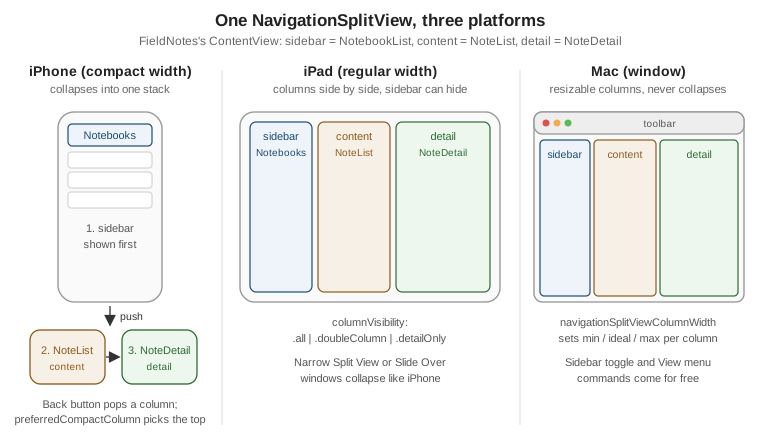
The figure is the reason FieldNotes uses one split view instead of platform-specific navigation code. On an iPhone, or in a narrow iPad window, the split view collapses into a stack and the back button pops columns. On iPad and in visionOS windows the columns sit side by side. On the Mac they become resizable panes with a sidebar toggle and matching View menu commands. How the same target adapts in other ways is covered on One Codebase for iOS, iPadOS, macOS, watchOS and visionOS.
NavigationStack and Value-Based Destinations
A NavigationStack shows a root view and pushes further views on top of it. Since iOS 16 the recommended
way to push is by value: a NavigationLink(value:) appends a hashable value to the stack’s path, and a
navigationDestination(for:) modifier maps each type of value to the view that displays it. Links no longer
build their destination views, so a list of a thousand notes doesn’t create a thousand detail views.
FieldNotes puts a stack in the split view’s detail column, so that from a note the user can follow a tag to the other notes that share it, then open one of those, and so on:
// FieldNotes/Views/NoteDetailStack.swift
struct NoteDetailStack: View {
    @Environment(NoteStore.self) private var store
    let noteID: Note.ID?

    var body: some View {
        NavigationStack {
            Group {
                if let note = store.notes.first(where: { $0.id == noteID }) {
                    NoteDetail(note: note)
                } else {
                    ContentUnavailableView("No Note Selected", systemImage: "note.text")
                }
            }
            .navigationDestination(for: Note.self) { note in
                NoteDetail(note: note)
            }
            .navigationDestination(for: String.self) { tag in
                TaggedNotesList(tag: tag)
            }
        }
    }
}

// Inside NoteDetail: each tag chip is a link that pushes a String value.
ForEach(note.tags, id: \.self) { tag in
    NavigationLink(value: tag) {
        Text(tag)
    }
    .buttonStyle(.plain)
}

// Inside TaggedNotesList: each row pushes a Note value.
List(notes) { note in
    NavigationLink(value: note) {
        NoteRow(note: note)
    }
}
See Apple Developer Documentation — NavigationStack and Apple Developer Documentation — navigationDestination(for:destination:).
Two rules from Apple’s documentation save a lot of debugging:
-
Put
navigationDestinationoutside lazy containers. A modifier attached to a row inside aListorLazyVStackmay not exist yet when a value is pushed, so the stack can’t find the destination. Attach it to the view that contains the list, asNoteDetailStackdoes. -
One destination per type, per stack. Registering
Note.selftwice in the same stack is ambiguous. When two kinds of screen need the same type, wrap it in a small enum instead (see Routes below).
For destinations that aren’t part of a path, two more modifiers exist. navigationDestination(item:) pushes
while an optional binding is non-nil, and navigationDestination(isPresented:) pushes while a Boolean is
true. FieldNotes uses the item form for the "related note" suggestion, which is computed rather than tapped:
@State private var suggestedNote: Note?

NoteDetail(note: note)
    .navigationDestination(item: $suggestedNote) { note in
        NoteDetail(note: note)
}Programmatic Navigation with NavigationPath
Passing a binding to the stack’s path: parameter hands the contents of the stack to your own state. With a
homogeneous path you can use an array ([Note]). When a stack pushes several types, as NoteDetailStack does
with Note and String, use NavigationPath, a type-erased list of hashable values. Appending to it
pushes, removing from it pops, and replacing it rebuilds the whole stack in one step.
FieldNotes keeps the path in a small @Observable router, so a toolbar button, a deep link or a notification
tap can all navigate without reaching into the view hierarchy:
// FieldNotes/Navigation/DetailRouter.swift
import SwiftUI
import FieldNotesModel

@Observable @MainActor
final class DetailRouter {
    var path = NavigationPath()

    func show(_ note: Note) { path.append(note) }
    func show(tag: String) { path.append(tag) }
    func back() { if !path.isEmpty { path.removeLast() } }
    func popToRoot() { path.removeLast(path.count) }
}

// NoteDetailStack, now driven by the router.
struct NoteDetailStack: View {
    @Environment(DetailRouter.self) private var router
    let noteID: Note.ID?

    var body: some View {
        @Bindable var router = router
        NavigationStack(path: $router.path) {
            NoteDetailRoot(noteID: noteID)
                .navigationDestination(for: Note.self) { NoteDetail(note: $0) }
                .navigationDestination(for: String.self) { TaggedNotesList(tag: $0) }
        }
    }
}
See Apple Developer Documentation — NavigationPath and Apple Developer Documentation — Understanding the navigation stack.
The @Bindable var router = router line produces the $router.path binding from an object read out of the
environment; the pattern is explained on State and Data Flow
with Observation. The router is created once in FieldNotesApp and injected with .environment(router), just
like NoteStore.
The system back button and the edge-swipe gesture pop by removing the last element of the same path, so your state and the screen can never disagree. The figure shows a typical session:
Routes, State Restoration and CodableRepresentation
Pushing whole Note values is convenient but has two costs: the pushed copy doesn’t see later edits to the
store, and Note isn’t Codable, so the path can’t be saved. Larger apps therefore push small route values
that carry identifiers. A NavigationPath whose elements are all Codable exposes a codable property of type
NavigationPath.CodableRepresentation, which can be encoded and stored in @SceneStorage to restore the stack
after the app is relaunched:
// FieldNotes/Navigation/Route.swift
enum Route: Hashable, Codable {
    case note(Note.ID)
    case tag(String)
}

struct RestorableDetailStack: View {
    @State private var path = NavigationPath()
    @SceneStorage("detailPath") private var savedPath: Data?

    var body: some View {
        NavigationStack(path: $path) {
            NoteDetailRoot(noteID: nil)
                .navigationDestination(for: Route.self) { route in
                    switch route {
                    case .note(let id): NoteDetailLoader(noteID: id)
                    case .tag(let tag): TaggedNotesList(tag: tag)
                    }
                }
        }
        .task {
            if let savedPath,
               let representation = try? JSONDecoder().decode(
                   NavigationPath.CodableRepresentation.self, from: savedPath) {
                path = NavigationPath(representation)
            }
        }
        .onChange(of: path) {
            guard let representation = path.codable else { return }
            savedPath = try? JSONEncoder().encode(representation)
        }
    }
}
See Apple Developer Documentation — NavigationPath.CodableRepresentation and Apple Developer Documentation — SceneStorage.
Codable itself is covered in the Swift reference under
Codable and Serialization; @SceneStorage is
covered with the scene life cycle on App Structure and Life
Cycle.
Deep-Link Navigation
Because navigation is just state, a deep link is just code that sets that state. FieldNotes accepts two
forms of link to a note: its custom URL scheme, fieldnotes://note/<uuid>, and a universal link,
https://fieldnotes.example.com/note/<uuid>;. SwiftUI delivers both to onOpenURL(perform:), in whichever scene
the system chooses:
// FieldNotes/Navigation/DeepLink.swift
enum DeepLink {
    case note(Note.ID)
    case notebook(Notebook.ID)

    init?(url: URL) {
        let parts = url.pathComponents.filter { $0 != "/" }
        // fieldnotes://note/<uuid> has host "note"; the https form has it as the first path component.
        let kind = url.scheme == "fieldnotes" ? url.host() : parts.first
        guard let idString = parts.last, let id = UUID(uuidString: idString) else { return nil }
        switch kind {
        case "note": self = .note(id)
        case "notebook": self = .notebook(id)
        default: return nil
        }
    }
}

// In ContentView: translate the link into selection and column state.
.onOpenURL { url in
    guard let link = DeepLink(url: url) else { return }
    switch link {
    case .note(let id):
        guard let note = store.notes.first(where: { $0.id == id }) else { return }
        selectedNotebook = note.notebookID
        selectedNote = note.id
        router.popToRoot()
        compactColumn = .detail
    case .notebook(let id):
        selectedNotebook = id
        selectedNote = nil
        compactColumn = .content
    }
}The custom scheme is declared under URL Types in the target’s Info tab. Universal links need an Associated
Domains entitlement (applinks:fieldnotes.example.com) and an apple-app-site-association file on the server:
{
  "applinks": {
    "details": [
      {
        "appIDs": ["ABCDE12345.com.example.fieldnotes"],
        "components": [ { "/": "/note/*" }, { "/": "/notebook/*" } ]
      }
    ]
  }
}Links are only one way in. Widgets, Spotlight results, Siri and Shortcuts reach the same DeepLink handling
through App Intents that open the app; that wiring is on
App Intents and System Integration, and the
notification path is on Notifications and Live
Activities. The web side of universal links, and the OAuth redirect case, are compared in
OAuth for Native and Mobile Apps.
TabView with Tab
A tab view suits a few peer areas that the user switches between and that each keep their own state. Since the
18 releases a TabView is built from Tab values rather than the deprecated tabItem(_:) modifier. A tab
can carry a value for programmatic selection and a role. TabSection groups secondary tabs; they appear as
sidebar sections when the tab view turns into a sidebar.
FieldNotes uses a tab-based root, FieldNotesTabs, as its top level. The Notes tab contains the whole
ContentView split view, and the other tabs are peers of it:
// FieldNotes/Views/FieldNotesTabs.swift
enum AppTab: Hashable {
    case notes, map, capture, search
    case notebook(Notebook.ID)
}

struct FieldNotesTabs: View {
    @Environment(NoteStore.self) private var store
    @State private var selection: AppTab = .notes

    var body: some View {
        TabView(selection: $selection) {
            Tab("Notes", systemImage: "note.text", value: .notes) {
                ContentView()
            }
            Tab("Map", systemImage: "map", value: .map) {
                NotesMap()
            }
            Tab("Capture", systemImage: "plus", value: .capture, role: captureRole) {
                QuickCaptureView()
            }
            Tab(value: .search, role: .search) {
                NoteSearchView()
            }
            TabSection("Notebooks") {
                ForEach(store.notebooks) { notebook in
                    Tab(notebook.name, systemImage: notebook.symbolName,
                        value: AppTab.notebook(notebook.id)) {
                        NoteList(notebookID: notebook.id, selection: .constant(nil))
                    }
                }
            }
            .defaultVisibility(.hidden, for: .tabBar)
        }
        .tabViewStyle(.sidebarAdaptable)
        .tabBarMinimizeBehavior(.onScrollDown)
    }

    /// `TabRole.prominent` is new in 27; on 26 the Capture tab is an ordinary tab.
    private var captureRole: TabRole? {
        if #available(iOS 27, macOS 27, watchOS 27, visionOS 27, *) {
            return .prominent
        }
        return nil
    }
}
See Apple Developer Documentation — TabView, Apple Developer Documentation — Tab and Apple Developer Documentation — Enhancing your app content with tab navigation.
The modifiers in that example each do one job:
-
.tabViewStyle(.sidebarAdaptable)keeps a bottom tab bar on iPhone. On iPad it shows a tab bar at the top that the user can expand into a sidebar, which is where theTabSectionof notebooks appears. macOS always shows a sidebar, and visionOS shows an ornament plus a sidebar for the sectioned tabs..defaultVisibility(.hidden, for: .tabBar)keeps the notebook tabs out of the compact tab bar so that only the four main tabs appear there. -
TabRole.searchmarks the tab that owns search. On iPhone it is drawn as a separate search button at the trailing end of the tab bar, and asearchablemodifier inside it is attached to that button. -
TabRole.prominent, new in 27, gives one tab a separate, emphasized position at the trailing edge of the tab bar. Only one tab can be prominent. When no tab has the role, a.searchtab may get the prominent treatment by default. FieldNotes makes Capture prominent because creating a note is the app’s primary action. Becauserole:takes an optionalTabRole, the availability check lives in a computed property, and the 26 releases fall back to a plain tab. -
.tabBarMinimizeBehavior(.onScrollDown), from the 26 releases, shrinks the Liquid Glass tab bar on iPhone while the user scrolls down through content and restores it when they scroll back up. The other values are.automatic,.neverand.onScrollUp.
See Apple Developer Documentation — sidebarAdaptable, Apple Developer Documentation — prominent and Apple Developer Documentation -- tabBarMinimizeBehavior(_:).
A tab bar can also host a bottom accessory, a small bar above the tab bar that collapses inline when the tab bar minimizes. FieldNotes shows the sync status there:
TabView(selection: $selection) { /* tabs as above */ }
    .tabViewBottomAccessory {
        SyncStatusView()   // "Synced 2 min ago", with a retry button
}On watchOS, TabView has its own vertical-page style, .verticalPage, which FieldNotesWatch uses for its
three glanceable screens; see watchOS: App Structure, Connectivity, Workouts and the Smart Stack.
Modal Presentations
Modal presentations interrupt the current flow for a self-contained task. They follow the same data-driven
rule as navigation: each one is attached to a view and driven by a Bool or an optional item. The presented
view closes itself through the dismiss environment action, never by reaching into its presenter.
Sheets and Detents
NoteList presents NoteComposer as a sheet (see App Architecture the
Apple Way). On iPhone a sheet can stop at intermediate heights called detents; FieldNotes lets the
composer start at half height, so the list stays visible behind it, and grow to full height when the user needs
room:
// NoteList
@State private var isComposing = false
@State private var composerDetent = PresentationDetent.medium

List(visibleNotes, selection: $selection) { note in NoteRow(note: note) }
    .toolbar {
        Button("New Note", systemImage: "square.and.pencil") { isComposing = true }
    }
    .sheet(isPresented: $isComposing) {
        NoteComposer(notebookID: notebookID)
            .presentationDetents([.medium, .large], selection: $composerDetent)
            .presentationDragIndicator(.visible)
            .interactiveDismissDisabled(composerHasUnsavedChanges)
    }

// NoteComposer closes itself.
struct NoteComposer: View {
    @Environment(\.dismiss) private var dismiss
    // ...
    var body: some View {
        NavigationStack {
            NoteDraftForm(draft: draft)
                .toolbar {
                    ToolbarItem(placement: .cancellationAction) {
                        Button("Cancel", role: .cancel) { dismiss() }
                    }
                    ToolbarItem(placement: .confirmationAction) {
                        Button("Save") { save(); dismiss() }
                    }
                }
        }
    }
}
See Apple Developer Documentation -- presentationDetents(_:selection:) and Apple Developer Documentation — Modal presentations.
Detents are .medium, .large, .fraction(_:), .height(_:), or a custom CustomPresentationDetent.
They apply on iPhone and in compact iPad layouts; on the Mac, and in regular-width iPad layouts, a sheet is a
centered card or window-attached panel whose size comes from its content and presentationSizing(_:).
interactiveDismissDisabled(_:) stops a swipe from throwing away a draft; pair it with a confirmation (below)
so the user still has a way out.
When the sheet shows one particular item, use sheet(item:) with an optional Identifiable value instead
of a separate Boolean. The sheet is presented when the value becomes non-nil and receives the unwrapped
value, so it can never show stale data:
@State private var editingNote: Note?

NoteList(notebookID: notebookID, selection: $selectedNote)
    .sheet(item: $editingNote) { note in
        NoteEditor(noteID: note.id)
}fullScreenCover(isPresented:) is the iOS and iPadOS variant that covers the whole screen; FieldNotes uses it
only for the camera capture flow on Camera, Media and Photos.
Popovers
A popover points at the control that opened it. On iPad and Mac it floats next to that control; in a compact
width it adapts to a sheet unless you ask otherwise with presentationCompactAdaptation(_:). The tag picker in
NoteDetail is a popover, kept as a popover even on iPhone because it is small:
@State private var isPickingTags = false

Button("Tags", systemImage: "tag") { isPickingTags = true }
    .popover(isPresented: $isPickingTags, arrowEdge: .bottom) {
        TagPicker(noteID: note.id)
            .frame(minWidth: 260, minHeight: 300)
            .presentationCompactAdaptation(.popover)
}Inspectors
An inspector is a trailing panel of details about the current selection: note metadata, word count, tags, location. In a regular-width layout on iPadOS and macOS it is a trailing column beside the content, with its presentation state restored by the framework. In a compact layout it adapts to a sheet:
// NoteDetail
@State private var showsInspector = false

NoteBodyView(note: note)
    .inspector(isPresented: $showsInspector) {
        NoteMetadataInspector(note: note)
            .inspectorColumnWidth(min: 220, ideal: 260, max: 340)
            .presentationDetents([.medium, .large])     // used when it adapts to a sheet
    }
    .toolbar {
        Button("Info", systemImage: "info.circle") { showsInspector.toggle() }
}Place .inspector on the detail column’s content, not on the whole NavigationSplitView, so it sits inside
the detail column and resizes with it.
Alerts from Errors and Items
Alerts report a problem or ask a short question. The 27 SDK adds alert and confirmation-dialog modifiers that take an optional item or error and build the title and actions from it. Their documentation pages list them as available back to the 15 releases, so FieldNotes uses them without an availability check.
alert(error:actions:) takes a binding to an optional LocalizedError. The alert appears while the error is
non-nil, takes its title from errorDescription, and clears the binding when dismissed. It also adds the
standard OK action when you give it no actions:
// FieldNotesServices
enum SyncError: LocalizedError {
    case offline
    case conflict(noteTitle: String)

    // Translator comments are shown on the Localization page.
    var errorDescription: String? {
        switch self {
        case .offline: String(localized: "You're offline")
        case .conflict(let title): String(localized: "\"\(title)\" was changed on another device")
        }
    }
    var recoverySuggestion: String? {
        switch self {
        case .offline: String(localized: "Your notes are saved and will sync when you're back online.")
        case .conflict: String(localized: "Choose which version to keep.")
        }
    }
}

// ContentView (splitView is the NavigationSplitView shown earlier)
@State private var syncError: SyncError?

splitView
    .task {
        do { try await syncService.sync() }
        catch let error as SyncError { syncError = error }
        catch {}
    }
    .alert(error: $syncError) { _ in
        Button("Retry") { Task { try? await syncService.sync() } }
        Button("OK", role: .cancel) {}
    } message: { error in
        Text(error.recoverySuggestion ?? "")
    }
See Apple Developer Documentation — alert(error:actions:) and Apple Developer Documentation — alert(error:actions:message:).
In the variant with a message: closure, both closures receive the unwrapped error, which is why the actions
closure above starts with _ in. alert(_:item:actions:message:) does the same for any optional value. The
syncService is the NoteSyncing service from
App Architecture the Apple Way; errors thrown from async code are covered
in Swift Concurrency in Apps.
Confirmation Dialogs
A confirmation dialog offers a choice of actions, typically before something destructive. On iPhone it is an
action sheet at the bottom of the screen; in regular width on iPad it becomes a popover; on the Mac it is a
sheet-style alert. The item: form, new with the 27 SDK like the alert above, passes the note to be deleted
into the actions and message:
// NoteList
@State private var noteToDelete: Note?

List(visibleNotes, selection: $selection) { note in
    NoteRow(note: note)
        .swipeActions {
            Button("Delete", systemImage: "trash", role: .destructive) { noteToDelete = note }
        }
}
.confirmationDialog(Text("Delete Note?"), item: $noteToDelete, titleVisibility: .visible) { note in
    Button("Delete \"\(note.title)\"", role: .destructive) { store.delete(note) }
    Button("Cancel", role: .cancel) {}
} message: { note in
    Text("This removes the note from all your devices.")
}On iOS, watchOS and tvOS, alert and dialog buttons can only have Text labels; other label views are dropped.
The system may reorder buttons by role, and a .cancel button replaces the dialog’s default dismiss action.
Zoom Navigation Transitions
A zoom transition makes a pushed view (or a presented sheet) grow out of the element the user tapped and shrink
back into it when dismissed, which keeps the user oriented. It takes two modifiers that share a Namespace and
an identifier: matchedTransitionSource(id:in:) on the source, and navigationTransition(.zoom(sourceID:in:))
on the destination.
FieldNotes uses it for the notebook grid from Lists, Tables and Collections: each notebook card zooms into its note list. The zoom style is not available on macOS, where the destination falls back to the automatic transition:
// FieldNotes/Views/NotebookGrid.swift
struct NotebookGrid: View {
    @Environment(NoteStore.self) private var store
    @Namespace private var zoom

    var body: some View {
        NavigationStack {
            ScrollView {
                LazyVGrid(columns: [GridItem(.adaptive(minimum: 150))]) {
                    ForEach(store.notebooks) { notebook in
                        NavigationLink(value: notebook) {
                            NotebookCard(notebook: notebook)
                                .matchedTransitionSource(id: notebook.id, in: zoom)
                        }
                        .buttonStyle(.plain)
                    }
                }
                .padding()
            }
            .navigationDestination(for: Notebook.self) { notebook in
                NoteList(notebookID: notebook.id, selection: .constant(nil))
                    #if !os(macOS)
                    .navigationTransition(.zoom(sourceID: notebook.id, in: zoom))
                    #endif
            }
        }
    }
}
See Apple Developer Documentation -- navigationTransition(_:), Apple Developer Documentation — matchedTransitionSource(id:in:) and Apple Developer Documentation — zoom(sourceID:in:).
Apply navigationTransition to the destination view itself, outside any VStack or other container. The same
modifier works on a sheet’s root view, which is how CaptureButton zooms into NoteComposer. The
matchedGeometryEffect family, for animating a view between two places within one screen, is covered on
Drawing, Animation and Gestures.
Toolbars
Toolbars hold a screen’s commands. A .toolbar modifier contributes ToolbarItems and ToolbarItemGroups,
each with a placement that describes its role (.primaryAction, .confirmationAction,
.cancellationAction, .secondaryAction, .navigation, .status, .bottomBar…) rather than an exact
position. The system maps roles to positions per platform: the navigation bar and bottom bar on iPhone, the
window toolbar on the Mac, ornaments on visionOS. With Liquid Glass, items are grouped into glass capsules.
The 26 and 27 releases added four tools for keeping a crowded toolbar in order:
| API | Available | What it does |
|---|---|---|
|
iOS, iPadOS, macOS 26 |
Splits items into separate glass groups (fixed) or pushes them apart (flexible) |
|
New in iOS, iPadOS, visionOS 27 (macOS 26.1) |
Decides which items move to the overflow menu first when space runs out |
|
New in iOS, iPadOS, visionOS 27 |
Puts secondary actions straight into the overflow menu, whatever the space |
|
New in iOS, iPadOS, visionOS 27 |
Pins an item to the trailing edge of the navigation bar so it never moves |
NoteDetail's toolbar uses all four. Share is the most important action and stays visible longest;
Archive and Duplicate are rare and go straight into the overflow menu:
// NoteDetail
.toolbar {
    ToolbarItem(placement: .primaryAction) {
        Button("Tags", systemImage: "tag") { isPickingTags = true }
    }
    ToolbarItem(placement: .primaryAction) {
        Button("Info", systemImage: "info.circle") { showsInspector.toggle() }
    }

    #if !os(visionOS)
    ToolbarSpacer(.fixed, placement: .primaryAction)   // Share sits in its own glass group
    #endif

    if #available(iOS 27, macOS 26.1, visionOS 27, *) {
        ToolbarItem(placement: .primaryAction) {
            ShareLink(item: note.body, subject: Text(note.title))
        }
        .visibilityPriority(.high)                     // new in 27: overflows last
    } else {
        ToolbarItem(placement: .primaryAction) {
            ShareLink(item: note.body, subject: Text(note.title))
        }
    }

    #if os(iOS) || os(visionOS)
    if #available(iOS 27, visionOS 27, *) {
        ToolbarOverflowMenu {                          // new in 27: always in the "..." menu
            Button("Duplicate", systemImage: "plus.square.on.square") { duplicate(note) }
            Button("Archive", systemImage: "archivebox") { archive(note) }
        }
    }
    #endif
}
See Apple Developer Documentation — Toolbars, Apple Developer Documentation — ToolbarSpacer, Apple Developer Documentation -- visibilityPriority(_:) and Apple Developer Documentation — ToolbarOverflowMenu.
A few details in that example matter:
-
ToolbarSpacerexists on iOS, iPadOS and macOS only, hence the#if !os(visionOS). The#ifblocks are Swift conditional compilation, covered in Attributes and Compiler Control. -
if #availableworks inside a toolbar because the toolbar builder supports limited availability. In Xcode 27 that builder is the unifiedContentBuilder, which replaces the type-specificToolbarContentBuilder; see SwiftUI Views and Modifiers and, for how result builders work, Result Builders. -
ToolbarOverflowMenuhas no macOS version, because a Mac toolbar already moves items into its own>>menu and lets the user customize it withtoolbar(id:).
Minimizing the Navigation Bar (New in 27)
The tab bar’s minimize behavior now has a navigation-bar counterpart. toolbarMinimizationBehavior(_:for:),
new in the 27 releases, shrinks the navigation bar as the user scrolls a long note, and an integrated top tab
bar on iPad minimizes with it:
ScrollView {
    NoteBodyView(note: note)
}
.navigationTitle(note.title)
.modifier(MinimizingNavigationBar())

struct MinimizingNavigationBar: ViewModifier {
    func body(content: Content) -> some View {
        if #available(iOS 27, macOS 27, watchOS 27, visionOS 27, *) {
            content.toolbarMinimizationBehavior(.onScrollDown, for: .navigationBar)
        } else {
            content
        }
    }
}Wrapping a 27-only modifier in a small ViewModifier keeps the availability check in one place instead of
repeating it at every call site. Custom view modifiers are introduced on
SwiftUI Views and Modifiers.
Search Placement
searchable(text:placement:prompt:) adds a search field and tells SwiftUI where you would prefer it. The
field’s actual position depends on the container the modifier is attached to and on the platform, so the
placement is a request, not a guarantee:
SearchFieldPlacement |
Where the field goes |
|---|---|
|
The platform default for the container: the navigation bar on iOS, the toolbar on macOS, and, in the 26 releases and later, the bottom toolbar on iPhone when the view is in a navigation stack |
|
A drawer under the navigation bar title on iOS; |
|
At the top of the sidebar column of a split view (iPadOS, macOS) |
|
In the toolbar, or its principal (center) position |
FieldNotes searches in two places. In the split view, attaching .searchable to the whole
NavigationSplitView with .sidebar placement puts one field at the top of the sidebar on iPad and Mac. In the
tab-based root, the .search tab owns search, and on iPhone the field starts minimized as a button so that it
doesn’t cover the list:
// ContentView: one search field for all columns.
NavigationSplitView { /* ... */ } content: { /* ... */ } detail: { /* ... */ }
    .searchable(text: $searchText, placement: .sidebar, prompt: "Search notes")

// FieldNotesTabs: the search tab's content.
Tab(value: .search, role: .search) {
    NavigationStack {
        NoteSearchResults(query: searchText)
            .searchable(text: $searchText, prompt: "Titles, tags and text")
            .searchToolbarBehavior(.minimize)
    }
}
See Apple Developer Documentation — searchable(text:placement:prompt:), Apple Developer Documentation — SearchFieldPlacement and Apple Developer Documentation -- searchToolbarBehavior(_:).
Filtering the list itself, search suggestions and tokens are covered with the lists on Lists, Tables and Collections.
Choosing a Structure
The decisions on this page come down to a few questions, in order:
-
Is the top level a hierarchy or a set of peers? A hierarchy browsed by selection is a
NavigationSplitView, even if the app ships only on iPhone, because it gains columns for free on iPad, Mac and Vision Pro. A set of peers is aTabViewwith.sidebarAdaptable. -
Does a column drill further down? Put a
NavigationStackin it, push values, and registernavigationDestination(for:)once per type outside lazy containers. -
Does something outside the view need to navigate? Own the
NavigationPath(or the selection) in an observable router, and make deep links, notifications and intents set that state. -
Is it a focused task or a question? Use a sheet for a task, a popover for a small choice tied to a control, an inspector for details beside the content, and an alert or confirmation dialog for a decision.
The Human Interface Guidelines behind these choices are summarized on Human Interface Guidelines in Practice, and the Liquid Glass treatment of tab bars and toolbars on Liquid Glass, Materials and Icons. The next page, Controls, Forms, Text, Images and SF Symbols, fills these screens with controls.
References
-
Apple Developer Documentation — Understanding the navigation stack
-
Apple Developer Documentation — Bringing robust navigation structure to your SwiftUI app
-
Apple Developer Documentation — Migrating to new navigation types
-
Apple Developer Documentation — NavigationSplitViewVisibility
-
Apple Developer Documentation — navigationDestination(for:destination:)
-
Apple Developer Documentation — navigationDestination(item:destination:)
-
Apple Developer Documentation — NavigationPath.CodableRepresentation
-
Apple Developer Documentation — Supporting associated domains
-
Apple Developer Documentation — Enhancing your app content with tab navigation
-
Apple Developer Documentation — tabViewBottomAccessory(content:)
-
Apple Developer Documentation -- presentationDetents(_:selection:)
-
Apple Developer Documentation — sheet(item:onDismiss:content:)
-
Apple Developer Documentation — popover(isPresented:attachmentAnchor:arrowEdge:content:)
-
Apple Developer Documentation -- presentationCompactAdaptation(_:)
-
Apple Developer Documentation — inspector(isPresented:content:)
-
Apple Developer Documentation — alert(error:actions:message:)
-
Apple Developer Documentation -- confirmationDialog(_:item:titleVisibility:actions:message:)
-
Apple Developer Documentation — matchedTransitionSource(id:in:)
-
Apple Developer Documentation -- toolbarMinimizationBehavior(_:for:)
-
Apple Developer Documentation — searchable(text:placement:prompt:)