Layouts
|
This section documents the current Vaadin release line — Vaadin 24 LTS / 25.x, Java 17+, Spring Boot 3 / Jakarta EE 10 — as published at the official Vaadin documentation, which is the reference these pages are written and verified against. No specific patch version is pinned. Flow (server-side Java) is the authoring style used throughout, with Hilla / React shown where it differs; Vaadin 7 and the pre-Flow architecture appear only as migration contrast. This content was generated with the assistance of AI and should be verified against the official documentation before being relied on in production, since Vaadin ships major releases roughly twice a year and its ecosystem iterates. This section’s bibliography lists the reference material consulted while preparing these pages. |
Vaadin Flow builds screens by nesting layout components — each a server-side Java object that renders to a CSS-flexbox or CSS-grid container in the browser. This page covers the built-in layouts and the sizing and alignment API they share, following Basic Layouts and Arrange with Layouts. For the components you place inside them see Components Overview.
VerticalLayout and HorizontalLayout
VerticalLayout stacks its children top-to-bottom; HorizontalLayout places them left-to-right. Both are
thin wrappers over a flexbox container, so the main axis is the stacking direction and the cross axis is
the other one. See
Vertical Layout and
Horizontal Layout.
Whitespace is controlled by three independent toggles: setSpacing (gaps between children), setPadding
(inset between the layout’s edge and its children), and setMargin (space outside the layout). A
VerticalLayout enables spacing and padding by default; a HorizontalLayout enables only spacing.
VerticalLayout column = new VerticalLayout();
column.setSpacing(true);
column.setPadding(true);
column.setMargin(false);
column.add(new H2("Profile"), new TextField("Name"), new EmailField("Email"));

HorizontalLayout actions = new HorizontalLayout();
actions.setSpacing(true);
actions.add(new Button("Save"), new Button("Cancel"));
Where Vaadin 7 nested layouts for every gap, one spaced HorizontalLayout now replaces that tree.
Sizing: full width, full size, and flex
A layout defaults to 100% width and content-based height (VerticalLayout) or content-based width and
height (HorizontalLayout). Override with setWidthFull (width: 100%), setHeightFull, or setSizeFull
(both). To make a child consume leftover space on the main axis, give it a flex-grow factor with
setFlexGrow; setFlexShrink controls how a child gives space back when the layout is too small.
expand(component…) is shorthand for setFlexGrow(1, …) plus setSizeFull() on the layout.
HorizontalLayout bar = new HorizontalLayout();
bar.setWidthFull();

TextField search = new TextField();
Button go = new Button("Search");

bar.add(search, go);
bar.setFlexGrow(1, search);   // search takes all spare width
bar.setFlexGrow(0, go);       // button stays at its natural width
bar.setFlexShrink(0, go);     // and never shrinks below it

VerticalLayout page = new VerticalLayout();
page.setSizeFull();
page.add(header, body, footer);
page.expand(body);            // body fills the height between header and footer
Alignment and distribution
setAlignItems(Alignment) positions every child on the cross axis — START, CENTER, END, STRETCH
(the default), BASELINE. setJustifyContentMode(JustifyContentMode) distributes children along the main
axis: START (default), CENTER, END, BETWEEN, AROUND, EVENLY. A single child overrides the
group with setAlignSelf(Alignment, child).
HorizontalLayout toolbar = new HorizontalLayout();
toolbar.setWidthFull();
toolbar.setAlignItems(FlexComponent.Alignment.CENTER);          // vertically centre every item
toolbar.setJustifyContentMode(FlexComponent.JustifyContentMode.BETWEEN); // title left, actions right
toolbar.add(new H3("Orders"), new Button("New order"));

Avatar avatar = new Avatar("A. Admin");
toolbar.add(avatar);
toolbar.setAlignSelf(FlexComponent.Alignment.START, avatar);    // this one hugs the top
HorizontalLayout also exposes setDefaultVerticalComponentAlignment / setVerticalComponentAlignment
for the same effect.
Scrolling: Scroller and Div
Layouts do not scroll on their own — overflowing content is clipped. Wrap the part that should scroll in a
Scroller and give it a bounded size; set the axis with
setScrollDirection(Scroller.ScrollDirection.VERTICAL) (also HORIZONTAL, BOTH — the default — and
NONE).
VerticalLayout list = new VerticalLayout();
messages.forEach(m -> list.add(new MessageCard(m)));

Scroller scroller = new Scroller(list);
scroller.setScrollDirection(Scroller.ScrollDirection.VERTICAL);
scroller.setHeightFull();       // a bounded height is what makes it scroll

VerticalLayout panel = new VerticalLayout(new H2("Inbox"), scroller);
panel.setSizeFull();
panel.expand(scroller);
Div is the unstyled block container — no flex defaults, no spacing — for applying your own CSS or Lumo
utility classes (see below) without fighting a layout’s built-in rules.
FlexLayout
FlexLayout is the raw flex container: no default spacing or padding, direction set with setFlexDirection,
and setFlexWrap(FlexLayout.FlexWrap.WRAP) to let children flow onto multiple lines. Use it when the
VerticalLayout / HorizontalLayout conventions get in the way.
FlexLayout tags = new FlexLayout();
tags.setFlexDirection(FlexLayout.FlexDirection.ROW);
tags.setFlexWrap(FlexLayout.FlexWrap.WRAP);
tags.getStyle().set("gap", "var(--lumo-space-s)");
labels.forEach(text -> tags.add(new Span(text)));
FormLayout with responsive steps
FormLayout lays fields out in a responsive grid. setResponsiveSteps maps a minimum width to a column
count, so the form collapses to one column on a phone and widens on a desktop. setColspan(field, n) lets a
field span several columns, and addFormItem(field, "Label") attaches a label that follows the layout’s
label-position setting. See Form Layout.
FormLayout form = new FormLayout();
form.setResponsiveSteps(
        new FormLayout.ResponsiveStep("0", 1),      // < 500px: single column
        new FormLayout.ResponsiveStep("500px", 2),  // >= 500px: two columns
        new FormLayout.ResponsiveStep("900px", 3)); // >= 900px: three columns

TextField firstName = new TextField("First name");
TextField lastName = new TextField("Last name");
TextArea notes = new TextArea("Notes");

form.add(firstName, lastName);
form.add(notes);
form.setColspan(notes, 3); // notes spans the full widthaddFormRow(…) groups fields onto one row regardless of the step, and the newer auto-responsive mode
(setAutoResponsive(true)) sizes columns from a target field width instead of explicit breakpoints.
SplitLayout
SplitLayout shows two areas separated by a draggable splitter. The orientation is horizontal by default;
setOrientation(SplitLayout.Orientation.VERTICAL) stacks the areas. Fill the areas with addToPrimary /
addToSecondary (or the two-argument constructor), and set the initial divider with
setSplitterPosition(percent). See Split Layout.
Grid<Customer> grid = new Grid<>(Customer.class);
CustomerDetails details = new CustomerDetails();

SplitLayout split = new SplitLayout(grid, details);
split.setOrientation(SplitLayout.Orientation.HORIZONTAL);
split.setSplitterPosition(60);          // primary (grid) gets 60% of the width
split.setSizeFull();
This is the usual skeleton for a master-detail view — see Components Overview for the
Grid side.
AppLayout: navbar and drawer
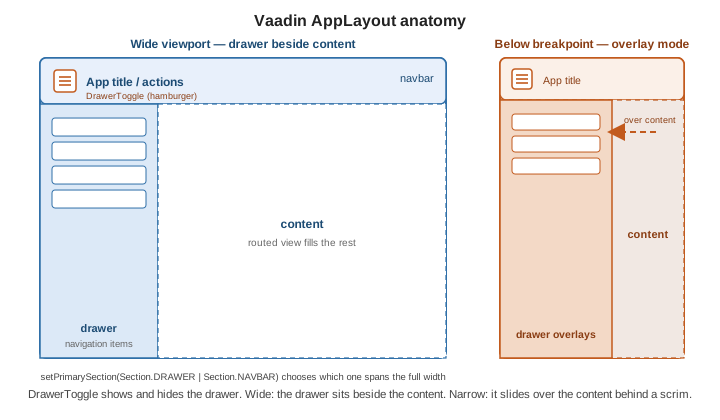
AppLayout is the application shell: a navbar across the top, a collapsible drawer on the side, and the
routed view in the remaining content area. setPrimarySection(AppLayout.Section.DRAWER) makes the drawer
span the full height with the navbar beside it; Section.NAVBAR (the default) makes the navbar span the full
width. A DrawerToggle placed in the navbar shows and hides the drawer — and below a viewport breakpoint
the drawer switches to overlay mode, sliding over the content behind a scrim instead of pushing it aside.
See App Layout.
public class MainLayout extends AppLayout {

    public MainLayout() {
        setPrimarySection(Section.DRAWER);

        DrawerToggle toggle = new DrawerToggle();
        H1 title = new H1("Irurueta Admin");
        title.getStyle().set("font-size", "var(--lumo-font-size-l)").set("margin", "0");
        addToNavbar(toggle, title);

        SideNav nav = new SideNav();
        nav.addItem(new SideNavItem("Dashboard", DashboardView.class, VaadinIcon.DASHBOARD.create()));
        nav.addItem(new SideNavItem("Customers", CustomerView.class, VaadinIcon.USERS.create()));
        addToDrawer(nav);
    }
}
A route becomes a child of this shell by naming it as the layout:
@Route(value = "customers", layout = MainLayout.class). Wiring routes into the shell is covered in
Routing and Navigation.
CSS Grid with Lumo utility classes
For a true two-dimensional grid, style a Div with Lumo utility classes rather than writing a stylesheet:
addClassNames takes constants from com.vaadin.flow.theme.lumo.LumoUtility. This needs the Lumo theme; see
CSS Grid Layouts and
Theming and Styling.
Div cardGrid = new Div();
cardGrid.addClassNames(
        LumoUtility.Display.GRID,
        LumoUtility.Grid.Column.COLUMNS_3,   // three equal columns
        LumoUtility.Gap.MEDIUM,
        LumoUtility.Padding.MEDIUM);

products.forEach(p -> cardGrid.add(new ProductCard(p)));
The same utility families (Display, Gap, Padding, FlexDirection, AlignItems) also tune a plain flex
container, and echo the vocabulary of Tailwind Reference. For breakpoint-driven column counts see
Responsive Layouts and
Responsive Design and PWA.
Reusable layout blocks with Composite
Composite<T> packages a chunk of layout as its own component. Subclass it with the root layout as the type
parameter, build the content against getContent(), and callers see one clean component instead of the
internal tree. It exposes only what you choose to make public — unlike extending VerticalLayout directly,
which leaks every add / remove method.
public class LabeledValue extends Composite<HorizontalLayout> {

    private final Span value = new Span();

    public LabeledValue(String caption) {
        Span label = new Span(caption);
        label.addClassNames(LumoUtility.TextColor.SECONDARY);

        getContent().setSpacing(true);
        getContent().setAlignItems(FlexComponent.Alignment.BASELINE);
        getContent().add(label, value);
    }

    public void setValue(String text) {
        value.setText(text);
    }
}

// used like any other component
LabeledValue total = new LabeledValue("Total");
total.setValue("EUR 1,240.00");
summary.add(total);
Override initContent() instead of using the constructor when the root should be built lazily on first
attach. See Vaadin Component
Basics.
See also
-
Components Overview — the fields, buttons and Grid that go inside these layouts.
-
Routing and Navigation — attaching routed views to an
AppLayoutshell. -
Theming and Styling — the Lumo theme, custom CSS and the utility-class catalog.
-
Responsive Design and PWA — breakpoints, viewport handling and installable apps.