Utility-First Fundamentals
|
This section documents Tailwind CSS v4.x — the CSS-first configuration line, whose v4.0 release shipped in January 2025 — as published at the official Tailwind CSS documentation, which is the reference these pages are written and verified against. No specific patch version is pinned. This content was generated with the assistance of AI and should be verified against the official documentation before being relied on in production, since Tailwind iterates quickly. This section’s bibliography lists the reference material consulted while preparing these pages. |
Tailwind’s core workflow is styling with utility classes: instead of writing CSS rules, you apply many small classes to each element. This page explains what a utility class actually is, why it is preferred over inline styles, how to keep the markup from repeating itself, and how variant prefixes stack into one class.
What a utility class is
A utility class is a thin wrapper around a single CSS declaration. m-4 generates margin: calc(var(--spacing)
* 4) — 1rem, because the theme’s --spacing variable is 0.25rem and the numeric scale multiplies it (so
1 = 0.25rem, 4 = 1rem, 8 = 2rem). A few utilities set a small coordinated group of declarations — text-lg sets both a font-size and a matching line-height — but the rule of thumb holds: one class, one
intent.
<div class="mt-4 mb-8 text-lg font-medium text-slate-700">
  <!-- mt-4    -> margin-top: 1rem      (4 x 0.25rem) -->
  <!-- mb-8    -> margin-bottom: 2rem   (8 x 0.25rem) -->
  <!-- text-lg -> font-size: 1.125rem; line-height: 1.75rem -->
  Spacing and type pulled from the theme scale
</div>
/* what the utilities above compile to */
.mt-4 { margin-top: calc(var(--spacing) * 4); } /* --spacing: 0.25rem -> 1rem */
.text-lg { font-size: var(--text-lg); line-height: var(--text-lg--line-height); }Why not inline styles
You could write style="margin-top: 1rem". Utilities win for four reasons, covered in the docs under
Why not just use inline
styles?:
-
Design constraints. Utilities draw from your theme, so you pick from a curated set of spacing, colour, and type values instead of arbitrary numbers — the design stays consistent.
-
States and media queries. An inline
styleattribute cannot expresshover:,focus:,md:, ordark:. Utilities can. -
Shorter, consistent values.
pt-4rather thanpadding-top: 1rem, spelled the same way everywhere. -
Responsive by prefix.
md:flexneeds no separate stylesheet or@mediablock.
<!-- inline style: no hover, no breakpoint, arbitrary value -->
<a style="background-color:#0284c7;padding:8px 16px">Link</a>

<!-- utilities: themed value, hover state, responsive padding -->
<a class="bg-sky-600 px-4 py-2 hover:bg-sky-500 md:px-6">Link</a>
Managing duplication
When the same class list repeats, reach for these in order — cheapest and most maintainable first:
-
Loop in the template. Render the repeated markup from an array; the class list is written once.
-
Extract a component. A React / Vue / Svelte component, a Blazor component, or a server-side partial — one definition, real parameters.
-
Multi-cursor edit. For a one-off repeat in a single file, select every occurrence and edit them together.
-
Custom CSS as a last resort. Only when none of the above fit.
<!-- 1. loop in the template (Handlebars) -->
<nav>
  {{#each navItems}}
    <a href="{{this.href}}"
       class="rounded px-3 py-2 text-sm font-medium hover:bg-slate-100">
      {{this.label}}
    </a>
  {{/each}}
</nav>
// 2. extract a component -- the class list is defined exactly once
function NavLink({ href, children }) {
return (
<a href={href}
className="rounded px-3 py-2 text-sm font-medium hover:bg-slate-100">
{children}
</a>
)
}Prefer components over @apply. Tailwind offers @apply to inline a utility list into a custom CSS rule, but
it recreates the very indirection utilities remove — a class name whose meaning now lives in another file. Use
a template loop or a component instead, and keep @apply for the unavoidable cases such as styling third-party
markup you cannot add classes to. This is the opposite of the preprocessor-mixin habit: see
Sass for how @mixin / @include and @extend address reuse when you do own the
stylesheet.
States, responsive, and dark mode at a glance
Every variant is a prefix on a utility, and prefixes stack. The mental model is simple: name the state, then name the utility it changes.
<button class="bg-sky-600 hover:bg-sky-500 focus:outline-2
               md:text-lg dark:bg-sky-400 dark:hover:bg-sky-300">
  Prefixes stack left to right
</button>-
hover:,focus:, and dozens more interaction and structural states — detailed on States and Variants. Full list: Hover, focus, and other states — Quick reference. -
sm:md:lg:xl:2xl:breakpoint prefixes, applied mobile-first — detailed on Responsive Design. -
dark:for dark colour schemes — detailed on Dark Mode.
Reading a utility page’s Quick reference table. Each utility page in
the Tailwind docs opens with a Quick reference
table: the left column is the class name (p-4, px-2, pt-8), the right column is the exact CSS it generates
(padding: 1rem). Scan it to find the class for the value you want, then add whatever variant prefixes the
situation calls for.
Anatomy of a utility class
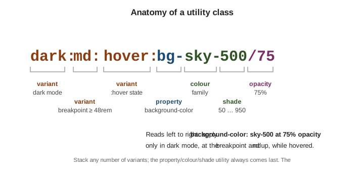
Read a fully-loaded class left to right:
-
dark:— a variant: apply only when the dark colour scheme is active. -
md:— a variant: apply only at themdbreakpoint and up (viewport >= 48rem). -
hover:— a variant: apply only while the pointer hovers the element. -
bg— the property:background-color. -
sky-500— the colour and shade from the theme palette. -
/75— the opacity modifier: 75% opaque, produced withcolor-mix().
All the conditions combine: the element gets a 75%-opacity sky background only when hovered, at md width or
wider, in dark mode. See Styling with utility
classes.