Content Components
|
This section documents Bootstrap 5.x as implemented by the official Bootstrap project. No specific patch version is pinned. Unlike the other reference sections on this site, no single reference book underpins it: the content was generated with the assistance of AI from general knowledge of Bootstrap, and should be verified against the current official documentation at getbootstrap.com/docs before relying on it in production. This section’s bibliography lists the reference material consulted while preparing these pages. |
Cards, list groups, and badges are the components most Bootstrap pages reach for to present a self-contained unit of content — a product tile, a settings menu, a status label — rather than a full-page layout. All three are pure markup and CSS; none of them require the JavaScript bundle.
Cards
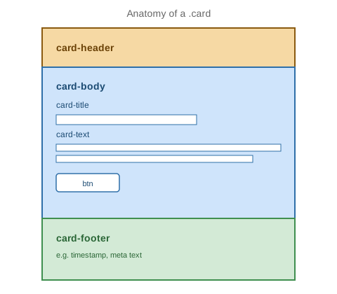
Anatomy
A .card is a bordered, rounded container divided into an optional header, a body, and an optional footer:
<div class="card" style="width: 18rem;">
  <div class="card-header">
    Featured
  </div>
  <div class="card-body">
    <h5 class="card-title">Card title</h5>
    <p class="card-text">
      Some quick example text to build on the card title and make up the bulk of the card's content.
    </p>
    <a href="#" class="btn btn-primary">Go somewhere</a>
  </div>
  <div class="card-footer text-body-secondary">
    2 days ago
  </div>
</div>
.card-header and .card-footer are both optional — a card with neither is just .card wrapping a single
.card-body. Inside the body, .card-title sizes a heading element consistently regardless of which <h1>-
<h6> level is used, and .card-subtitle (paired with a muted .text-body-secondary utility) sits directly
under it for a secondary line.
Images
.card-img-top (or .card-img-bottom) places an image flush against the top or bottom edge of the card,
outside the padded body, with corners that follow the card’s own border radius:
<div class="card" style="width: 18rem;">
  <img src="cap.jpg" class="card-img-top" alt="Descriptive alt text for the card's image">
  <div class="card-body">
    <h5 class="card-title">Card with image</h5>
    <p class="card-text">Text below the image, inside the padded body.</p>
  </div>
</div>
An image can also fill the entire card as a background, with text overlaid on top, using .card-img plus
.card-img-overlay:
<div class="card text-bg-dark">
  <img src="banner.jpg" class="card-img" alt="Descriptive alt text">
  <div class="card-img-overlay">
    <h5 class="card-title">Overlaid title</h5>
    <p class="card-text">Overlaid text, positioned absolutely over the image.</p>
  </div>
</div>
Layout: grids and groups
Multiple cards are usually laid out with the standard grid (see Layout: Float, Flexbox & Grid) rather than a card-specific class:
<div class="row row-cols-1 row-cols-md-3 g-4">
  <div class="col">
    <div class="card h-100">
      <div class="card-body"><h5 class="card-title">Card 1</h5></div>
    </div>
  </div>
  <div class="col">
    <div class="card h-100">
      <div class="card-body"><h5 class="card-title">Card 2</h5></div>
    </div>
  </div>
  <div class="col">
    <div class="card h-100">
      <div class="card-body"><h5 class="card-title">Card 3</h5></div>
    </div>
  </div>
</div>
.row-cols-1.row-cols-md-3 wraps one card per row on narrow screens and three per row at md and up, .g-4
adds gutters, and .h-100 on each .card stretches every card in a row to match the tallest one, so uneven
content doesn’t leave ragged card heights. .card-group is a related but different layout, not a horizontally
scrolling variant of it: it renders its cards as an equal-height flex row with the gutters between them removed
so adjacent borders touch, wrapping onto a new line at narrow widths the same as the grid above rather than
scrolling. An actual horizontally scrolling strip of cards needs .d-flex.flex-nowrap.overflow-auto on the
wrapper instead.
List groups
.list-group renders a flush, bordered list — a common building block for a settings menu, a sidebar of
options, or a simple feed:
<ul class="list-group">
  <li class="list-group-item">An item</li>
  <li class="list-group-item active" aria-current="true">A second, active item</li>
  <li class="list-group-item disabled" aria-disabled="true">A disabled item</li>
  <li class="list-group-item">A fourth item</li>
</ul>
Actionable items
Swapping <li>/<ul> for <a>/<div> (or <button>/<div>) turns each row into a clickable, hoverable,
focusable action rather than static text — useful for a navigation-style list:
<div class="list-group">
  <a href="#" class="list-group-item list-group-item-action active" aria-current="true">
    Inbox
  </a>
  <a href="#" class="list-group-item list-group-item-action">Sent</a>
  <a href="#" class="list-group-item list-group-item-action">Drafts</a>
  <button type="button" class="list-group-item list-group-item-action" disabled>
    Archived (unavailable)
  </button>
</div>
Contextual colors and badges
Each item accepts the same contextual color modifiers as alerts (see
Feedback Components), and a .badge (below) can sit inside an
item to show a count, right-aligned with a d-flex justify-content-between on the item itself:
<ul class="list-group">
  <li class="list-group-item list-group-item-success">A success item</li>
  <li class="list-group-item list-group-item-danger">A danger item</li>
  <li class="list-group-item d-flex justify-content-between align-items-center">
    Notifications
    <span class="badge text-bg-primary rounded-pill">14</span>
  </li>
</ul>
Horizontal and flush variants
.list-group-horizontal (and its -sm/-md/-lg/-xl/-xxl breakpoint variants) lays items out in a row
instead of a column above that breakpoint; .list-group-flush removes the group’s own rounded corners and
outer border, which is useful when the list sits directly inside a .card:
<div class="card">
  <div class="card-header">Recent activity</div>
  <ul class="list-group list-group-flush">
    <li class="list-group-item">Signed in</li>
    <li class="list-group-item">Updated profile</li>
  </ul>
</div>
Badges
A .badge is a small, inline count or label, typically sitting next to a heading or inside a button or list
item:
<h3>Notifications <span class="badge text-bg-secondary">4</span></h3>

<button type="button" class="btn btn-primary">
  Messages <span class="badge text-bg-light">12</span>
</button>
text-bg-* (covering the same semantic palette used throughout Bootstrap — primary, secondary, success,
danger, warning, info, light, dark) sets both the background and a contrasting, readable text color
in one class. Adding .rounded-pill renders fully rounded, pill-shaped ends instead of the default slightly
rounded rectangle:
<span class="badge text-bg-success rounded-pill">New</span>
<span class="badge text-bg-danger rounded-pill">3</span>
A badge has no default aria handling of its own — if it conveys meaning beyond decoration (an unread count,
for instance), that meaning should also be present in the surrounding text or an aria-label, since the
badge’s small size and color are not something every user can rely on to perceive it.
See the official Card docs, the official List Group docs, and the official Badge docs for the complete set of variants.