Feedback Components
|
This section documents Bootstrap 5.x as implemented by the official Bootstrap project. No specific patch version is pinned. Unlike the other reference sections on this site, no single reference book underpins it: the content was generated with the assistance of AI from general knowledge of Bootstrap, and should be verified against the current official documentation at getbootstrap.com/docs before relying on it in production. This section’s bibliography lists the reference material consulted while preparing these pages. |
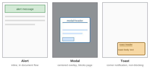
Alerts, modals, and toasts all communicate something to the user, but they differ in how intrusive they are and how long they stay visible. Choosing between them is mostly a question of urgency and whether the user must react before continuing:
-
An alert sits inline, in the normal document flow, near what it refers to — a form error, a page-level notice. It never blocks the rest of the page.
-
A modal interrupts everything else: it dims the page behind it and (by default) traps focus until the user explicitly closes it or completes the action it demands.
-
A toast is the least intrusive: a small, temporary notification, usually in a corner, that appears and disappears without ever blocking the user from doing anything else.
Alerts
.alert plus a contextual color modifier (primary, secondary, success, danger, warning, info,
light, dark) renders a colored banner:
<div class="alert alert-success" role="alert">
  Your changes have been saved.
</div>

<div class="alert alert-danger" role="alert">
  <strong>Something went wrong.</strong> Please check the form below and try again.
</div>
role="alert" marks the element as an ARIA live region so assistive technology announces it as soon as it
appears in the DOM, without the user needing to be focused on it — important since an alert is often injected
dynamically after a form submission rather than present on initial page load.
Dismissible alerts
Adding .alert-dismissible plus a close <button> makes an alert closable by the user; the fade transition and
click handling are provided by Bootstrap’s Alert JavaScript component, so the JS bundle must be loaded for the
button to actually work:
<div class="alert alert-warning alert-dismissible fade show" role="alert">
  This action cannot be undone.
  <button type="button" class="btn-close" data-bs-dismiss="alert" aria-label="Close"></button>
</div>
.fade and .show together produce the closing fade-out transition; data-bs-dismiss="alert" is what wires
the button’s click to actually removing the alert, and .btn-close supplies the small "x" icon with a
built-in, theme-aware aria-label fallback (overridden here to "Close", which is good practice regardless).
Alerts with links or extra content
An alert can hold headings, additional paragraphs, and links; .alert-link colors a link to match the alert’s
own contextual color rather than the browser default blue, so it doesn’t clash:
<div class="alert alert-primary" role="alert">
  <h4 class="alert-heading">Well done!</h4>
  <p>You successfully read this important alert message.</p>
  <hr>
  <p class="mb-0">
    Whenever you need to, be sure to use margin utilities to keep things nice and tidy.
    <a href="#" class="alert-link">Learn more</a>.
  </p>
</div>
Modals
A modal is built from a fixed outer .modal, a sizing/positioning wrapper .modal-dialog, and the visible
.modal-content, which itself splits into header/body/footer — the same three-region pattern as
cards:
<button type="button" class="btn btn-primary" data-bs-toggle="modal" data-bs-target="#confirm-modal">
  Delete item
</button>

<div class="modal fade" id="confirm-modal" tabindex="-1" aria-labelledby="confirm-modal-label" aria-hidden="true">
  <div class="modal-dialog">
    <div class="modal-content">
      <div class="modal-header">
        <h1 class="modal-title fs-5" id="confirm-modal-label">Confirm deletion</h1>
        <button type="button" class="btn-close" data-bs-dismiss="modal" aria-label="Close"></button>
      </div>
      <div class="modal-body">
        Are you sure you want to delete this item? This cannot be undone.
      </div>
      <div class="modal-footer">
        <button type="button" class="btn btn-secondary" data-bs-dismiss="modal">Cancel</button>
        <button type="button" class="btn btn-danger">Delete</button>
      </div>
    </div>
  </div>
</div>
data-bs-toggle="modal" and data-bs-target="#confirm-modal" on the trigger button open the modal without any
custom JavaScript; aria-labelledby pointing at the header’s title id is what makes the modal intelligible to
a screen reader once it opens. aria-hidden="true" on the closed .modal itself keeps its hidden content out
of the accessibility tree; Bootstrap’s JavaScript removes that attribute (rather than flipping it to false)
and adds aria-modal="true" plus role="dialog" once the modal is shown. Both attributes are part of the
standard markup, not optional extras — see Accessibility for what this
does and does not protect a screen-reader user from.
Sizing and scrolling
.modal-dialog accepts size modifiers and a vertical-centering modifier, and .modal-dialog-scrollable scrolls
just the .modal-body internally instead of the whole page when the content is taller than the viewport:
<div class="modal-dialog modal-lg modal-dialog-centered modal-dialog-scrollable">
  ...
</div>
Available sizes are .modal-sm, the unmodified default, .modal-lg, .modal-xl, and .modal-fullscreen
(which can also be applied only below a breakpoint, e.g. .modal-fullscreen-sm-down).
Static backdrop
By default, clicking outside a modal (on its dimmed backdrop) closes it, as does pressing the Esc key. Setting
data-bs-backdrop="static" disables the click-outside close, keeping the modal open until the user explicitly
uses a close control — useful when the modal represents an action that must not be silently abandoned:
<div class="modal" data-bs-backdrop="static" data-bs-keyboard="false" tabindex="-1">
  ...
</div>
data-bs-keyboard="false" additionally disables the Esc-key shortcut, though the modal’s own explicit close
button(s) should always remain available regardless.
Modals rely on the same JavaScript component API described on
Interactive Components — new bootstrap.Modal(…) — for
opening or closing one programmatically rather than through data-bs-* attributes alone.
Toasts
A toast is a small, auto-hiding notification, typically stacked inside a fixed-position .toast-container so
multiple toasts queue in a corner of the viewport rather than overlapping:
<div class="toast-container position-fixed bottom-0 end-0 p-3">
  <div id="save-toast" class="toast" role="status" aria-live="polite" aria-atomic="true">
    <div class="toast-header">
      <strong class="me-auto">Notification</strong>
      <small class="text-body-secondary">just now</small>
      <button type="button" class="btn-close" data-bs-dismiss="toast" aria-label="Close"></button>
    </div>
    <div class="toast-body">
      Your file has been saved.
    </div>
  </div>
</div>
role="status" and aria-live="polite" (rather than role="alert"/aria-live="assertive", used for alerts)
reflect a toast’s lower urgency: it is announced to a screen reader without interrupting whatever the user is
currently doing. aria-atomic="true" ensures the entire toast content is re-read as one unit rather than only
the piece of text that changed.
Unlike alerts and modals, a toast is not visible by default — it must be shown from JavaScript, and by default hides itself again after a delay:
const toastEl = document.getElementById("save-toast");
const toast = new bootstrap.Toast(toastEl, { delay: 4000 });
toast.show();
Passing { autohide: false } instead keeps a toast visible until the user dismisses it manually with its close
button, which is appropriate for a message the user must actually read (an error) rather than a fire-and-forget
confirmation.
Choosing the right one
| Component | Blocks page? | Auto-dismisses? | Typical use |
|---|---|---|---|
Alert |
No |
Only if built explicitly |
Form errors, page-level notices tied to specific content |
Modal |
Yes |
No |
Confirming a destructive action, a focused task that must complete or be cancelled |
Toast |
No |
Yes, by default |
"Saved", "Copied to clipboard" — transient confirmations the user doesn’t need to act on |
See the official Alerts docs, the official Modal docs, and the official Toasts docs for the complete option and event reference.